文字を通じて新しい文化創造の担い手になることを企業理念として誕生したフォントワークスは、 日本語DTPの黎明期におけるポストスクリプトへの対応や、現在の標準的な導入スタイルとして浸透している年間定額制フォントサービス「LETS」の開始など、文字に関するさまざまなソリューションの先駆けとなってまいりました。
伝える側と受けとる側、ヒトとヒトとのつながりだったものが、ヒトとモノへ、さらにはモノとモノ同士がコミュニケーションを図る、ものづくりとITが融合した社会へと進化を続けるなか、私たちはこれからも進化し続ける未来の担い手として、コミュニケーションに新たな価値を生み出し続けたいと考えています。
まずはその心がまえを象徴するものとして、先進性はそのままに、柔軟な考えを取り入れたダイナミックアイデンティティをコンセプトとするロゴマークに一新いたします。
新コーポレート ロゴ
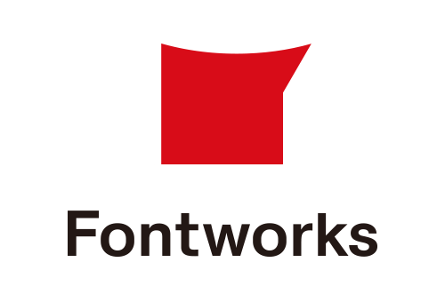
力強さと情熱を兼ね備えた赤いシンボルマークは、Fontworksの頭文字「F」をモチーフにしたものです。 極限までそぎ落としたシンプルなフォルムは力強く安定感があり、フォントワークスの理念や目標に向かって躍進する社員の姿勢をシンボライズしています。上部の有機的なラインは柔軟な姿勢を、右上の鋭角は常に最先端を目指すという志を表現しています。
新LETS ロゴ
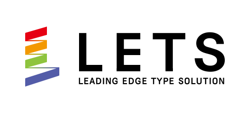
メインのイメージロゴともなるシンボルマークは、「LETS」の頭文字の[L]をモチーフにデザインしたものです。下から上に伸びているバネにも見える帯状のフォルムは “向上心” と “力強さ” を表現しています。メインカラーは、新しく生まれ変わり、さらに成長を続けることをあらわし、彩度をあわせた4つの色(赤/黄/緑/青)によるバリエーション豊富なラインナップも表現しています。