Kurokane typefaces is posted in the Yomiuri Shimbun Living Home Column "Kotonoha Tour"

Media Related

Fontworks and Kurokane typefaces were featured in the column "Kotonoha Tour", which deals with topics related to everyday words in the Yomiuri Shimbun lifestyle.

Publication paper / publication surface Yomiuri Shimbun national edition (excluding Kansai) morning edition
Living Home Column "Kotonoha Tour"
Publication date Wednesday, November 12, 2020
掲載記事URL Yomiuri Shimbun Online Article
TV telop, font selection is actor selection
https://www.yomiuri.co.jp/culture/20201112-OYT1T50089/
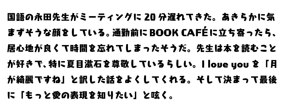
About Kurokane

Kurokane is a popular typeface that you often see in various media such as TV programs. The end of the thick element is dropped quickly, and in a black and powerful atmosphere like iron, the typeface has some kindness, and the skeleton is totally charming so as not to feel the "dull weight" of metal. The design brings out the modern Japanese pop kindness, strength, and brightness. Suitable for use in slightly larger short sentences such as titles and copies.


Kurokane EB can be used with a contract of LETS, mojimo-live, and mojimo-jewel ☆.