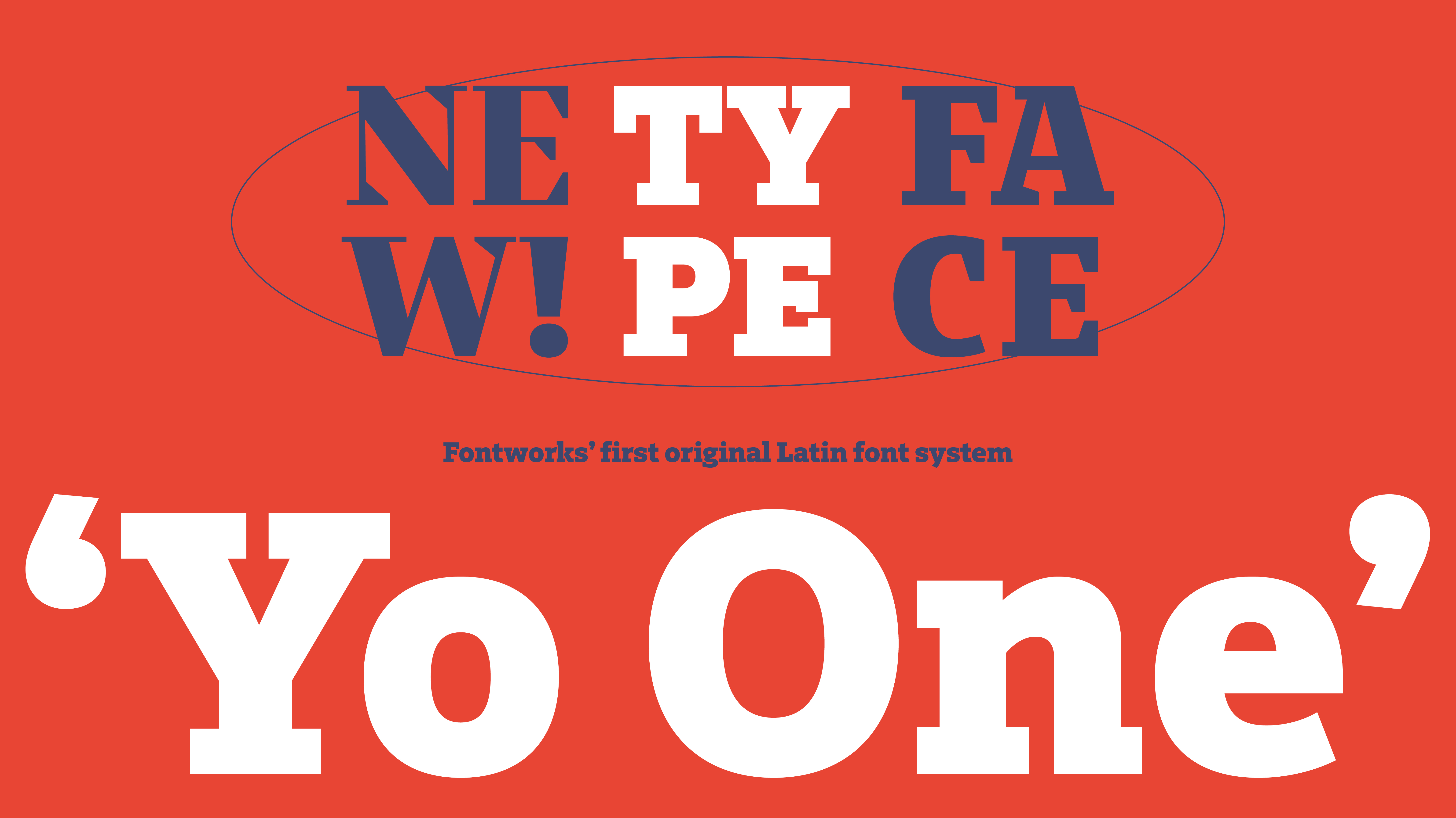
On Thursday, September 28, 2023, we released our first original European font, "Yo One."
About the new typeface “Yo One”
Yo One, created by Fontworks Typeface Design Director Joachim Müller-Lancé, is a font system that systematizes the various variations of European fonts along multiple axes, and is a superfamily of 156 fonts.
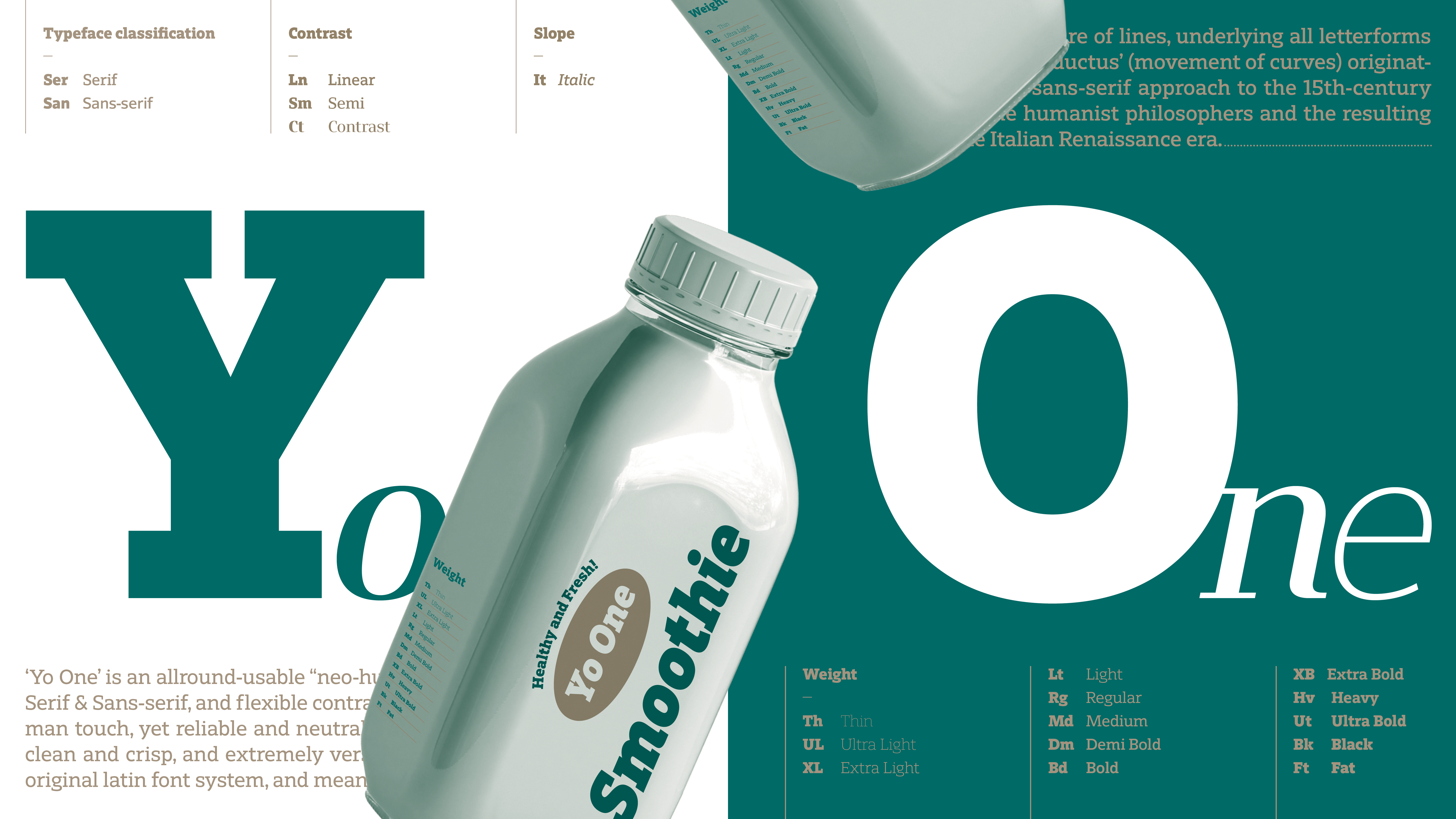
It is roughly divided into six families. First of all, it is divided into two Styles: ``Serif and Sans-Serif'', and each type has 3 flavors: ``Linear, Semi-Serif,'' and ``Contrast'' that represent the characteristics of the typeface.
Each family is available in 13 weights, each with two angles: roman and italic.
6 families (2 Styles x 3 flavors) x 26 subfamilies (13 weights x 2 angles) = 156 fonts
You can flexibly choose a font from these variations.

The Yo One super family starts from a single typeface and develops into typefaces with different characteristics, such as the presence or absence of serifs, the strength of contrast, etc. Because it is a superfamily designed with unified rules, fonts with different characteristics, such as serifs and sans-serifs, can be used together and still maintain harmony. This typeface is also Recommended for situations where visual consistency is required, such as for branding.
You can use it at no additional charge with the annual flat-rate font services ``Fontworks LETS'' and ``Fontworks LETS for Students.''
Fontworks LETS: https://lets.fontworks.co.jp/
A neo-humanist typeface with the ultimate in beauty and practicality.
Yo One is a versatile typeface that combines warmth and familiarity with reliability and practicality. It was designed to be a modern, clean and crisp typeface that meets all your needs.
The framework that forms the basis of all Styles is "neo-humanist."
In the history of European typefaces, in contrast to the neo-grotesque sans-serifs that proliferated in the 1950s, humanist sans-serifs, which were easier to read, emerged. These incorporate calligraphic hand movements to recreate the natural strokes of writing. Neohumanist typefaces are a further development of this.
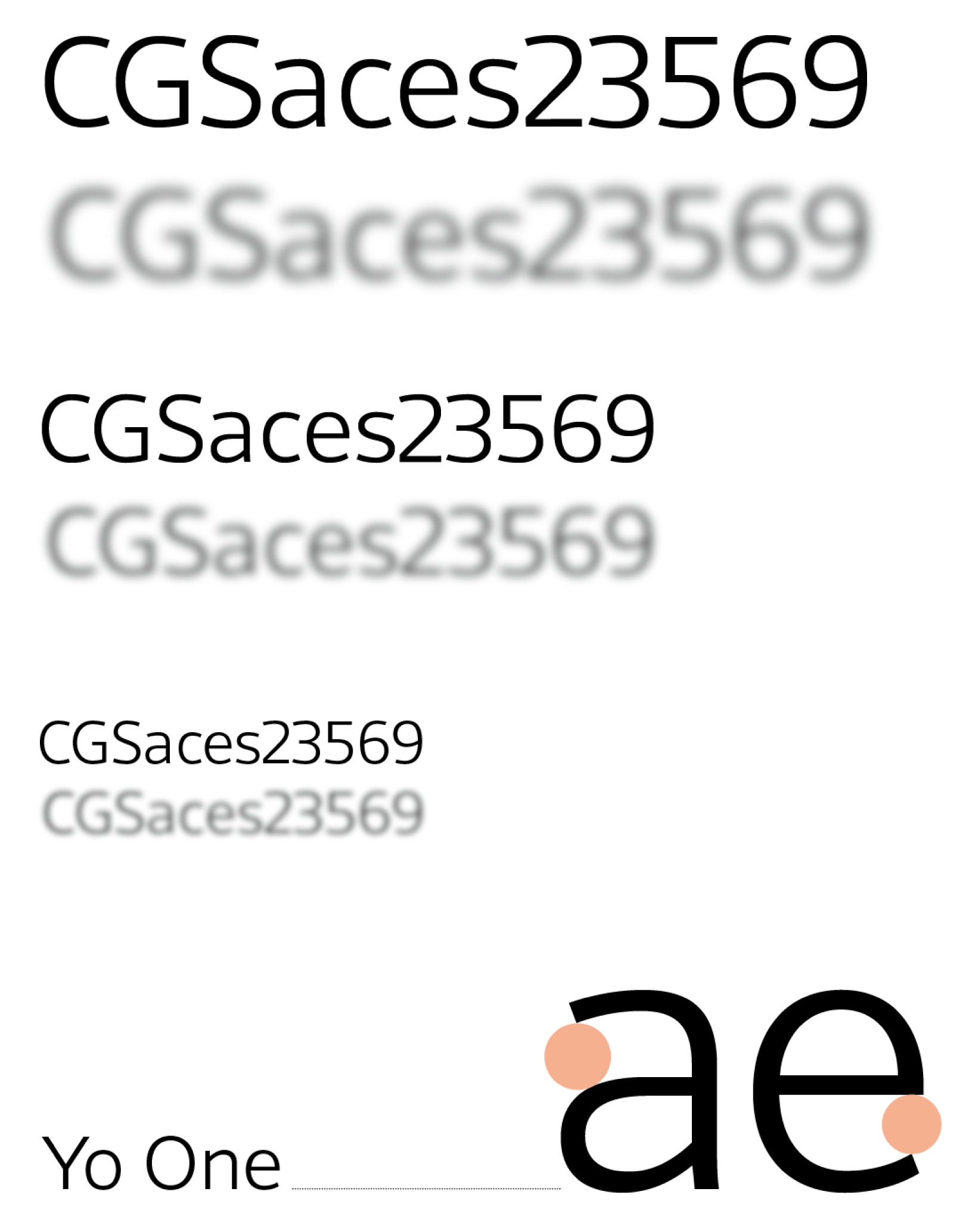
The shapes of each letter are significantly different, making them easy to identify. A distinctive feature is the open counter shape seen in letters such as "C", "e", and "3", and the wide opening improves distinguishability and visibility.
It is Recommended not only for posters, Packaging, and web design, but also for embedding into various devices.
Joachim Müller-Lancé Profile

Born in Germany in 1961.
Studied graphic design at the Basel School of Design in Switzerland and received high acclaim, winning first place in typography competitions in various countries including Japan. He teaches at schools in several countries around the world and has published articles and works related to graphic design and typography.
In addition, he is in charge of information design and VI (visual identity) for several overseas companies. In 2018, he worked as a design director for European languages at YOON Design, a font manufacturer in Seoul.
In 2020, he joined Fontworks and assumed the role of typeface director for the current European fonts.