フォントワークス株式会社は、年間定額制フォントサービス「モトヤLETS」および「学生向けモトヤLETS」、Webフォントサービス「FONTPLUS」にて、文字にツヤと光沢感を与えるデザイン書体「モトヤクレイル 2」の提供を開始しました。
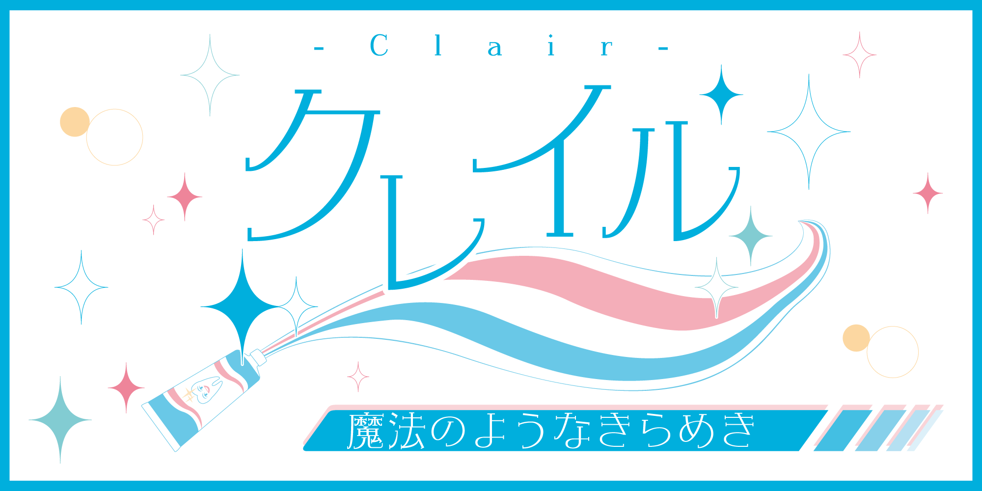
モトヤクレイル コンセプト
モトヤクレイルは、文章に「ツヤ」「光沢感」を付与できるデザイン書体です。その性質から、書体名にはフランス語で「明るい」「光」を意味する「Clair(クレイル)」と名付けました。
文字のバランスは全て足長気味にデザインし、あえて重心を高めに設定しています。
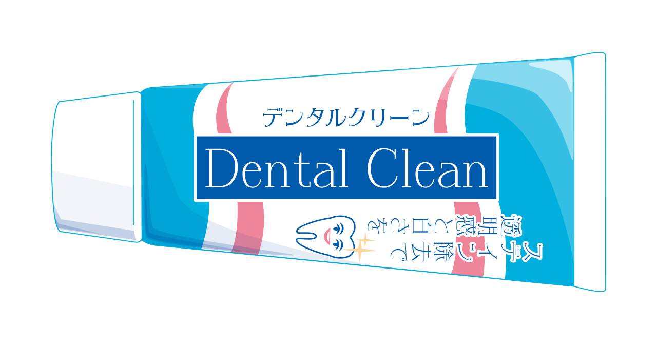
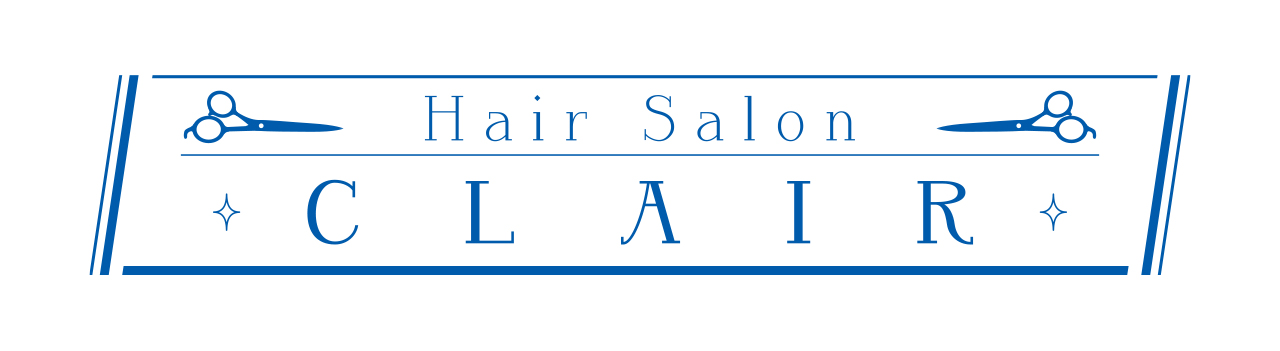
モトヤクレイルは、文字の表情として「清潔感」「高級感」を持ち合わせているため、例えば清掃用品・歯科衛生用品・洗車グッズのパッケージやロゴ、美容室・サロンの看板やキャッチコピーへの使用にも最適です。
【提供書体一覧】
モトヤクレイル 2 Std
モトヤEXクレイル 2(TrueType)
年間定額制フォントサービス「モトヤ LETS」および「学生向けモトヤ LETS」にて、追加料金なくご利用いただけます。
モトヤLETS:https://lets.fontworks.co.jp/motoya
また公式noteでは株式会社モトヤの書体についてご紹介しています。是非ご覧ください。
フォントワークス×Monotype公式note:
「可読性の良さ」と「文字の美しさ」の追求―― 株式会社モトヤ
モトヤ LETS用フォントリスト
モトヤの書体をまとめたフォントリストをこちらからインポートできます。
※フォントリストの書体をご利用いただくには、年間定額制フォントサービス「モトヤ LETS」および「学生向けモトヤ LETS」へのご契約が必要となります。
モトヤについて
モトヤ書体の開発は、1950年代から始まり現在に至っています。この間モトヤ書体は、鉛活字、タイプ活字、写植用文字盤、デジタルフォント(ビットマップフォント・アウトラインフォント)と様々な組版手段に対応し、その製品形態を変えてきました。しかし永年にわたる書体開発の歴史の中で、変わらないものが「可読性」と「文字の美しさ」の追求です。
URL: https://www.motoyafont.jp/