ニューシネマA D
ニューシネマA D
フォントについて
対応サービス
デザイナー
佐藤 英夫
詳細
- 読み方
- にゅーしねまえー
- フォントメーカー
- Fontworks
- ファウンダリー
- フォントワークス
- 言語:
- 日本語
- カテゴリ
- 専門書系
- 規格
- JIS X 0208:1990
- 文字セット
- 詳しくはこちら
- ファイルサイズ
- 4MB
- OpenType機能
- 字幅半角メトリクス(halt)
- カーニング(kern)
- プロポーショナルメトリクス(palt)
- 縦組み字幅半角メトリクス(vhal)
- 縦組みペアカーニング(vkrn)
- 縦組みプロポーショナルメトリクス(vpal)
- 任意の合字(dlig)
- 等幅全角字形(fwid)
- 等幅半角字形(hwid)
- JIS78 字形(jp78)
- 一般的な合字/標準合字(liga)
- プロポーショナル字形(pwid)
- 旧字体(trad)
- 縦組み用字形(vert)
字形
{{ currentShapeTextTitle }}
- {{ text }}
フォントファミリー1スタイル
{{ currentSampleTextTitle }}
- ニューシネマA D
- {{ currentSampleText }}
- 一般的な合字/標準合字(liga)
- 前後関係に依存する字形(calt)
- 任意の合字(dlig)
- スモールキャップス(smcp)
- 大文字のスモールキャップス(c2sc)
- スワッシュ字形(swsh)
- デザインのバリエーション(salt)
- ライニング数字(lnum)
- オールドスタイル数字(onum)
- プロポーショナル数字(pnum)
- 等幅数字(tnum)
- 分数(frac)
- 上付き序数表記(ordn)
- デザインのセット 01-20(ss##)
- プロポーショナル字形(pwid)
- プロポーショナルメトリクス(palt)
- プロポーショナルかな(pkna)
- 等幅全角字形(fwid)
- 等幅半角字形(hwid)
- 字幅半角メトリクス(halt)
- 等幅三分字形(twid)
- 等幅四分字形(qwid)
- JIS78 字形(jp78)
- JIS83 字形(jp83)
- JIS90 字形(jp90)
- JIS2004 字形(jp04)
- 旧字体(trad)
- ルビ用字形(ruby)
- 横組み用かな(hkna)
- 印刷標準字体(nlck)
- 修飾字形(nalt)
- イタリック(ital)
- 縦組みペアカーニング(vkrn)
- 縦組み用字形(vert)
- 縦組みプロポーショナルメトリクス(vpal)
- 縦組み字幅半角メトリクス(vhal)
- 縦組み用かな(vkna)
- カーニング(kern)
- 字体組版/分解(ccmp)
- ローカライズの字形(locl)
- 上付き文字(sups)
- 下付き文字(subs)
-
mojimo-VR
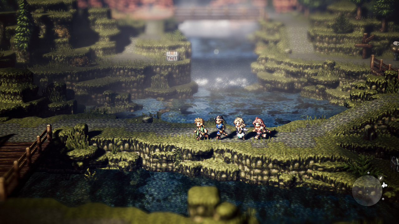
PlayStation VR専用ソフト『初音ミク VRフューチャーライブ』や『サマーレッスン』などの人気VR作品で使用され、 VR/AR空間に適していると評判のフォントが、mojimo-VRとしてパッケージングされました! VR空間において発生してしまうレンズのゆがみやエフェクトの影響による文字の視認性の低下。 これらの課題をクリアしたのが、このmojimo-VR。 「どの角度から見ても視認性が良い書体」であるUD角ゴ_ラージを含め、10書体を提供します。 フォントファイルを組込んで使用するUnityなどのゲームエンジンでの開発も、 追加費用なしで利用でき、またYouTubeなどの動画共有サイトでのご使用もOK!
機能詳細
{{ functionType === 'spec' ? '文字セット' : 'OpenType機能' }}
| OTF | TTF | ||||||||
|---|---|---|---|---|---|---|---|---|---|
| A-J 1-6 | A-J 1-5 | A-J 1-4 | A-J 1-3 | ||||||
| Pr6 | Pr6N | Pr5 | Pr5N | Pro | ProN | Std | StdN | ||
| D | ● | ● | |||||||
合字
文字
数値
デザインのセット
幅の異なる字形
文化的に異なる字形
縦書き機能
その他
対応サービス
使用事例
© 2025 Monotype KK