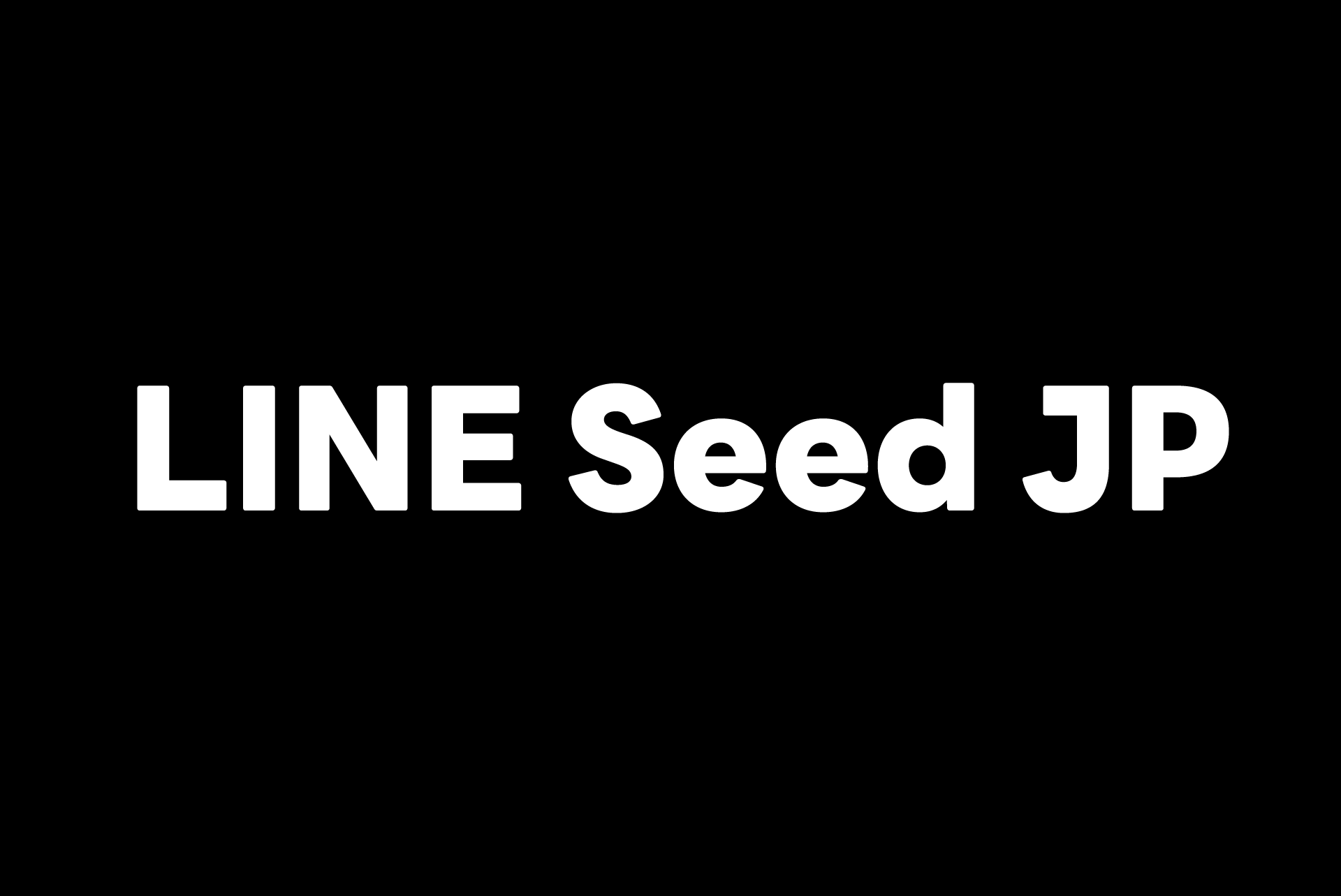
LINEは、ブランディングの一環として欧文コーポレートフォント『LINE Seed Sans』を2020年にグローバルでリリースしています。今回、その日本語書体である『LINE Seed JP』をLINEクリエイティブセンター BXデザイン室と共同開発いたしました。
『LINE Seed JP』は今後LINEの事業活動やイベントなど、さまざまなシーンで使用されます。さらに、一般にも公開してどなたでも使用していただけるようになります。
書体の特徴
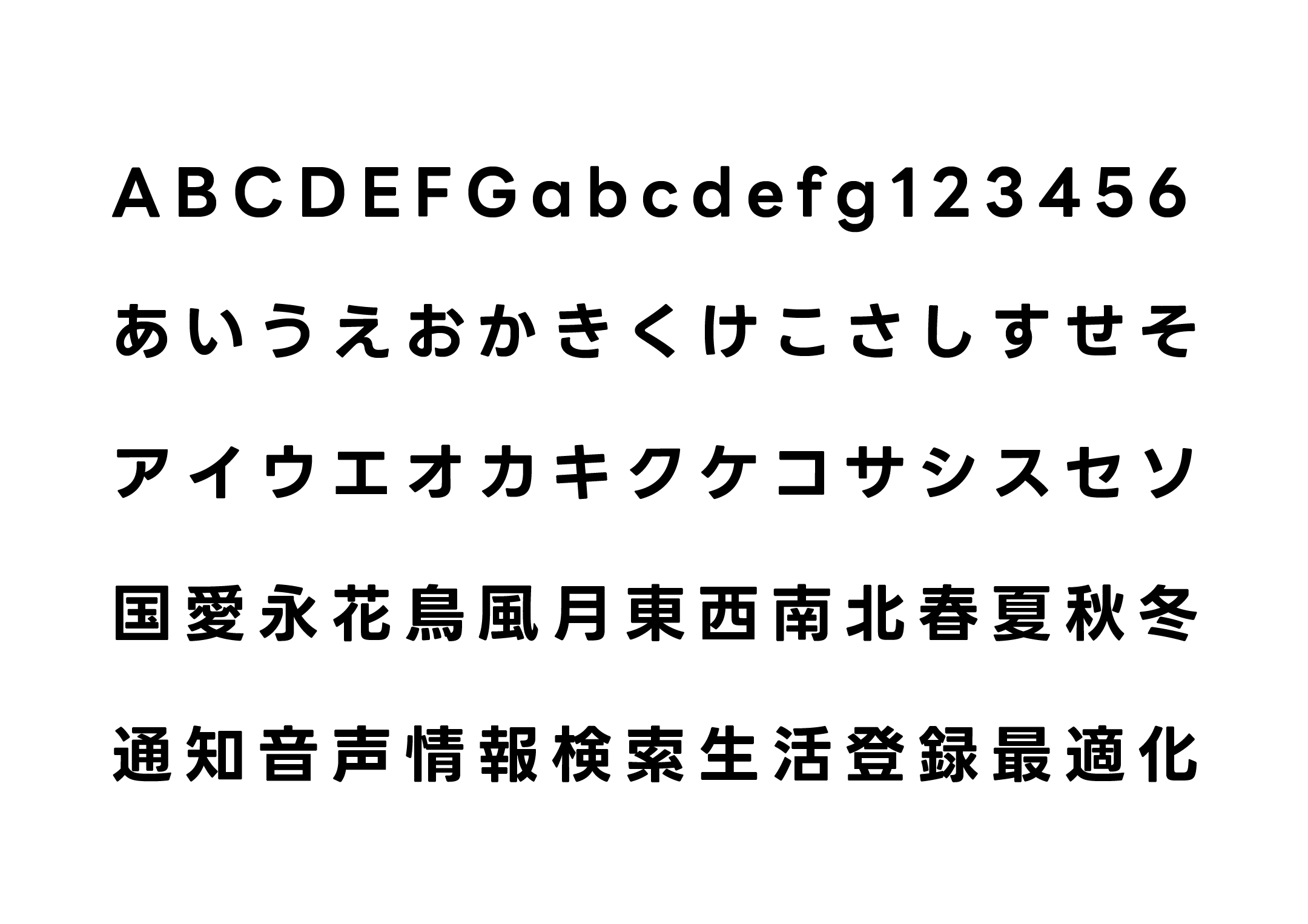
1.親しみのある“カドマル”ゴシック
既存の欧文コーポレートフォント『LINE Seed Sans』は、角の丸み = 「カドマル」 が最大の特徴であり、全ての文字に共通したアイデンティティとなっています。
今回の日本語書体『LINE Seed JP』でもこの特徴を取り入れ、角ゴシック体よりも少しカジュアルで柔らかい、親しみやすさが伝わる書体になりました。
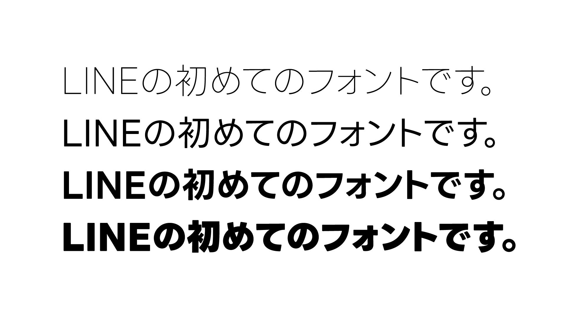
2.明るく、大人なモダンスタイル
モダンでありながら親しみのある印象を目指し、“ふところ”を広く、仮名は曲線を多く取り入れた明るいモダン系のゴシック体です。
3.日本語ならではの美しさと整合性のバランス
既存の欧文コーポレートフォント『LINE Seed Sans』は、統一されたジオメトリックなルールに基づいて開発されています。しかし、日本語書体は文字のバリエーションが多く、漢字と仮名など、密度が大きく異なる文字を同時に扱うことは簡単ではありません。
『LINE Seed JP』の開発にあたっては、読むときの心地よさや日本語書体ならではの不揃いな美しさと、形の整合性との間で何度も検証を重ね、これまでにない新しいモダンゴシック体が完成しました。
LINE株式会社 LINEクリエイティブセンター
BXデザイン室 コメント
グローバル企業として一貫したブランディングを行うために、コーポレートフォントの役割はとても重要だと考えています。コミュニケーションの言語が変わっても、コーポレートフォントはブランドの声となって同じトーンでメッセージを伝えることができます。LINEはテキストコミュニケーションを中心に成長したサービスであり、言葉を大切にする企業だからこそ、コーポレートフォントを開発することは大きな意義があります。
『LINE Seed JP』のデザインは、LINEのブランドアイデンティティが表現できることや、ユーザーフレンドリーであることに徹底的にこだわりました。今回のフォント開発によって、あらゆるシーンにおいて唯一無二のLINEならではのフォントで、シンプルかつユーザーフレンドリーな印象を与える事ができ、ユーザーの皆様のコミュニケーション体験をより豊かなものにしていくことを目指しています。

書体デザインディレクター 藤田重信 コメント
『LINE Seed JP』の制作はフォントワークスにとっても大きな挑戦でした。すでにある『LINE Seed Sans』は誠実で温厚という人格を感じたので、日本語書体では「大人のひとが微笑んでいるような印象を持った文字」をイメージして監修にあたりました。『LINE Seed JP』がLINE社で末永く愛されるコーポレートフォントになることを願います。
LINE Seed Webサイトではフォントファイルを無料で公開しています。ぜひこの機会にお試しください。
※ご使用の際にはライセンスポリシーを必ずお読みください。
プロジェクトの背景については、LINE クリエイティブセンター BXデザイン室の皆さんに詳しくおうかがいしたインタビューを、「もじがたり」に掲載しています。
フォントワークス公式noteではLINE Seed JPの書体について詳しく解説しています。ぜひ合わせてご覧ください。