人・情報・サービスをつなぐコミュニケーションアプリ「LINE」を手がけるLINE株式会社は、新時代における新しいコミュニケーションの形を目指して、日本のみならずグローバルに事業を展開されています。
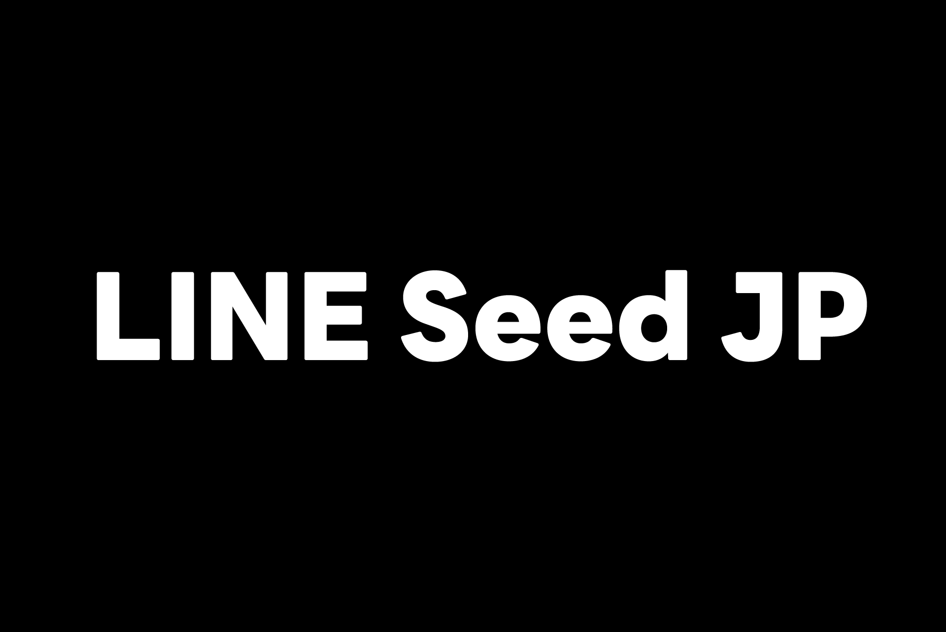
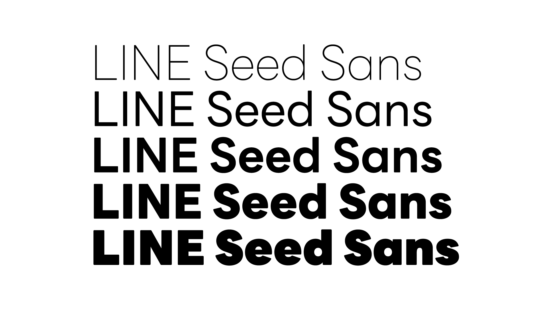
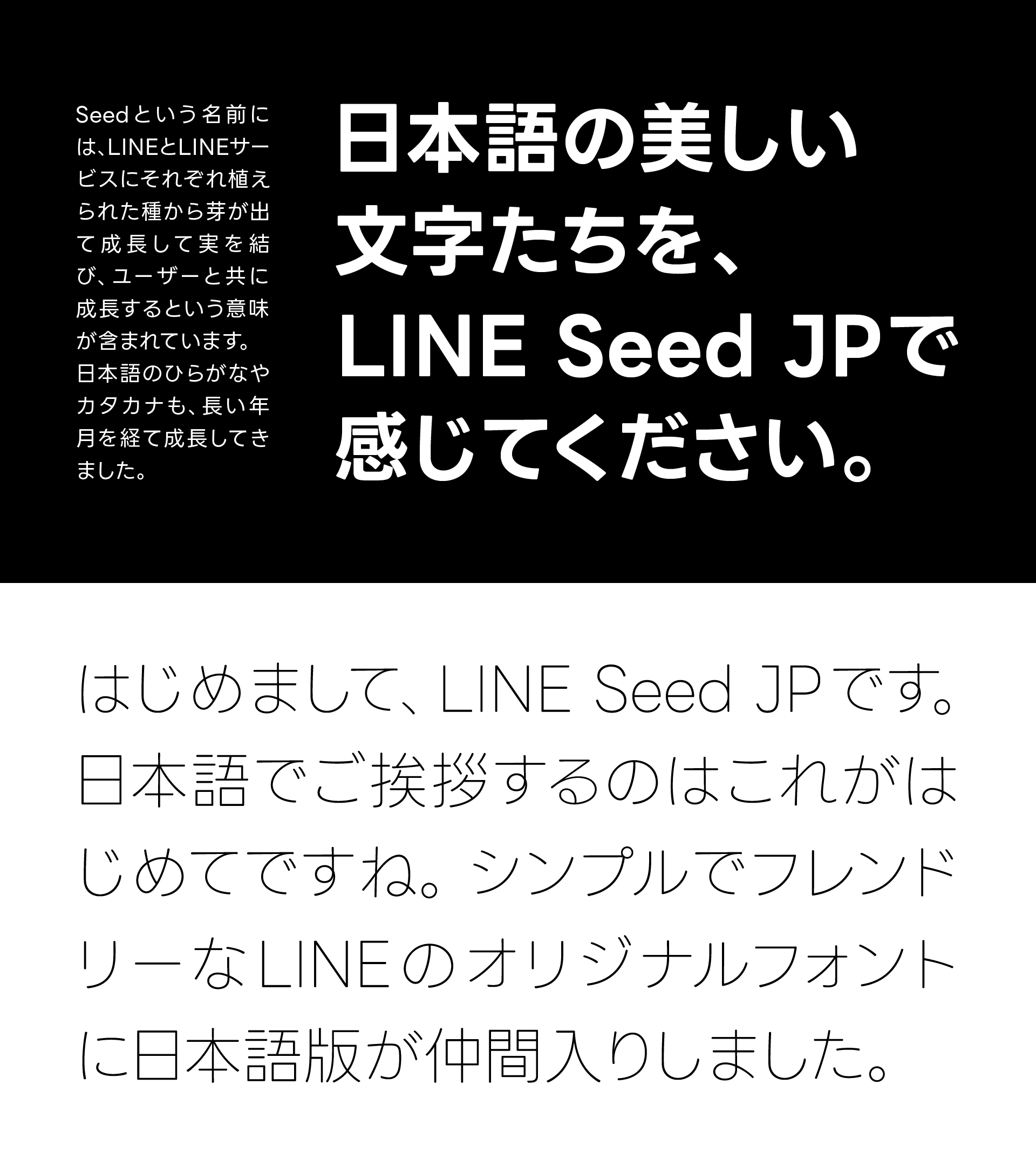
そのLINEのブランディングの一環として開発されているのが、コーポレートフォント「LINE Seed」です。2020年にグローバルでリリースされた欧文(英語・数字・記号)を皮切りに、2021年2月には日本語の開発がスタート。その日本語書体である「LINE Seed JP」を、韓国のフォントメーカー Fontrixと、フォントワークスが共同で開発させていただきました。
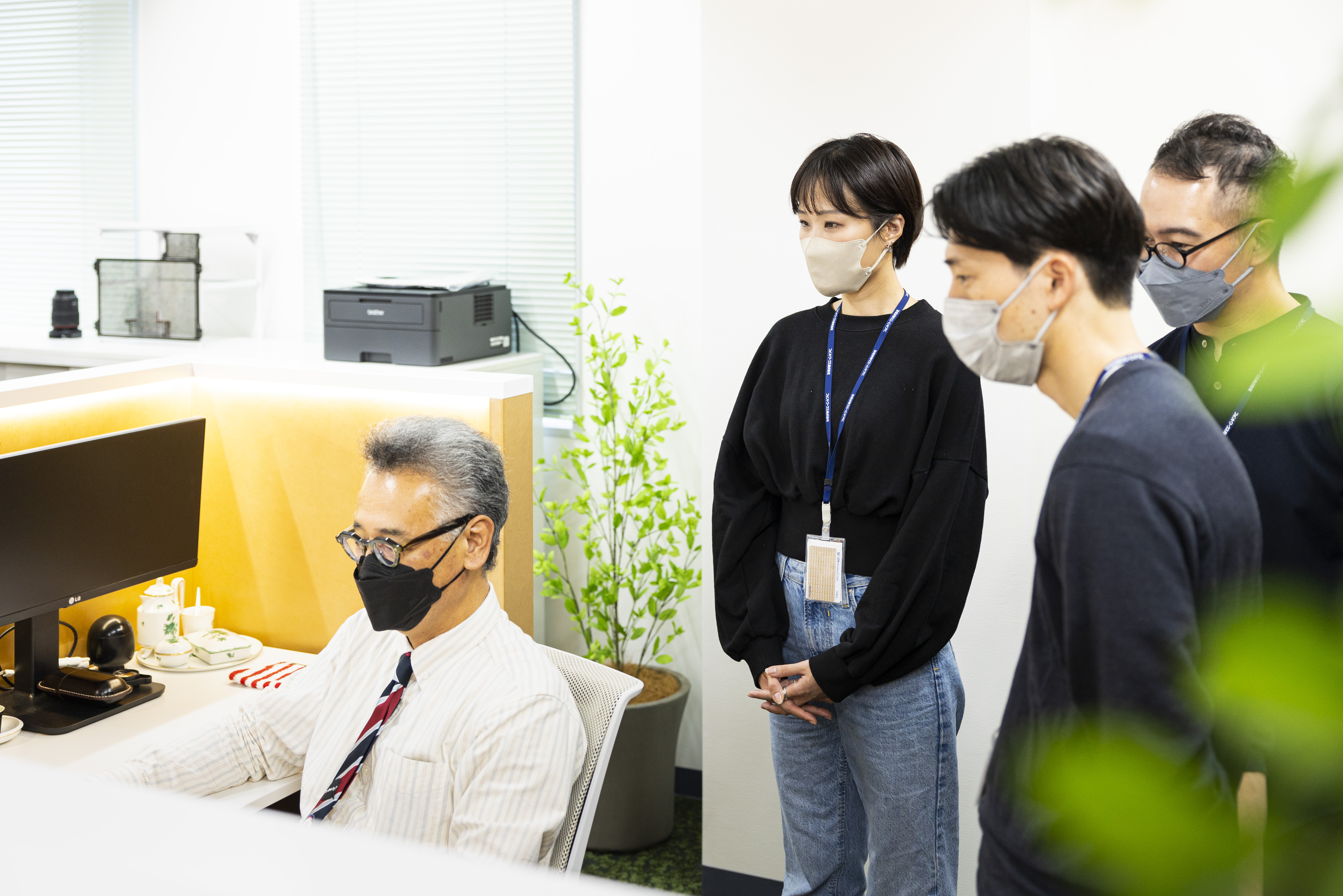
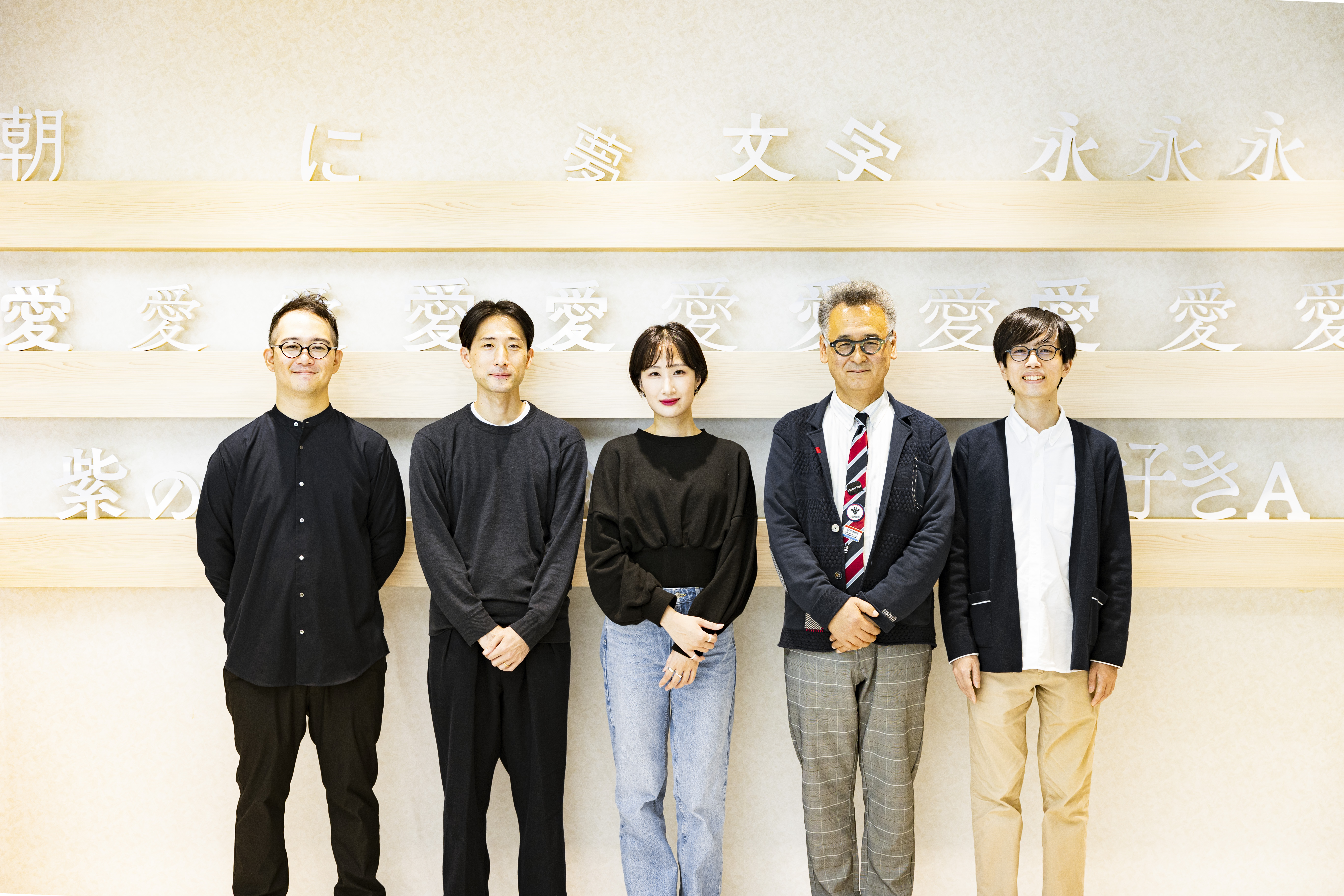
今回は、LINE Seed JPのプロジェクトに携わられた、LINE CREATIVE CENTER(以下クリエイティブセンター) BXデザイン室の柳沼航太さん、横田周平さん、黄聖媛(ファン・ソンウォン)さんをお招きし、コーポレートフォント開発の背景についてうかがいました。


さまざまな言語で一貫したブランディングを実現する グローバルなコーポレートフォント
――本日お越しいただいた柳沼さん、横田さん、黄さんは、日本語コーポレートフォント開発において、デザインや仕様の確認、制作を担当されたとうかがっています。まずは皆さんが所属されているBXデザイン室について教えていただけますか?
横田さん:私たちが所属するBXデザイン室は、主にオフラインにおけるクリエイティブだったり、広い意味でのLINEのブランドアイデンティティを担う組織です。BXとは「ブランド・エクスペリエンス」の略称です。BXデザイナーのミッションは、 デザインによる課題解決でユーザーとサービスの距離を縮め、生活のプラットフォームとして定着させること。各サービスのブランドおよび、それを通じた体験設計に取り組んでいます。
――具体的にはどのような制作に携わられることが多いですか?
黄さん:普段はサービスのロゴやアイコン、あとはイベントのキービジュアルやノベルティなど、幅広い制作物を担当しています。なので、私たち自身がフォントを使う機会は多いですね。
――早速、本題のフォントについて聞かせてください。LINE Seed Sansは2020年にリリースされた欧文フォントの開発にはじまり、韓国語、そして日本語のLINE Seed JPへの展開となりました。
柳沼さん:まず私たち、LINEには「世界中の人と人、人と情報・サービスとの距離を縮める」というミッションがあります。それを踏まえて、国内のクリエイティブ領域を担うクリエイティブセンターでは「システム化されたデザイン戦略をもって、ユーザー視点からより良いデザインを生み出し、ユーザーとLINEの距離を縮める」という使命のもと業務に勤しんでいます。
その中で、グローバル企業として一貫したブランディングを実現していくために、LINEのサービスを展開する多くの国で共通したブランドイメージを持つ言語が使用されていくことを目指して開発しているのがLINE Seedです。日本語の開発がスタートしたのは2021年の2月ですね。
――グローバルに共通したブランドイメージを持ってもらいたいというお話がありましたが、クリエイティブではどのようなことを重視されていますか?
柳沼さん:一貫していてブレないことですね。コミュニケーションの言語が変わってもイメージをきちんと統一できるようにしたい。それが、さまざまな言語に対応できるコーポレートフォントを開発する、ということにもつながっています。
横田さん:より良いデザインという面では、ユーザーフレンドリーであることを大事にしています。伝えたいことがパッと伝わる、そうした機能性がクリエイティブ全体に求められていると思います。
――欧文のLINE Seed Sansが完成してからは、既存の日本語書体を組み合わせて使用されていたとうかがいました。LINE Seed JPのプロジェクトがスタートした2021年2月の時点で、すでに日本語書体のイメージは固まっていたのでしょうか。
柳沼さん:欧文に合わせて開発することは決まっていましたが、その先、実際にどういう書体がいいんだろうというのは、フォントワークスの皆さんとやり取りをする中で徐々に見えてきました。私たちも手探りなことがたくさんあって……。
――フォント開発に携わること自体、そうあることではないですよね。
横田さん:デザイナーとして働いていても、日本語書体の開発に携わることなんて滅多にない。貴重な機会だったと思います。
柳沼さん:プロジェクトにアサインされたとき、やはりワクワク感はありました。でも、こんなに日本語の文字が多いとは知らなかったですね。関わったメンバーも、「大変そうだな」というのはなんとなく想像していたと思うのですが、想像以上のものでした。
親しみやすくユニバーサルに こだわりの詰まった
日本語書体「LINE Seed JP」
――では、今回制作させていただいたLINE Seed JPについて聞かせてください。まずはこの書体で目指したものを教えていただけたらと思います。
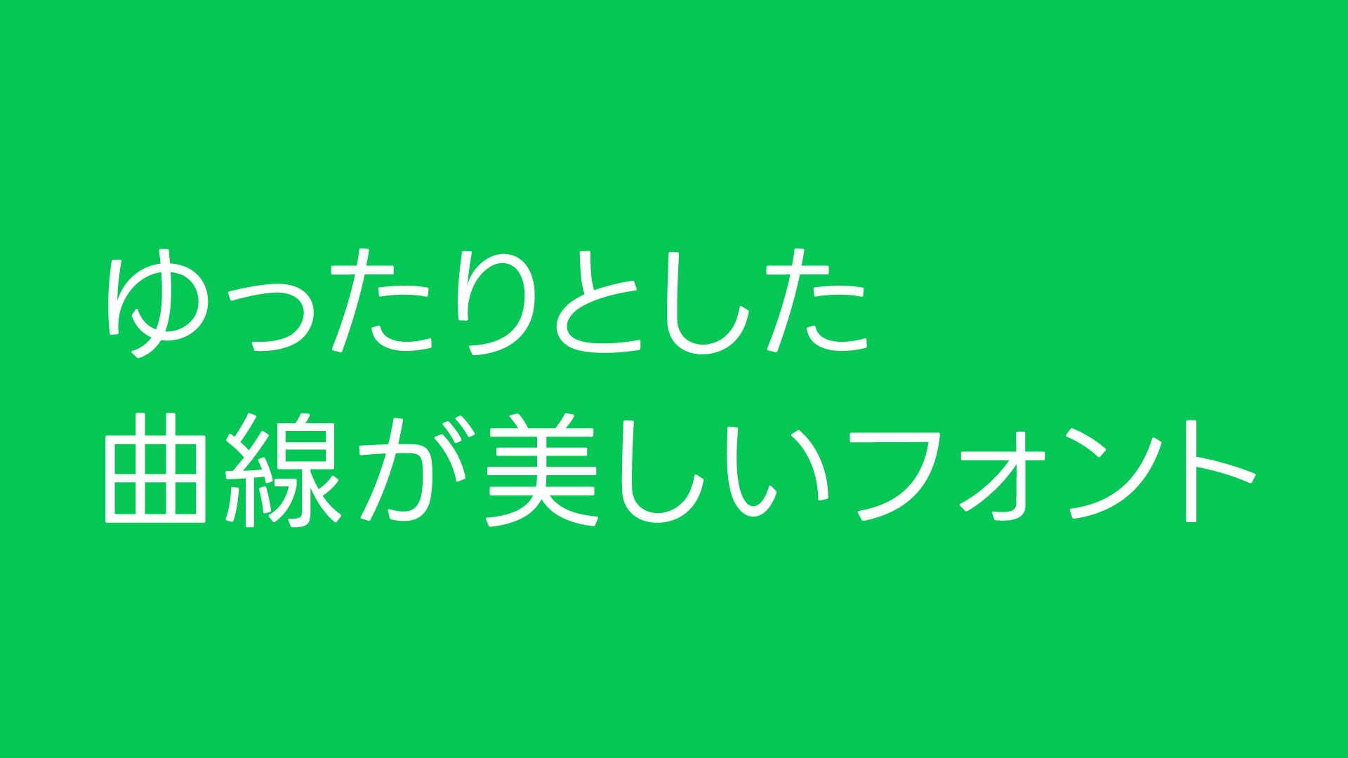
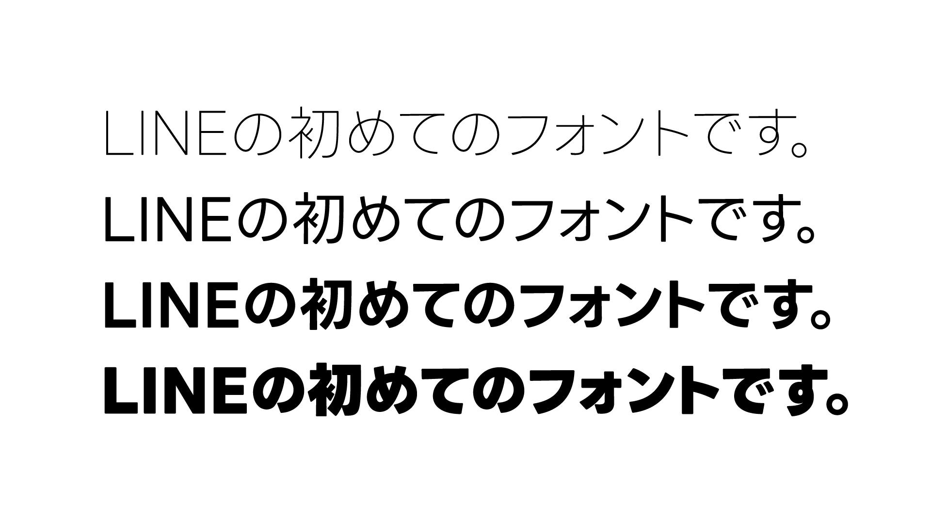
柳沼さん:英語のコーポレートフォントであるLINE Seed Sansの特徴を活かしつつ、日本語ならではの形の美しさを持った、親しみやすい、ユニバーサルな日本語書体を目指しました。この親しみやすい書体というのも、私たちの目指すユーザーフレンドリーな姿勢につながるかなと思います。
LINE Seedは世界中のさまざまな言語で展開していくフォントのため、他言語とのバランスを重視したのは大きな特徴と言えると思います。特に、欧文と和文のサイズ、太さ、高さなどのバランスにこだわって詳細に確認をさせていただきました。
――形の特徴では、基となった欧文と共通した角の丸みや、幾何学的なところ。あとフォントワークスのデザイナーからは、「もちもち感を感じる」という声もありました。
柳沼さん:もちもち感!? それは初めて聞きました。
横田さん:ちょっと分かる気がします。
――シンプルだけど親しみやすい、スタイリッシュだけどユーザーフレンドリーなところがそう思わせるのかもしれません。他に弊社のデザイナーからは、数値やルールを根拠とした細やかなフィードバックをいただくことが多かったと聞いたのですが、やはりロジカルな考え方をデザインでも大事にされているのでしょうか。
横田さん:どちらかというと私たちが大切にしているのは、LINEのブランドアイデンティティが表現できているかどうか。それぞれの文字の中でデザイン的な整合性が取れているかという点は、特に注意を向けて確認しました。それが数値を根拠にしてフィードバックさせていただいたところなのかなと思います。
例えば、モダンでありながら親しみのある印象作りでは、文字の角を丸く処理したり、ゆったりとした曲線の美しさにこだわってLINEらしい表情のフォントに仕上げていただきました。他にも“はらい”をやや短めにしたり、濁点の角度やサイズをできる限り揃えるようにフィードバックさせていただいたこともありました。
ご提案いただいた文字はどれも素晴らしいものだったのですが、整合性やLINEらしさなど、私たちが守りたいことと差異があったときには細かい調整をお願いして、その都度丁寧に対応していただいたのが印象的でした。
――弊社内で話を聞くと、日常的に文字をデザインしているデザイナーにとっては「文字の形ってこういうもの」と捉えていたことが、書体デザイナーとは違う視点から「もっとこうしたい」という意見をいただいて、学ぶことが多かったと言っていました。
横田さん:デザインで意識しているところの違いはあると思います。書体制作において日本語本来の形はとても重要だと思うのですが、私たちの捉え方で見ると、本来の文字の形というよりも目の前にある形そのものの整合性を追求してしまうところがある。そのすり合わせをして、お互いにバランスを取りながらまとめていったのが、今回のプロジェクトで重要なところだったのではないかなと思っています。
確認作業では、制作中の文字を全てプリントアウトして並べてみたりもしたんですよ。机の上に広げたものをみんなで見ながら「これどう思う?」と話し合って……。
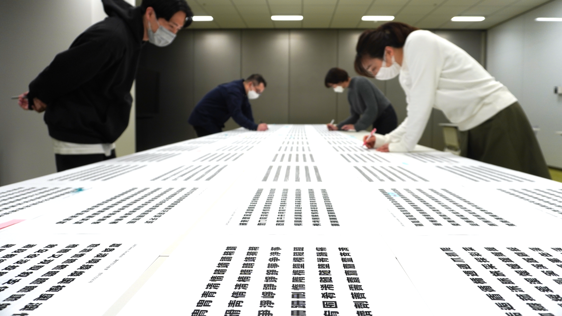
――それは気が遠くなりますね。漢字は7,000字以上ありますから。
横田さん:でも、たくさんの発見があって有意義な経験でした。
黄さん:「この文字は線が接していて、同じようなつくりの別の文字では離れている。なぜだろう」とか、並べてみたからこそ見えてくることがありました。
今のは同じウェイトでの整合性の話ですが、さらにその後、異なるウェイトで見比べてみたときに印象が保てているかどうかのチェックも大変でしたね。一番細いウェイトと太いウェイトを並べて同じ書体に見えるかどうかは、特に重要視したところです。
コーポレートフォントは、ブランドの「声」
LINEならではの唯一無二の書体
――このインタビュー時点では最終調整をされているところだと思いますが、社内での評判はいかがでしょうか?
黄さん:社内でアンケートを取っていまして、プロダクトデザインや映像制作、スペースデザインなど、クリエイティブに関わる幅広い制作環境で、問題なく使用できることが確認できています。
これまでは指定の欧文と和文を組み合わせて使用していたため、細かい調整が必要だったのですが、この手間がなくなってとても嬉しいという意見が挙がっていたり、LINEらしいシンプルで親しみやすいデザインに仕上がっているといった好意的な声が寄せられています。
リリース後はLINEの事業活動やイベントなど、さまざまなシーンで幅広く活用していく予定です。
さらに、一般にも公開してどなたでも使用していただけるようになります。
――プロジェクトに携わられた皆さんは、実際にLINE Seed JPを使ってみてどのような印象を持たれましたか?
横田さん:まず、やはり使いやすいと思いました。文章にまとまりが感じられますし、“ふところ”が広くて柔らかいけどカッチリもしている。組んだときにパキッとシャープにまとまるなと思います。
黄さん:そうですね。デザインでLINEらしさを表現するときにはシンプルさが大事で、トーン&マナーが決まっているんですけれども、LINE Seed JPが加わったことで全体的な統一感が出るのが嬉しいです。
――コーポレートフォントを作られる企業でも、欧文や仮名のみの場合が多いなか、オリジナルでこれほど幅広い言語に対応できるものが作られることは滅多にないと思います。なぜここまで徹底して取り組まれているのか、最後にLINEの皆さんが考えるコーポレートフォントの必要性をお聞かせ願えますでしょうか。
横田さん:LINEがグローバル企業として一貫したブランディングを行うために、コーポレートフォントの役割はとても重要です。コーポレートフォントはブランドの「声」とも言えるかなと思っていて、コミュニケーションの言語が変わっても、書体が統一されていれば同じトーンでメッセージを伝えることができます。
今回のフォント開発によって、あらゆるシーンにおいて唯一無二のLINEならではの書体で、シンプルかつユーザーフレンドリーな印象を与えることが可能になったのかなと考えています。
――フォントワークスにとっても、たいへん貴重な機会を与えていただきました。これからLINE Seed JPがたくさん使われていくのを楽しみにしています。本日はありがとうございました。
フォントワークス公式noteではLINE Seed JPの書体について詳しく解説しています。こちらもあわせてご覧ください。
LINEの日本語コーポレートフォント「LINE Seed JP」が誕生。ディテールを徹底解説!!
LINE公式noteではクリエイティブセンター BXデザイン室の柳沼航太さん、横田周平さん、黄聖媛さんとフォントワークス書体デザイナー・藤田重信と森田隼矢の対談記事も近日公開予定です。
また、LINE Seed Webサイトではフォントファイルを無料で公開しています。ぜひこの機会にお試しください。
※ご使用の際にはライセンスポリシーを必ずお読みください。