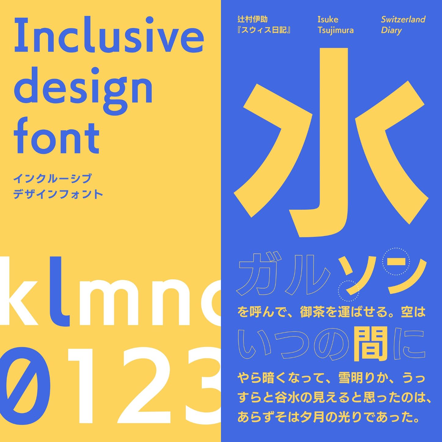
In pursuit of further possibilities for fonts, Fontworks has developed and released the Inclusive Design Font (ID Font), a font that is highly readable and legible for the elderly and those with visual impairments (weak vision).
*Not available for flat-rate font services "LETS" and "mojimo"
Development background
Fontworks has been researching and developing Universal Design fonts from the perspective of universal design, and has provided Universal Design fonts that aim to be effective for everyone.
However, after listening to a wide range of customers, we began to think that rather than creating one design that works for everyone, providing designs optimized for specific groups might ultimately deliver the best possible design to everyone.
In our initial research into Universal Design fonts, we concluded that there was little difference in how older people and younger people see things, and we have been releasing our Universal Design fonts since 2015. However, in light of the idea mentioned above, rather than simply assuming that there was "little difference," we felt it necessary to address small differences, and so we began working on ways to accommodate an aging society.
At the same time, we have also been researching and developing fonts for not only the elderly but also the visually impaired (weak vision).
Based on the results of two years of research, we have now completed an "Inclusive Design Font (ID Font)" that incorporates the concept of inclusive design and is ideal for the elderly and those with visual impairments (weak vision).
For more detailed research results, please see the link below.
*Inclusive design is a design methodology developed by the Royal College of Art in London that involves diverse people who have traditionally been excluded from the design process or as users of Products, such as the elderly, people with disabilities, and foreigners, from the early stages of the design process and design together with them.
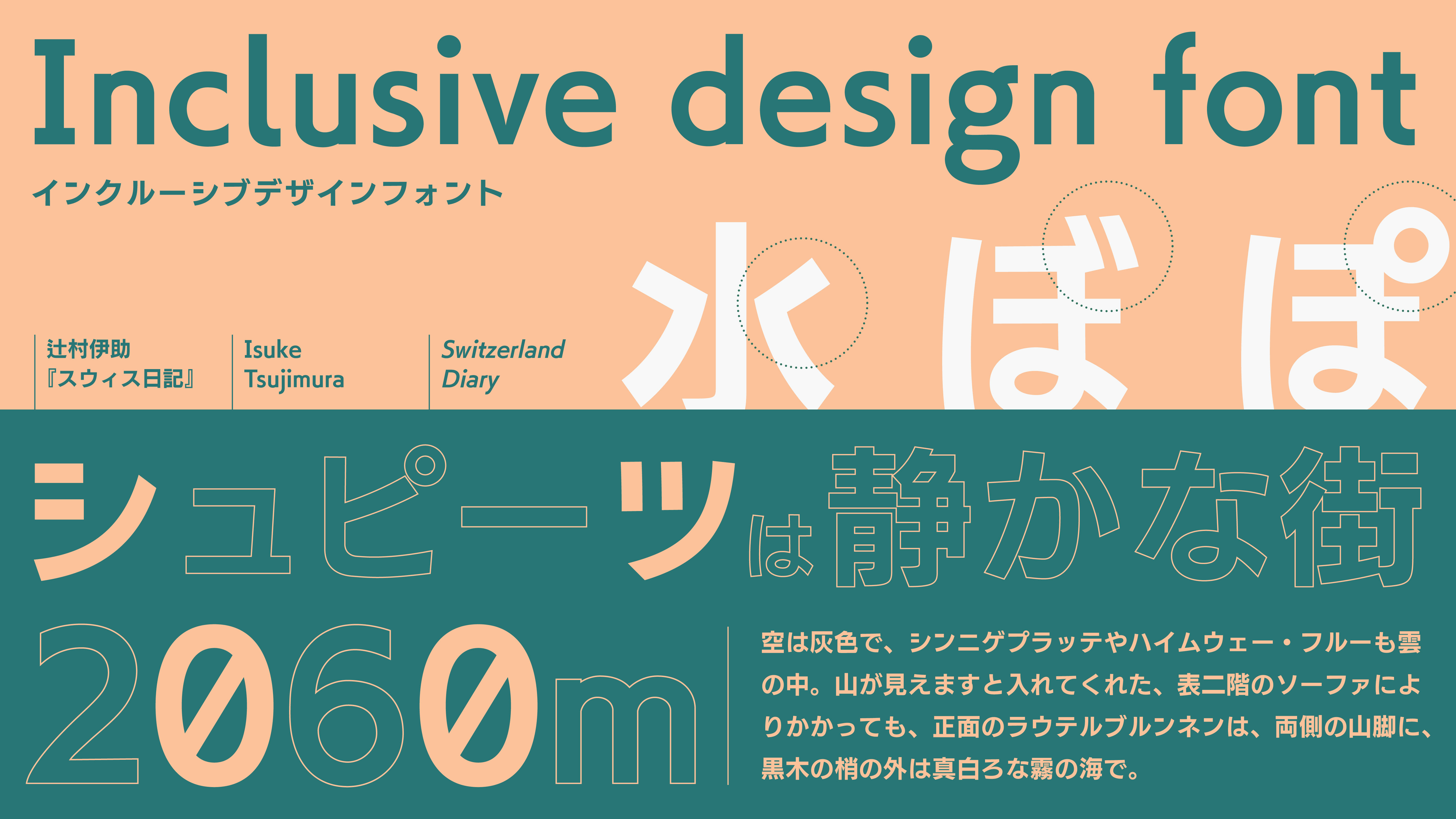
"Inclusive Design Font (ID Font)" typeface description
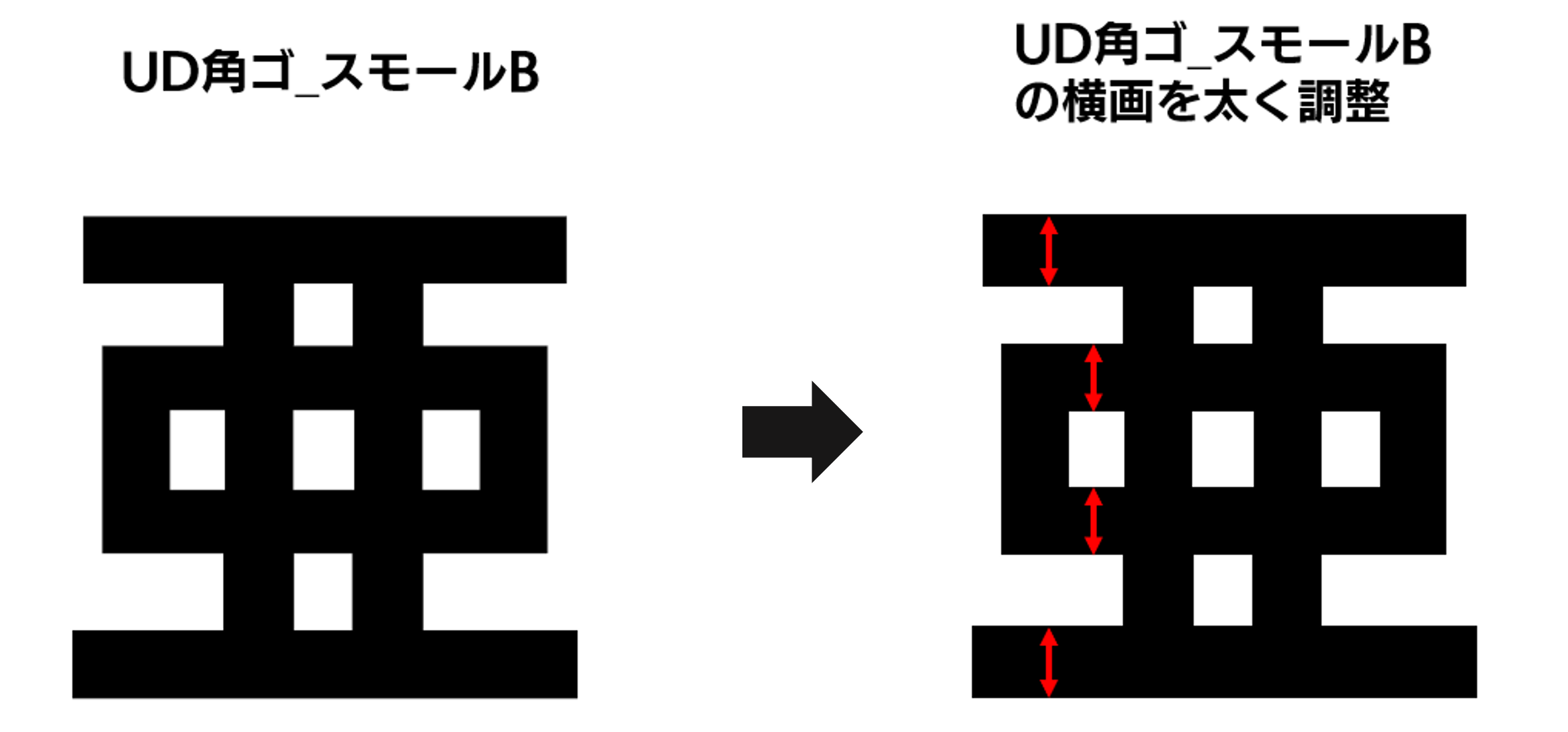
Based on the beautiful, easy-to-read "Universal Design Kaku Gothic Small B," which is ideal for long texts, this typeface offers improved readability and distinction for the elderly and those with visual impairments (weak eyesight).
1. Improved readability
Usually, the design of kanji characters is adjusted so that Weight of the strokes appears the same by making the vertical strokes thicker than the horizontal strokes. However, the kanji characters in ID fonts are The horizontal lines have been adjusted to be thicker than previous versions.
The reason for this is that the design of kanji fonts takes into consideration several optical illusions, including the Fick optical illusion in which horizontal strokes appear thicker. For this reason, the vertical strokes are usually made thicker than the horizontal strokes to make the strokes appear the same Weight, but it is said that the amount of this optical illusion changes with age. Therefore, in a comparative evaluation experiment, it was determined that fonts with thicker horizontal strokes were easier to read, so the horizontal strokes were made thicker.
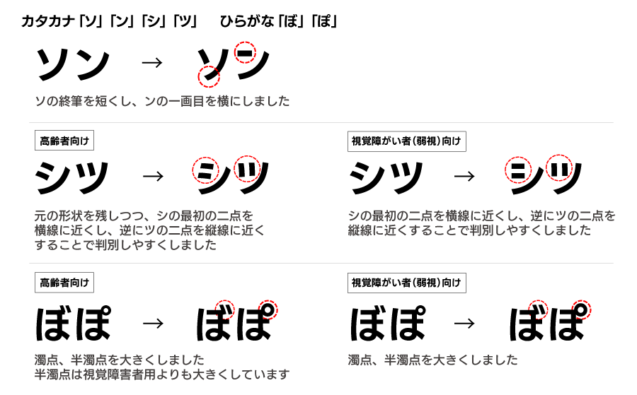
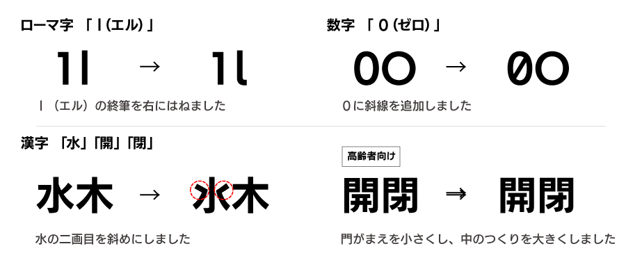
2. Improved discrimination
According to the research results, the characters ``So'' ``N'' ``Si'' ``Tsu'' ``Bo'' ``Po'' ``l (El)'' ``0 (zero)'' ``Water'' Radicals)” has been redesigned to improve distinguishability.
今後、インクルーシブデザインフォント(IDフォント)は、さらに特定のグループにとって「可読性」「判別性」が高いフォントを開発し、より多くの人に最適なフォントをお届けして参ります。
製品に関するお問い合わせは、info@fontworks.co.jpまでお願いいたします。お客さまのご要望に最適なご提案をさせていただきます。