In search of further possibilities for fonts, Fontworks conducted research to find the optimal fonts for the visually impaired (weak eyesight) and the elderly. I will report its contents.
We have been researching and developing UD fonts from the perspective of universal design. Our UD fonts have aimed to be effective designs for everyone. However, in discussions with various customers, Rather than creating one design that is effective for everyone, it is better to make changes for each specific group and create their own design, resulting in the best design for everyone. I came to think that it might not be.
In the first research on UD fonts, we also conducted experiments with elderly people.
In conclusion, we have concluded that there is not much difference between the elderly and young people, and have released our UD fonts since 2015.
In the light of the above considerations, we need to address small differences rather than "not much." We decided to tackle this first, as it would also correspond to an aging society.
During the discussion, there was an opinion that it would be better to include not only the elderly but also the visually impaired (weak eyesight). Research and development of UD fonts for the visually impaired (weak eyesight) and the elderly decided to do In 2021, we found the best font among our fonts, and also found some problems, so we developed the fonts to solve them. Along with that, new Inclusive Design Font (ID Font) I decided to
Research overview
1. font development
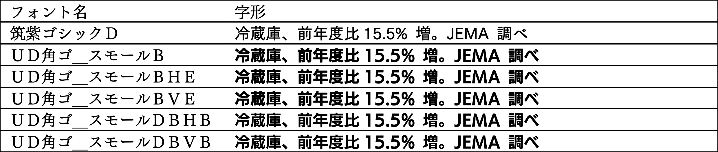
We have developed a new font based on UD Kakugo_Small B.
・Improve discrimination
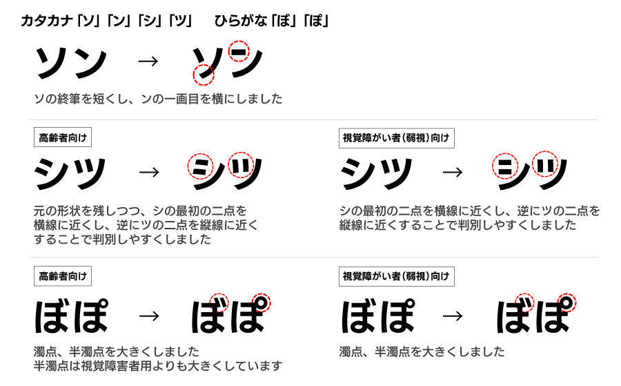
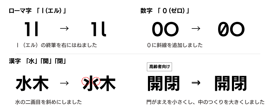
From the research results of 2009, we know that the discrimination of some character sets is not good. Therefore, I changed the following characters. In fact, we created several types of revisions, evaluated them in evaluation experiments, and changed them based on the results.
・Improved readability
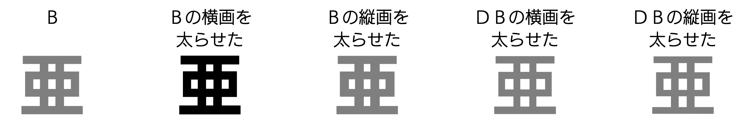
In the design of the typeface, we are conscious of some optical illusions. One of them is the Fick illusion, in which horizontal strokes appear thicker. For this reason, by making the vertical strokes thicker than the horizontal strokes, Weight of the lines is made to look the same. It is said that the amount of optical illusion changes with age, so I thought about the possibility of changing the readability by changing the horizontal or vertical stroke. Therefore, we created such a font only for kanji and conducted a comparative evaluation in an experiment. All non-kanji characters (alphanumeric characters, kana, etc.) are the same (except for improved discrimination).
2. Font comparison experiment
We conducted two experiments.
・ Readability evaluation experiment
Evaluate fonts in terms of "readability".
・Discrimination evaluation experiment
Fonts are evaluated from the viewpoint of "ease of distinguishing" characters that are easy to misread.
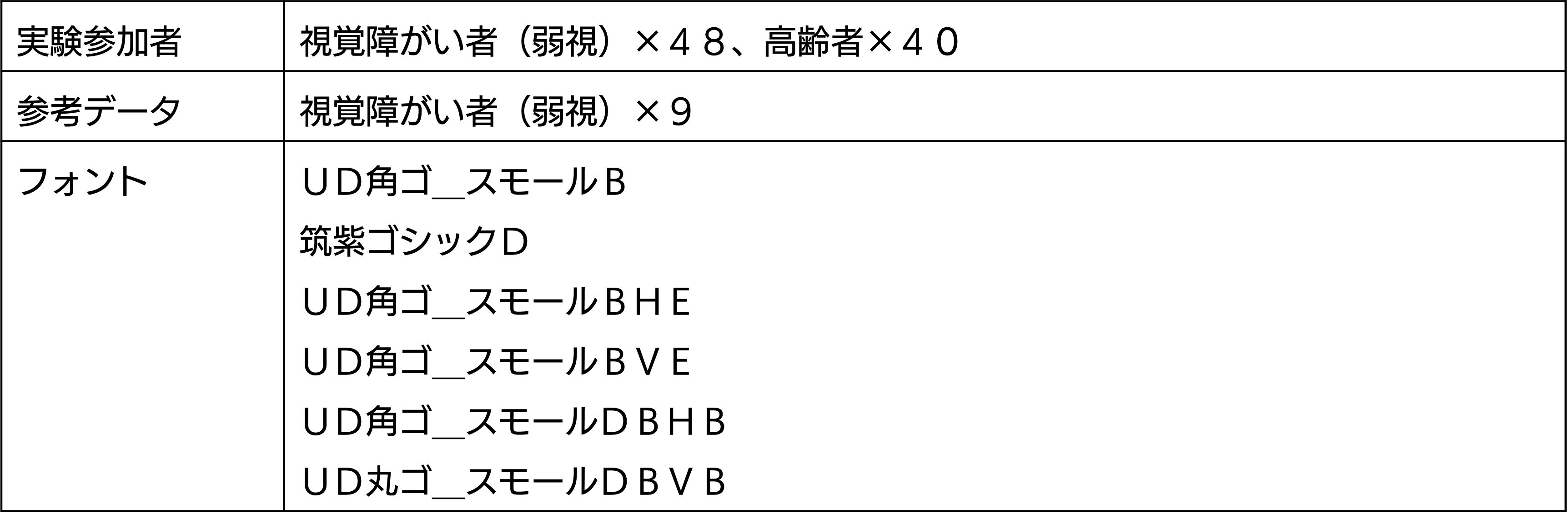
The purpose of this research was to find the optimal font from among the developed fonts for the visually impaired (amblyopia) and the elderly.
We asked Mirairo Co., Ltd. and Asmark Co., Ltd. to select the subjects.
Table 1: Subjects
| Visually Impaired (Amblyopia) Conditions | elderly conditions |
|---|---|
| "Amblyopia" | Age 65+ |
| Gender/age balance does not matter | Gender balance is irrelevant |
| Congenital/acquired balance is irrelevant | not visually impaired |
Tsukushi Gothic was used as the developed font, the base font, and the reference font for comparison.
For the visually impaired (amblyopia), we tried the same online experiment as last time. A web application for the experiment was created, and the subject operated it on a PC or tablet to conduct the experiment. The PC and tablet used were those of the subjects. Web fonts were used in the character display of the experimental application. In the experiment, the following constraints were set for the subjects.
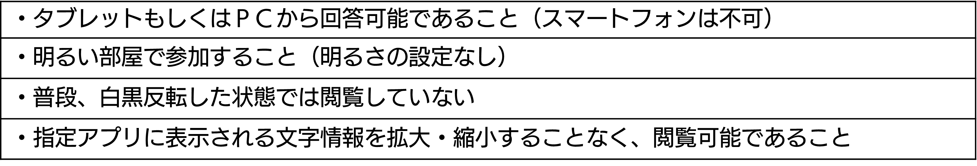
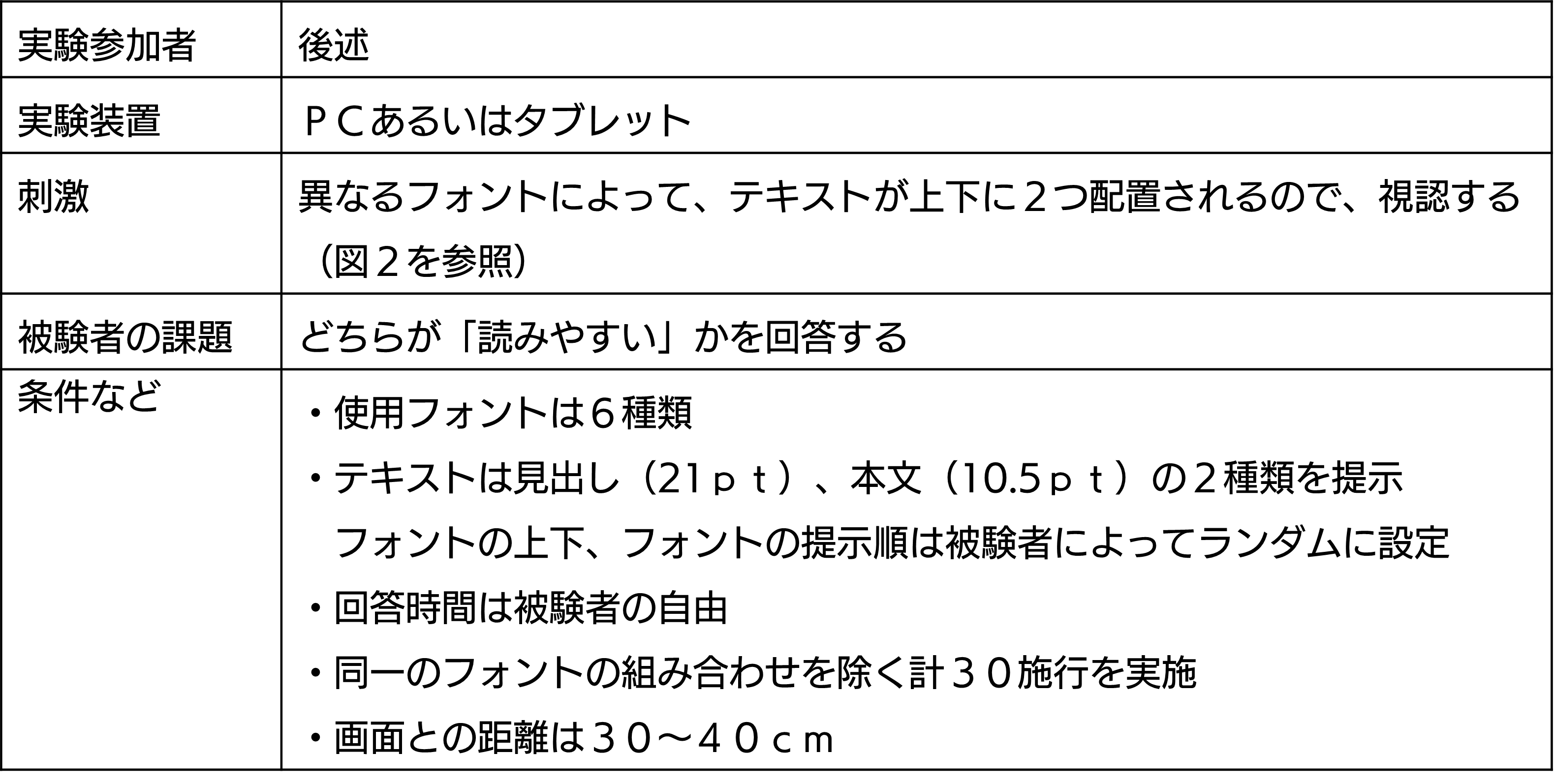
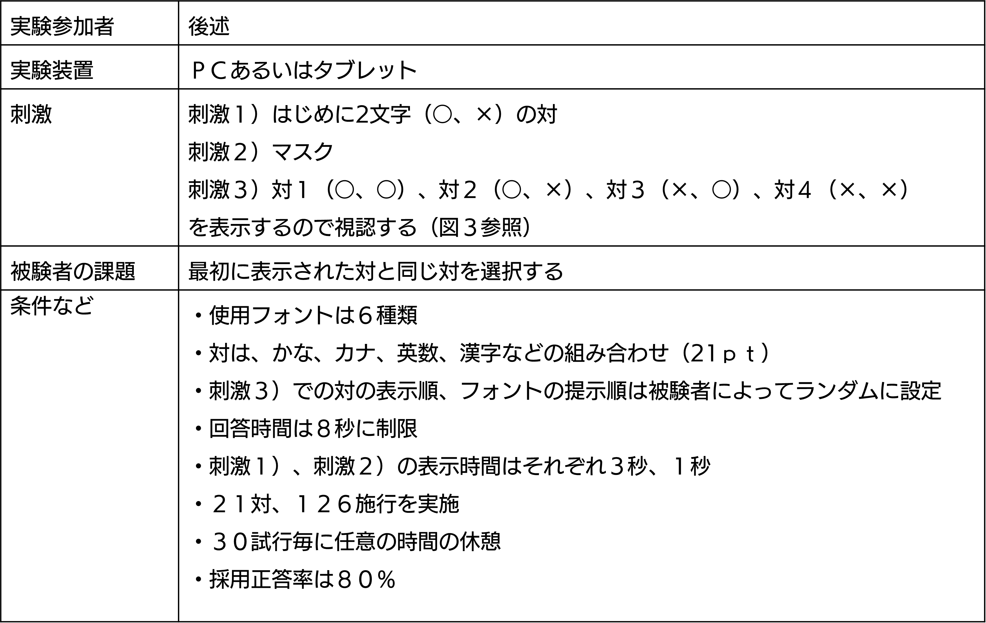
Experiment details
■ Readability experiment
■ Discrimination test


Experimental result
A preliminary experiment was conducted, and the main experiment was carried out after seeing the results. However, we decided that there was no need to make any changes based on the results of the preliminary experiment, so we carried out this experiment as is.
□ Discrimination test
□ Discriminability result
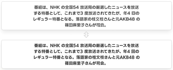
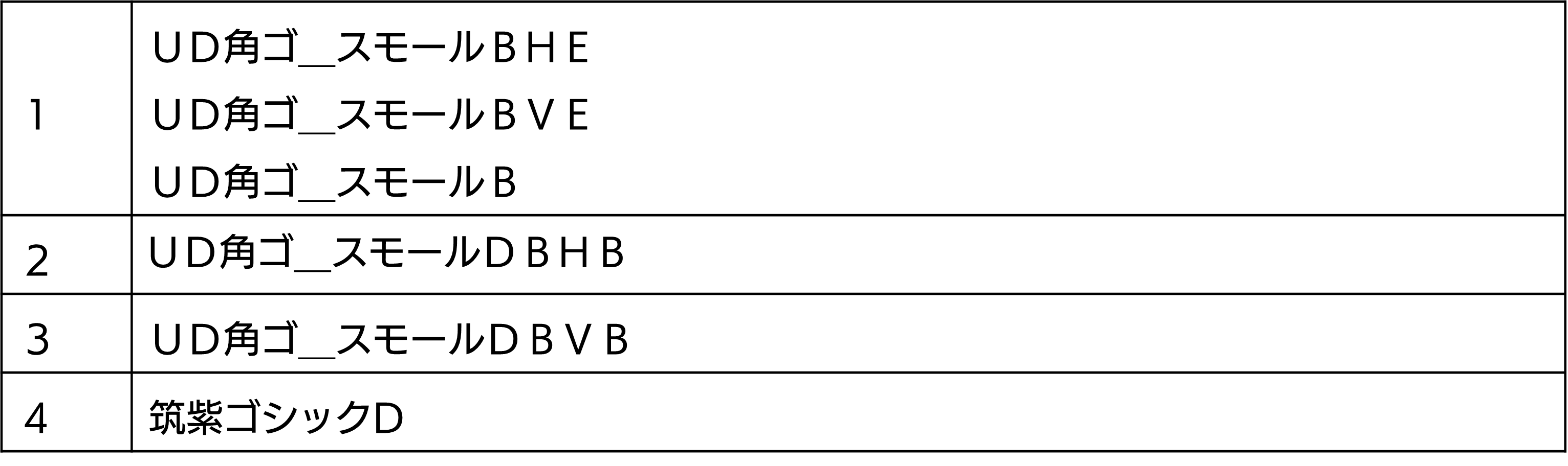
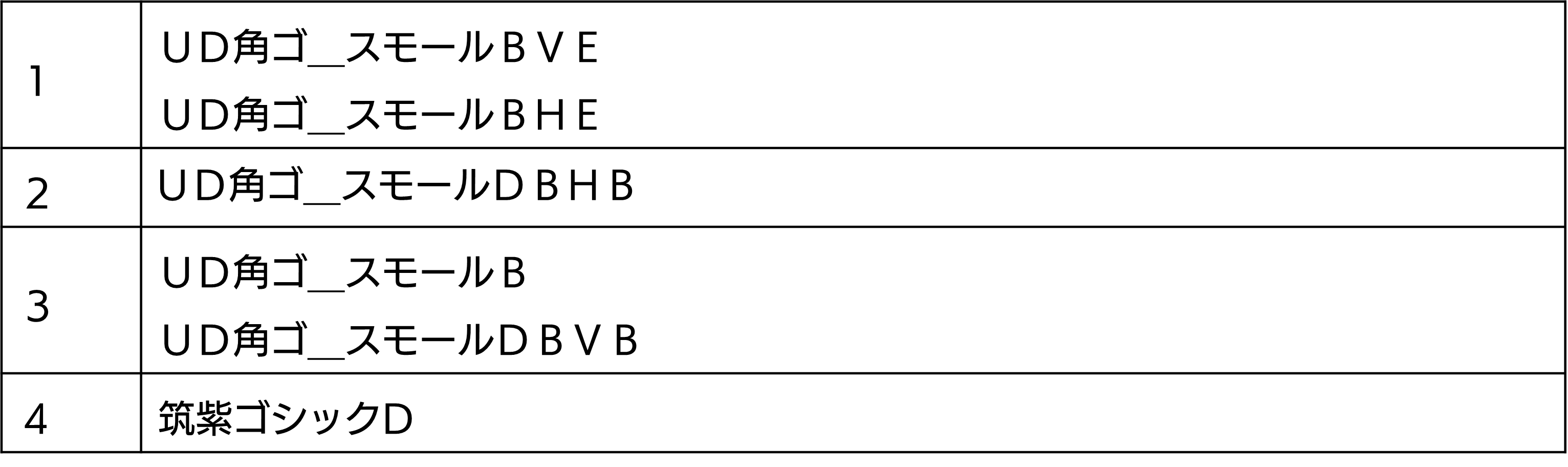
There were 5 visually impaired (amblyopia) subjects who did not reach the effective correct answer rate. The correct answer rate of the inclusive design font for each character combination except for the five people is as follows. The shaded percentage of correct answers is one or less incorrect answers.
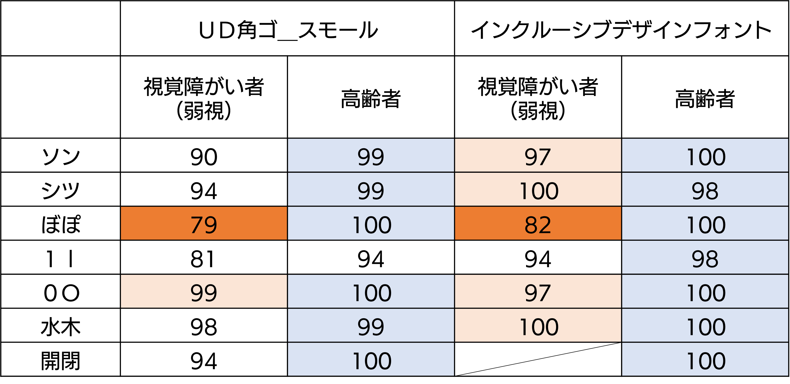
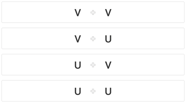
It was found that visually impaired people (amblyopia) had a particularly low rate of correct answers for the combination of "bo" and "po".
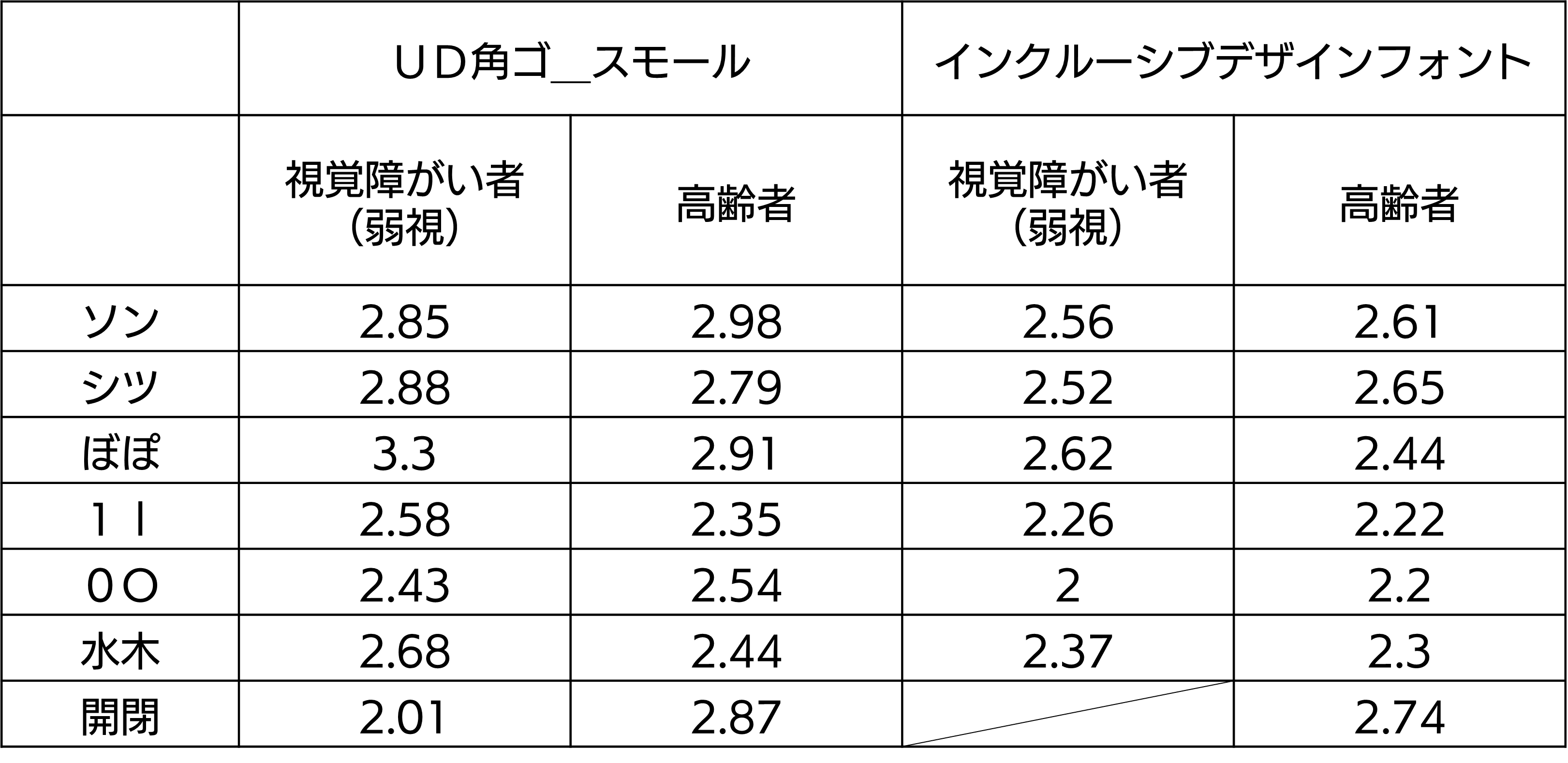
The average number of seconds it took to answer was as follows. Inclusive design fonts are faster.
□ Readability test
□ Visually impaired (low vision) readability results
There were some differences in evaluation results between the visually impaired (amblyopia) and the elderly.
Text
Heading
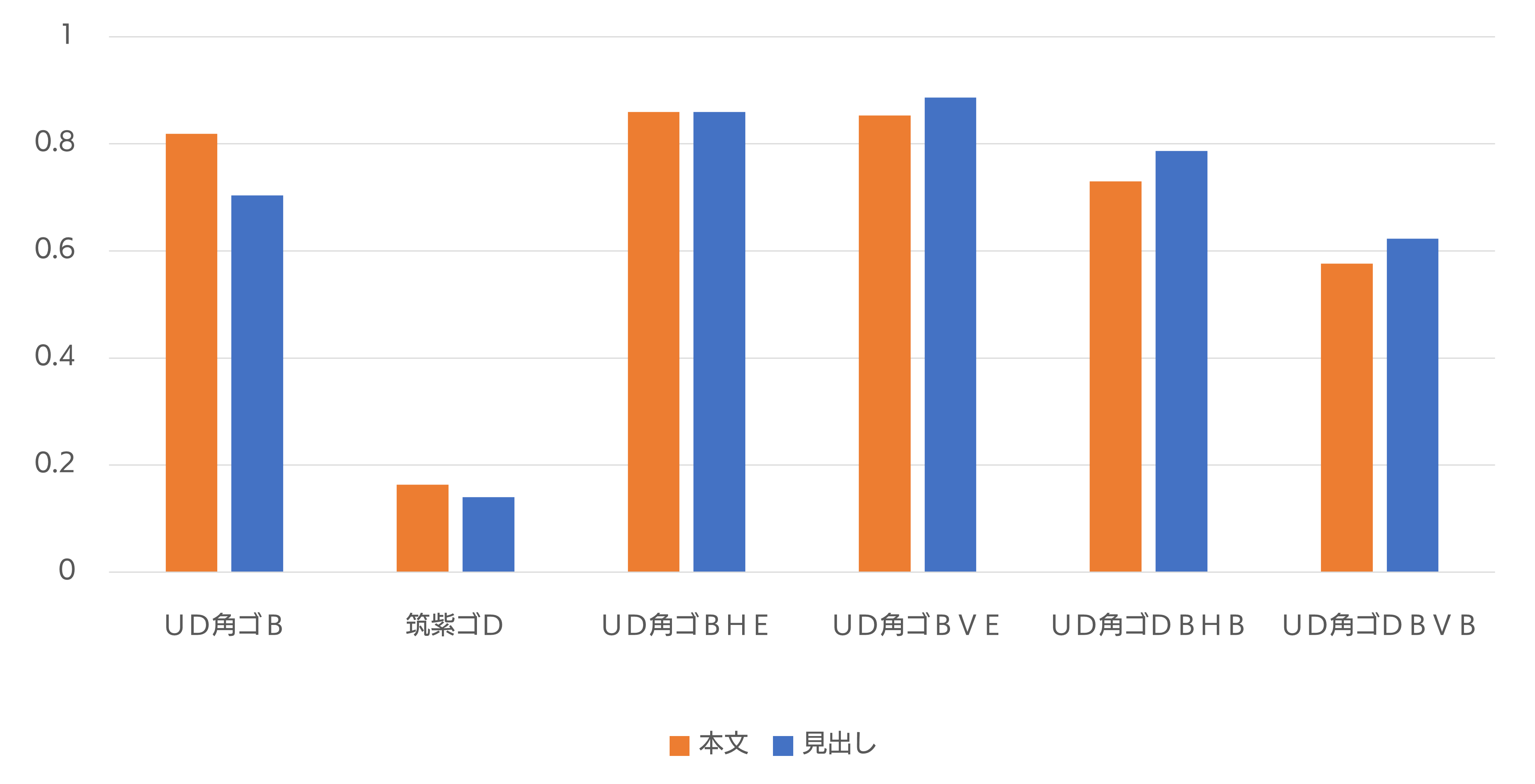
□ Evaluation of readability for the visually impaired (low vision)
In Text, the best group UD Kakugo_Small BHE and UD Kakugo_Small BVE are almost the same. Likewise, Heading are nearly identical. They are almost identical when compared to each other. From these things, I judge that UD Kaku Go_Small BHE or UD Kaku Go_Small BVE is good.
□ Elderly readability results
Text
Heading
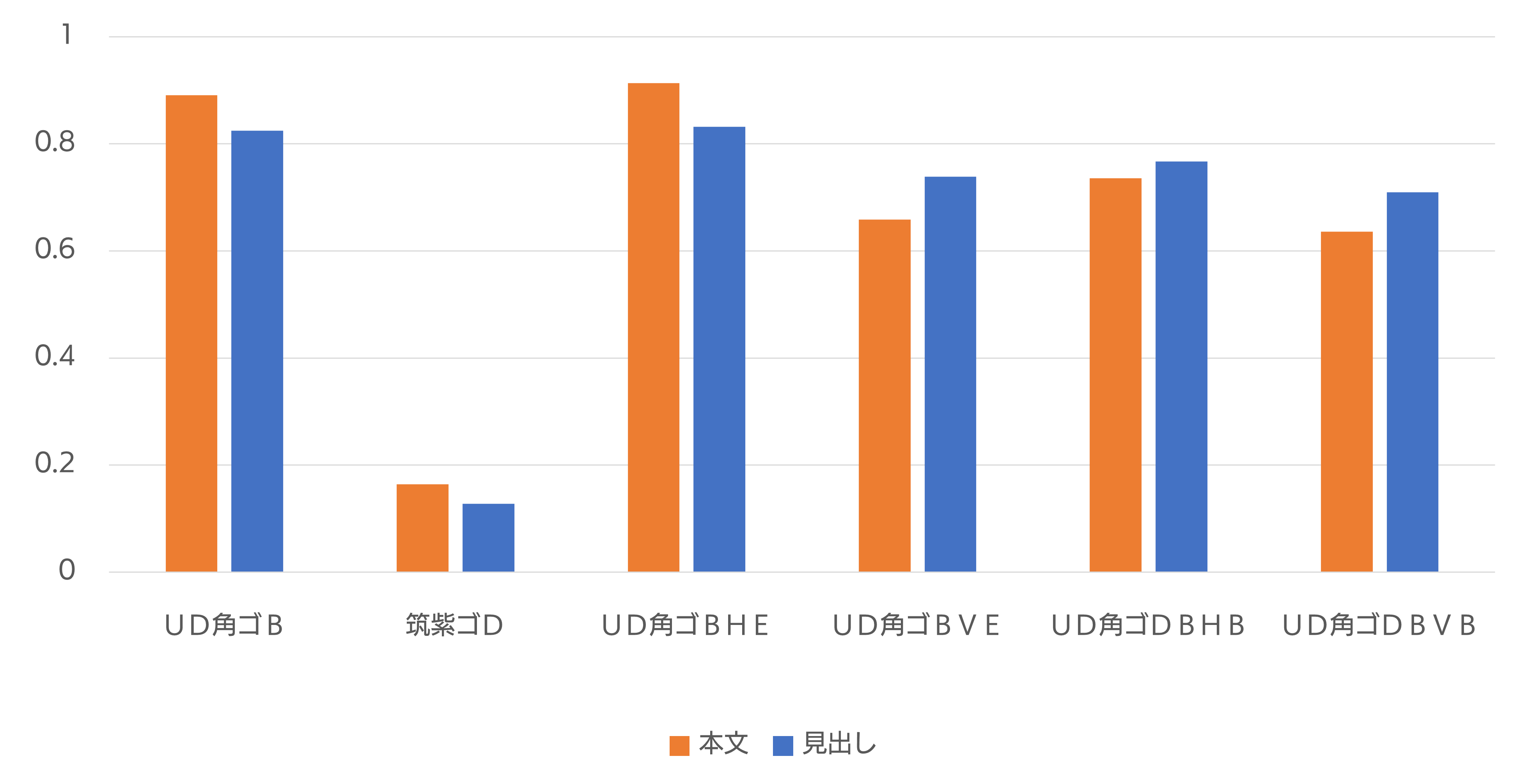
□ Readability evaluation for elderly people
Almost the same result was obtained for Text and Heading. UD Kakugo_Small BHE and UD Kakugo_Small B have become highly rated fonts. Also, fonts with thick horizontal strokes show better results than fonts with thick vertical strokes. From these things, I judge that UD Kakugo_Small BHE is good.