Fontworks Inc. (Headquarters: Minato-ku, Tokyo, President and CEO: Shimizu Hisahiro, hereinafter referred to as Fontworks) released KanaeReisho on Tuesday, October 29, 2024.
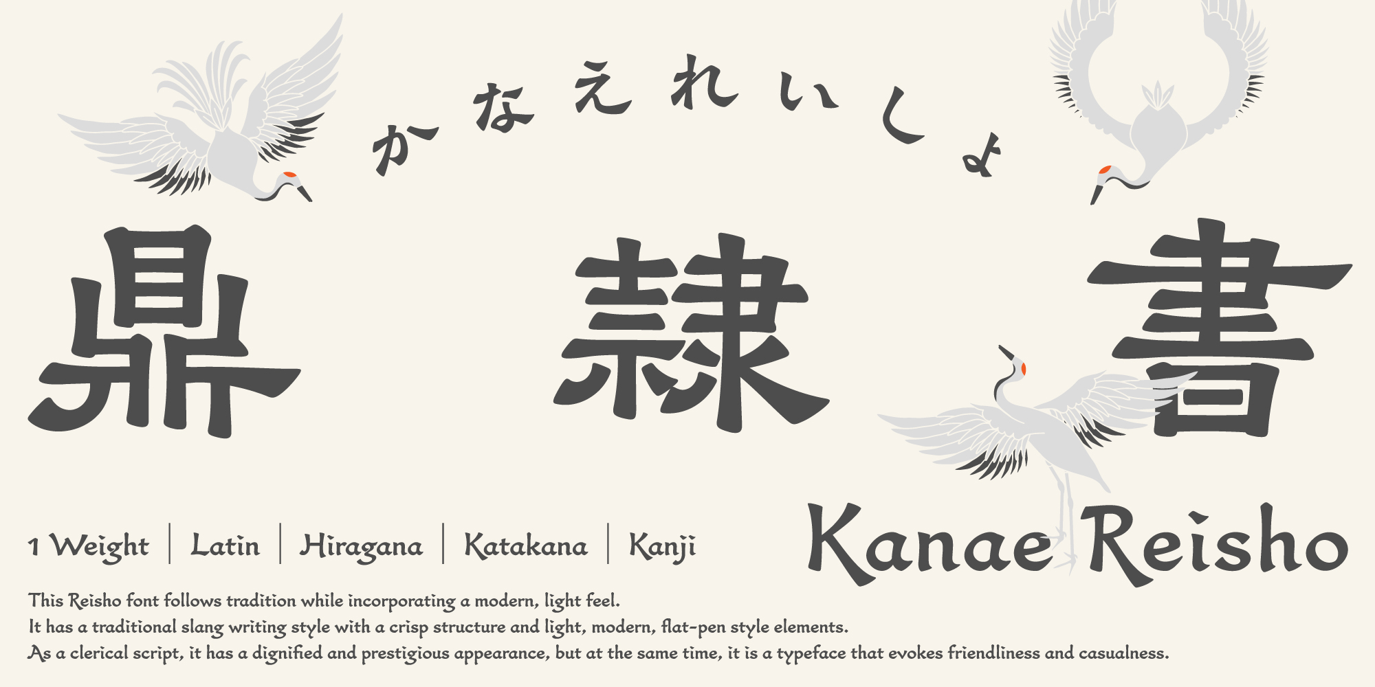
About the new style KanaeReisho, Kanae Reisho
The new typeface KanaeReisho Std B is our first original typeface by Fontworks Type Designers Kanae Yamamura. It is a typeface that follows tradition while also having a modern atmosphere, and while following historical brushworks, you can enjoy the rhythmic shape with a well-balanced structure and light flat pen-like elements.
This typeface can be used in a wide range of genres, including books, Packaging, and subtitles, making it a clerical script with new possibilities.


Typeface feature 1: A sense of rhythm that creates a light and modern atmosphere
Usually, digital fonts fit characters within a square frame, but this typeface is a new typeface that pursues the essence of characters without being bound by that frame. There are flattened parts and vertically emphasized parts, and each character has a clear contrast. Furthermore, when composed into a sentence, the mixture of tall and flat characters creates a unique and rhythmic atmosphere.
Font feature 2: Waves that create a solid image
The wavy horizontal lines and right harai, which are characteristic of clerical script, are particularly emphasized. This characteristic creates the charm of clerical script and exudes a deep history. In KanaeReisho, by highlighting the wavy lines, we have achieved a design that combines the solidity of clerical script with a modern atmosphere.
Designer interviews covering the development background and more are now available
To commemorate the release, we have published an article in which Type Designers Yamamura talks about the appeal of the typeface. He also shares behind-the-scenes stories about its development, so please take a look.
The new typeface KanaeReisho Std B, is available at no additional charge through the annual flat-rate font services "Fontworks LETS" and "Fontworks LETS for Students," and the web font service "FONTPLUS."
On the same day, Fontworks ID Font, a Japanese font that incorporates the concept of inclusive design that is optimal for the elderly and visually impaired (weak vision), will also be added to the above service.
Fontworks LETS: https://lets.fontworks.co.jp/
FONTPLUS: https://fontplus.jp/home
Kanae Yamamura Profile
Graduated from the Kyushu University Graduate School of Design, Master's course. Joined Fontworks Inc. in 2015. In charge of creating the kana for "NewGreco" in the Fontworks Greco family of Japanese fonts. Started calligraphy at the age of 6, and developed an interest in fonts during university, and decided to become Type Designers.