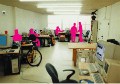
Air Co., Ltd., with the slogan of “Chochoi Video Company”, creates Video of innovative ideas and high-quality designs day and night, from the opening of programs to the image construction of the entire broadcasting station, commercials and corporate identity, etc. I will.
We are engaged in a wide range of productions from sophisticated to comical, but there are many jobs that communicate with the design of the Video itself, which overlaps the sense of the two worlds with the Video printing.
Professional design and rational and growing system
In the world of Video for a long time, I haven't paid much attention to the design of letters as in the world of printing. The reason is that when using characters with Video, it was only possible to use fonts that were prepared in advance on a dedicated device (a very limited number of fonts), so the creator gave up from the beginning. However, with the improvement of computer technology, things like "desktop publishing" in the printing world have become commonplace in the world of Video, and any font that can be used on a PC is Video. It is ready to use. On the contrary, tinkering with existing fonts and moving them over time has become commonplace. As a component of Video, the characters play a more important role than ever before.
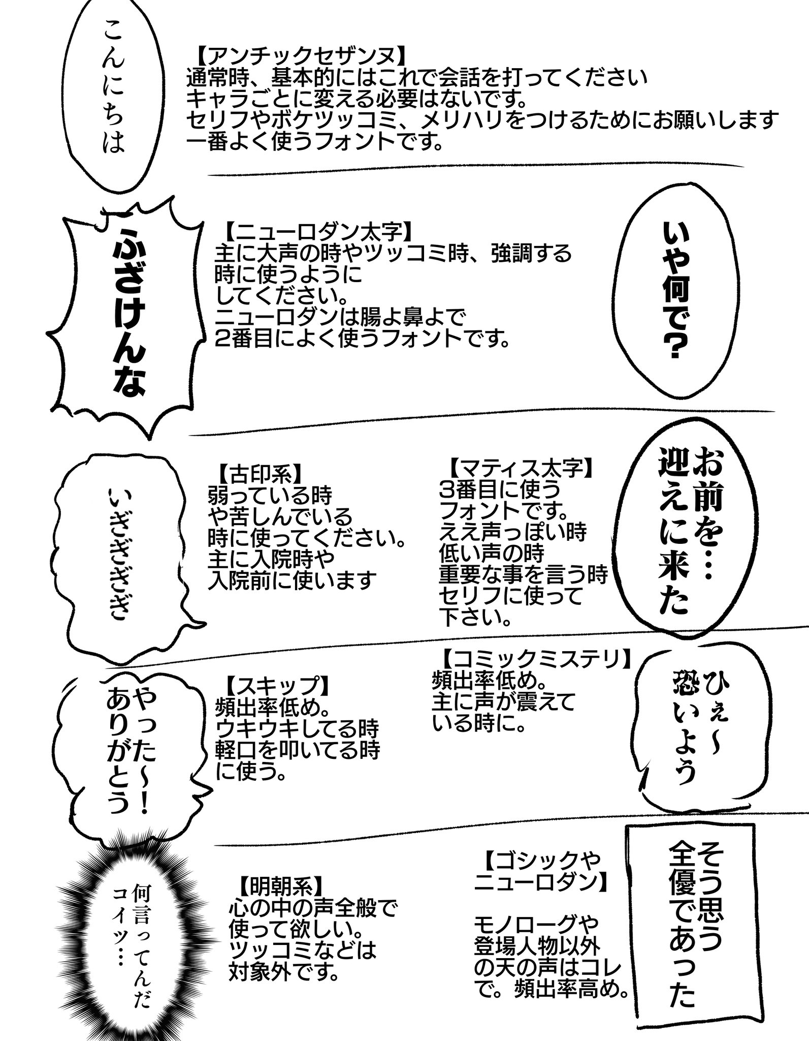
As the name suggests, Air Co., Ltd. is very good at "moving design". Naturally, font selection is an important point. Unlike printed materials, Video needs to convey a message in an instant, so even if you convey the same content, simply changing the font changes the impression. Kanji, which is an ideographic character, is particularly delicate because the characters themselves have meaning. So the choice of fonts is just great. Regarding the alphabet, it is possible to obtain as many stars as there are on the Internet, but regarding the Japanese fonts, the number itself is small, and even if you find it on the Internet, the design perfection is low, There are many cases where it cannot be actually used. In addition, Video industry has a lot of rights relations (copyright of music and photos, etc.), and for that reason, we often end up making our own based on existing fonts.
At that time, knowing Fontworks LETS, I was able to solve the two problems of "arranging many kinds of fonts" and "use without charge when On Air". From an uncompromising professional perspective, we are happy with the design of individual LETS fonts. You can use it as it is, and the character is solid, so even if you process it, you can spend less time on redesign. Also, when I use letters in Video, I have to pay special attention to the letters Weight, but with the family, I solved that too. Furthermore, being able to deal flexibly with various PC operating environments was also an important factor. The current Video production site has changed to an open environment instead of the closed dedicated system of the past. That is a mix of Macintosh and Windows machines to work faster and more efficiently. In some cases, we even pull out and use the remaining old machines. I think that font Packaging cannot easily support a font environment that can flexibly deal with this kind of chaotic system condition. We don't have time to send back the key floppy disk. With LETS, you can install, delete, and reinstall on as many PCs as you have licenses, so if you license the maximum number of PCs that make up the production environment, you can install it on any PC at any time. Well, I also thought about actually installing the font and deciding the PC to use and reducing the number of licenses, but rather than using my head to manage that number, I have the freedom to configure the system flexibly. More importantly in our value standards.
One of the advantages is that LETS members will automatically receive the new typeface. However, to be strict, it is also true that the Japanese library still lacks the font of Categories that we still need. If Fontworks says "letter is culture", we are proud that "Video is culture". As a person who creates the same "culture", I hope that our members, including us, will feed back the font request of Categories that we want to use in the form of font.
I was attracted by the service that allows not only us but also LETS members to grow LETS together. I'm really looking forward to the release of new fonts and improved services.
Company Info
| Company name | Air Co., Ltd. |
|---|---|
| Head office location | Fukuoka Prefecture Fukuoka City Chuo-ku Kego 1-15-6 KH22 Building 5F |
| TEL | 092-713-4815 |
| URL | http://www.koo-ki.co.jp/ |
| Establishment | 1997 |
| Business description | Design, typesetting, production, plate making, printing |
