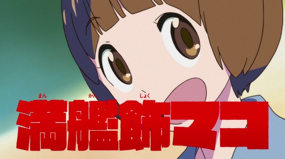
Raglan Punch UB
最終hui
About fonts
Correspondence service
Details
- How to read
- Raglan Panchi
- Font maker
- Fontworks
- Foundry
- Fontworks
- Language:
- Japanese
- category
- Display
- standard
- JIS X 0208:1990
- Character Sets
- Click here for details
- file size
- 2 MB
- OpenType function
- Character width Half-width metric (halt)
- Proportional metrics (palt)
- Vertical type width half-width metrics (vhal)
- Vertical Proportional Metrics (vpal)
- Any ligature (dlig)
- Single-width double-byte character (fwid)
- Mono-width half-width character (hwid)
- JIS78 character shape (jp78)
- General ligatures / standard ligatures (liga)
- Proportional glyphs (pwid)
- Old font (trad)
- Vertical type (vert)
Glyph
{{ currentShapeTextTitle }}
- {{ text }}
Font family1 Styles
{{ currentSampleTextTitle }}
- Raglan Punch UB
- {{ currentSampleText }}
detail of function
{{ functionType === 'spec' ? '文字セット' : 'OpenType機能' }}
| OTF | TTF | ||||||||
|---|---|---|---|---|---|---|---|---|---|
| AJ 1-6 | AJ 1-5 | AJ 1-4 | AJ 1-3 | ||||||
| Pr6 | Pr6N | Pr5 | Pr5N | Pro | ProN | Std | StdN | ||
| UB | ● | ● | |||||||
Ligature
- General ligatures / standard ligatures (liga)
- Glyph depending on context (calt)
- Any ligature (dlig)
letter
- Small Caps (smcp)
- Uppercase small caps (c2sc)
- Swash-shaped (swsh)
- Design variations (salt)
Number
- Lining number (lnum)
- Old Styles numbers (onum)
- Proportional number (pnum)
- Monospaced numbers (tnum)
- Fraction (frac)
- Superscript ordinal notation (ordn)
Set of designs
- Design set 01-20 (ss ##)
Glyphs with different widths
- Proportional glyphs (pwid)
- Proportional metrics (palt)
- Proportional kana (pkna)
- Single-width double-byte character (fwid)
- Mono-width half-width character (hwid)
- Character width Half-width metric (halt)
- Monospaced triplet (twid)
- Monospaced quartet (qwid)
Culturally different glyphs
- JIS78 character shape (jp78)
- JIS83 character shape (jp83)
- JIS90 character shape (jp90)
- JIS2004 character shape (jp04)
- Old font (trad)
- Glyph for ruby
- Kana for horizontal writing (hkna)
- Standard print font (nlck)
- Modified glyph (nalt)
- Italic
Vertical writing function
- Vertical pair kerning (vkrn)
- Vertical type (vert)
- Vertical Proportional Metrics (vpal)
- Vertical type width half-width metrics (vhal)
- Kana for vertical assembly (vkna)
Other
- Kerning
- Typesetting / decomposition (ccmp)
- Localized glyphs (locl)
- Superscript (sups)
- Subscript
Correspondence service
-
Fontworks LETS
An annual flat-rate font service that allows you to use all of the high-quality, variety of fonts from multiple manufacturers. With a wide variety of lineups, we offer various fonts such as Japanese, Hangul, Simplified Chinese, Traditional Chinese, Thai, and Hebrew.
-
mojimo-manga
Fontworks fonts are never seen in anime and comics. Select the best typeface for designers, illustrators, hobbyists and doujinshi creators.
-
mojimo-live
A "telop" that is essential for video production. Although it seems to be obvious on TV programs, even on YouTube etc., not only lines and emotional expressions, but also situation explanations, product introductions, blurs and punches, etc. , Now it is indispensable.
Usage
-
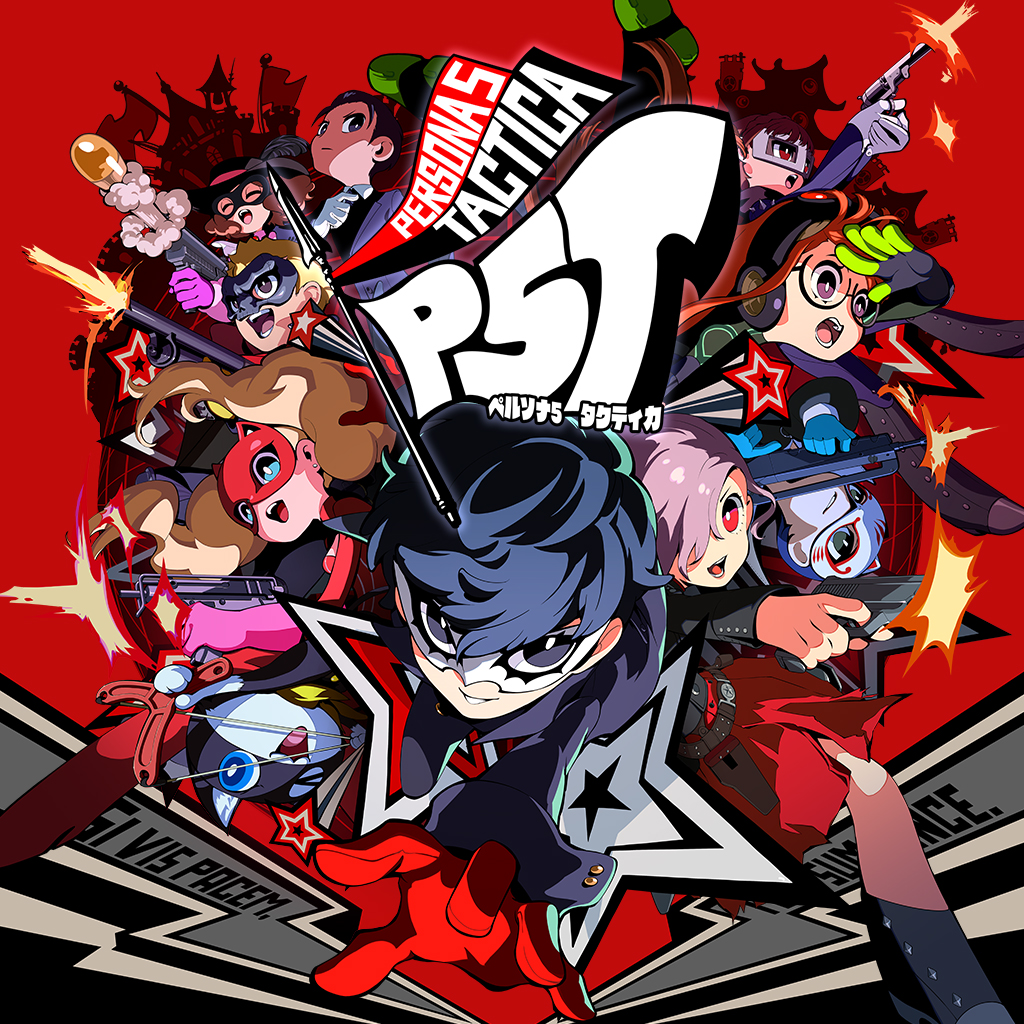
persona 5 tacticala
Raglan Punch / Kafu Techno / UD Marugo_Large / Yuruka / Rodin and others
©ATLUS ©SEGA All rights reserved.
-
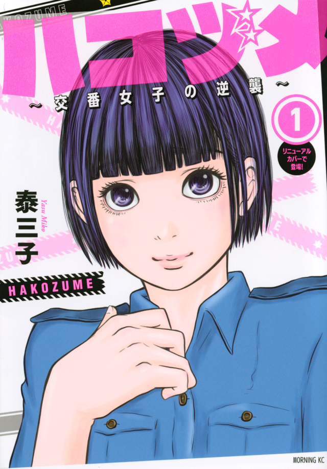
Hakozume ~Counterattack of Police Box Girls~
Raglan Punch
-
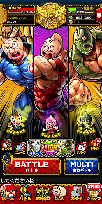
Kinnikuman Muscle Shot
New Rodin / Kokin Edo / Raglan Punch
© Boiled egg
© COPRO .co., Ltd
© DeNA Co., Ltd.
Developed by Interesting corporation kayak -
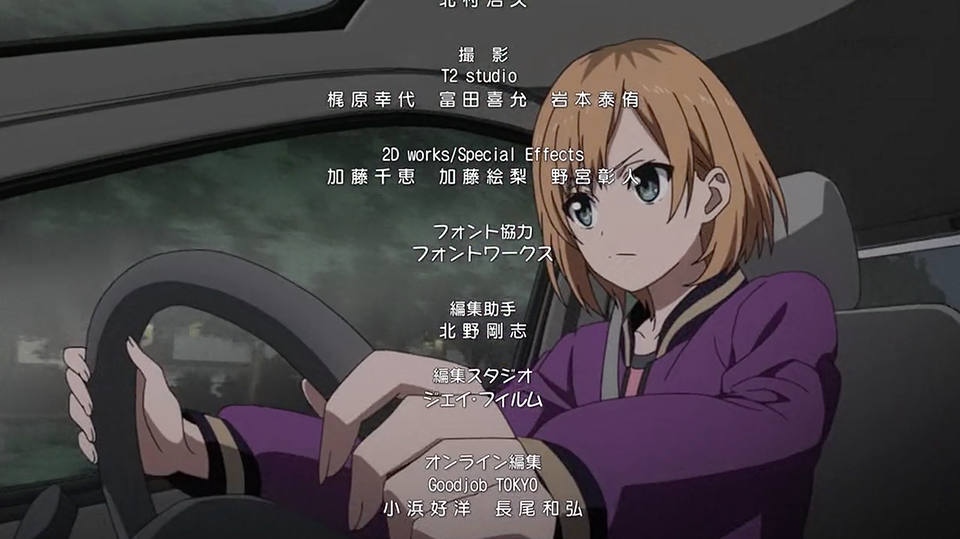
SHIROBAKO
Reggae / Seurat Capie / Raglan Punch / Rowdy
© "SHIROBAKO" Production Committee
-
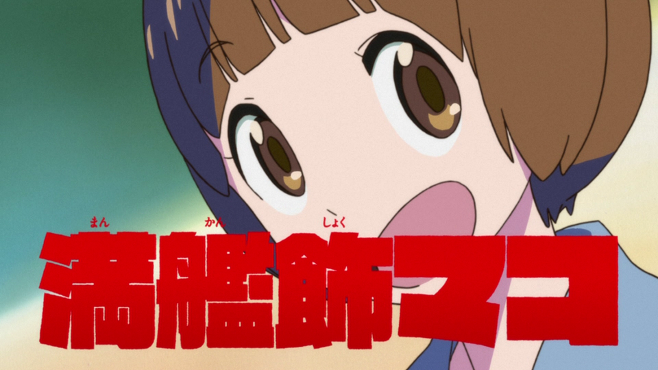
Kill la kill
Raglan Punch
© TRIGGER / Kazuki Nakajima / Kill la Kill Production Committee
-
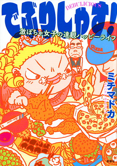
Let's take a break! Geki Pocha Girls' Dazzling Happy Life
Raglan Punch / Tsukushi A MaruGothic / Tsukushi Old Gothic
-
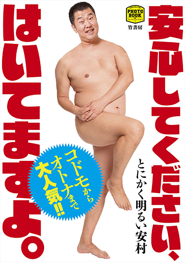
Please be assured, I am wearing it. (PREMIUM PHOTO BOOK)
Raglan Punch
-
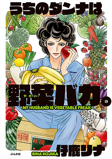
Our danna is a stupid vegetable.
Raglan Punch
-
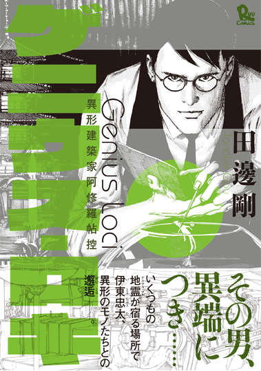
Genius Loki
Raglan Punch
Related article
© 2024 Fontworks Inc., a Monotype company.
