フォントワークスのフラグシップフォントである筑紫書体も、最初の提供フォント「筑紫明朝-L/LB」「筑紫A見出ミン-E」「筑紫B見出ミン-E」のリリースから10年が経ちました。今では多くのユーザーに愛され、雑誌や書籍などの出版物をはじめ、テレビテロップやWebサイトでの表示など、幅広いメディアでご使用いただいています。
今回、この10年を振り返った特別版として、グラフィックデザイナー 戸田ツトム氏のインタビューをご紹介します。筑紫書体を最初に評価いただいた方の1人として、リリースされてすぐの「筑紫明朝-L」についてお話を伺ったものです。DTP環境がより身近になり、また筑紫書体が多くの方に支持されているいま、改めて魅力をお伝えできればと思います。[2005年 取材]
DTP時代、なぜ標準と呼べる本文用明朝がなかったのか。
筑紫明朝を最初にご覧いただいた時の感想を聞かせてください。
文字は、ある言葉を綴るための道具、発明品
一番最初に見せていただいた筑紫明朝は紙にプリントアウトされたものだったんですが、その時にふと頭の中をよぎった問題があります。
デザイナーの多くは昔の書体(金属活字)がいいねと、デザイン的に、或いは感覚的に、単に視覚物としての美しさだけではない優れたものを大変に感じている。ある言い方をすれば、その中に神性が宿っているというような。活字から写植の時代になってからも新しい書体がどんどん開発されつづけていますが、常に活字が優れていると言われてきました。人々は活字に懐かしさを半分と、そして懐かしさだけではない部分─我々の生活や身体、感性に、親和性があると感じています。それはいったい何なのでしょうか。これについてはどこも、いかなる場面でも解明できていません。その当時、ちょうど藤田さん(筑紫設計者)がいらした頃は、いわゆる本文明朝用のデファクトスタンダードというものは存在しませんでした。
何故、そういった標準ができないのか?という問いに対する一つ目の答えは、率直に言わせていただくと、書体というものを最初から「見えるもの」としてデザインしようとしていたことが影響しているのではないかということです。
文字というものは、視覚物である以前の機能として、自分のために、あるいは誰かに聞かせるために読むものであったり、ある言葉を綴るための道具、発明品です。文字には、造形的な美しさといった視覚的な部分に根拠はあまりなかったはずです。自分の内外にある思惑や気持ちを自身の身体を通してから外に出したい、要するにメディアに載せたい、更にはそれを複製メディアで広げたい…となったときにはじめてそこで、言葉は視覚化され、見せるものでもあるのだと、文字の役割が意識されるようになります。
「綺麗な書体」という一言だけでまとめてはいけないのではないか
つまり、デザインを始める地点が少し違うんじゃないかと。「綺麗な書体」と表現されますが、綺麗な書体などというものは、言葉におけるコミュニケ−ションではあまり必要ありません。伝わればいいのです。では、文字を必要としている人は、そこに何を付随させるか。それは意志だったり怒りだったり喜びだったり感動だったりというものでしょう。そういったことを含めて文字で表現することの付加価値みたいなものを「綺麗な書体」という一言だけでまとめてはいけないのではないかと思ったわけです。
そうした個人の思いや生活感をのせるのは書体そのものの視覚的な要素ではまったくなく、文字の周りのマージナルな部分だとか、滲み、ノイズといったようなちょっといい加減な言い方で表現されてきたと思われる部分で、感情に応じて組版面も凸凹しているべきなんですよね。活字で組んだ組版面はそうでしたし、文字の飛び、潰れというのもよく出てきました。でも、あまりにひどく無い限りは、読む人が文字の飛び、潰れに社会問題レベルで文句を言ったというような話はあまり聞きません。しかも新聞は、最近まで活版でやってましたから、けっこうガタガタでした。
でも何故そうしたものを「汚い」としたのでしょうか。あるいは汚いかもしれないけれど、それらを全部削り取り、「綺麗」というパッケージで覆ってしまったのか。それによって、現代のグラフィックデザインは本来の「綺麗さ」とは別の意味を持ち、サッパリしていることが評価されるようになりました。
DTPが主流になってから作られたほかの明朝体は、文字が全体的に正方形の仮想ボディへとだんだん近づいていくものでした。そうした書体は組むと、ひとつのラインがパッと立ち上がり、仮名の多い文章でも漢字の多い文章でも、それほど密度や凸凹にあまり差がない組版面としてできあがります。それを「綺麗な」と言ってしまったのでしょう。
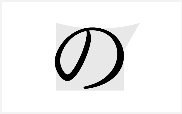
筑紫明朝には今まで知っている様々な活字の片鱗が見えた
つまり「均質な組版面」が「綺麗な組版面」という言葉を使ってあらわされたのです。デジタルフォントで一行組んで、またそれがあまり文字を詰めたりする必要もないような書体であれば、確かにひとつの面積としては綺麗に見えるかもしれないのですが、例えば特に、哲学書とか、詩を組むといったときはやはり均質というのはだめです。言葉なんですから。
人の深い気持ちに触れようとする内容において、読者はハッキリ言えば書体そのものはどうでもよく、おそらく、読書をしながらその深い部分に触れようと、頭の中で文字とは別の風景を描いているのではないでしょうか。読んでいくうちに、ある言葉に触れて非常に感動した瞬間、読者は静止します。止まって文字を見つめているのではなくて、全身におこるあらゆる活動とともに、文字に触れています。そうした読書の現場がありながらも、あるデジタルデザインというものは、組版はこうだ、明朝はこうなんだということを、ある程度決めつけざるを得ない事情があったと思います。
DTP以前は、印刷所や特に組版の方々といった、専門職の人だけしか直接文字に触れる事はできませんでした。本文は特にそうです。それが不特定多数のデザイナーの手に渡って、それらの標準となる平均値は何なのかと問うたときに、標準に対して何かを付加しなければいけないなというのが当時、あったと思うんですね。もうDTPは15年くらい経っていた時期です。これは非常に難しい課題だったので、そろそろ次の段階に行かなければいけないという時がおとずれても、明朝体で止まっていたんです。
筑紫明朝を一番最初に見せていただいたのとほぼ同時期に、既に見出し明朝の試作も出来ていました。手書きのような、外部に発散するような、荒れていくような印象を持ちました。
それらは当時あったDTPのための明朝体とは全く違う方向性を持っていると感じられました。それまでは、秀英明朝や築地書体とかが既にあり、それらを地にしてなんとなく頃合いを見計らって、正方形の仮想ボディとの加減を調整してゆくという流れで設計されたものが多かったように思います。フォントワークスで言えば、マティス的なものです。そんな中で、筑紫明朝には今まで私の知っている様々な活字の片鱗が見えました。
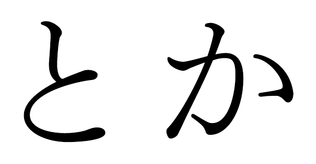
例えば「と」。石井中明朝の「と」の最初のストロークに似たものが感じられました。また、「か」。現在の写植の秀英体ではない秀英明朝には、丁度24ポイントぐらいで非常に細く鋭くなる局面がありまして、藤田さんの作った「か」には、それが感じられました。あちこちからの記憶がそこかしこに入っていました。その記憶とは何かといいますと、さきほど申し上げた、おそらく活字が携えてきた、図形としての見た目だけではないもので、電算や写植では決して伝承できなかったものです。それが筑紫明朝の中には遺伝子のように刻み込まれています。
筑紫明朝、装幀への使用感
筑紫明朝と装幀について聞かせてください。
本そのものの存在に近いものを
装幀というのは、書名は一番目立たなければいけないものであり、なるべく大きく、太くあらわすというのはごく当たり前にいわれてきたことでした。幸い私は比較的、哲学書とか思想書を手掛けさせていただくことが多く、それらは時代の最先端の思想ではあるけれども、何万部も売れるというようなことが期待されるようなものではありません。そうした本の読者や、また本づくりに携わる編集者にもある程度限定の範囲があります。そのような人々と装幀によってコミュニケーションができる書体、特に明朝体をずっと探していました。当時は、写研の秀英明朝体や、読売明朝(YEM)、場合によってはゴチックをよく使っていたように思いますが、実際に使っていたんですけれども、どうも「本」にはしっくりこない。常に何か、本そのものの存在に近いものを望んでいました。
活版というバックグラウンドから私が仕事を始めたころ、書体は明朝とゴチしか選択肢がありませんでした。たまにアンチック体があるくらいです。その印刷をする印刷会社が持っている書体の、すでに成立している文字の大きさへの指定しかできません。字形も大体把握はしていても、ポイントサイズによってはひとつの書体のファミリーでも字形は全く異なります。たとえば指定を入れる際は「明朝 ○ポ・2行どり」などと言い、著者がゴチックと書いたところにだけゴチ(G)とし、あとは位置指定のみでおしまい。そういった経験をしてきたせいか、そういうものだという観念のようなものがあった気がします。
本の本文の存在そのままを装幀として表出したようなデザイン
仕事の進行としては非常に粗雑であるかのように思えますが、振り返れば、意外といいますか、やはりといいますか、かなり高度な組版が充分できていました。
一冊の本を一書体で作る。何も活版の真似をしようという訳ではありませんが、一書体でつくるというひとつの論理を通して、装幀も本文用明朝でできなければいけない。操作は一回であるべきだと、かねてから思っていました。複雑なパラメーターによって、ポイント、書体、そのほかを様々に変えると論理がねじれてゆき、別物になってしまいます。
DTPの初期は、そういったことを何となくモヤモヤと思いながら、装幀を始めました。そうすると案の定、出版社から「書体が細い」と言われてしまう。そこで逆に問題提起しました。「目立たないですか?」「読みにくいですか?」と。「いや別にそういうことはないんだけど、普通は太くするものだから」と。普通を実現すれば埋もれるのでは……。
そうした状況の中に筑紫明朝が登場し、いわゆる装幀として写真を使ったり、色を多くつけたりしなくても充分、成立しました。つまり先程述べたような本の本文の存在そのままを装幀として表出したようなデザインというものはあり得るんだと、自分なりに確立したかなと思います。そうして多くの現場を経て、今は細い明朝で対処するということにしています。これに関しては、設計された藤田さんはなにかお考えがおありかと思うのですが…
そしてこれは私自身、藤田さんにはお伝えしていないのですが、筑紫明朝の「の」について。「の」という文字は、図形として見ると、非常に不思議です。モリサワの本木昌三の本にも「の」の文字が装幀にバンッと入っていますが、「の」という音韻の、文章の中での役割。たとえば「デザインの発想」という文、正確には何も言っていません。「経済の生態」、「デザインの発想」……よくわからない。
よくわからないのですが、実は両者は緊密な間柄ですよという事を「の」という図形は見事に体現しています。丸でもなければ只の曲線でもない。ハッキリ論理的に決めなくてもいいじゃないといったあいまいさをも感じさせます。また、書体を見ていく場合にまず「の」からというのは、デザイナーであれば大体常套手段な筈なんですが、これはそうした事を意識しているのだろうかというぐらい、直線的です。想像するに、五十音中で中心に位置する文字なんだと捉えて、これはニュートラルな存在になろうとしているものなのではないかと。
筑紫明朝の「の」の持つニュートラルさっていうのはあらゆる要素を取り込んでみた時に、結果的に、特徴がちょっとなくなってしまった…と。面白いことに、特徴がないわりには他に似た「の」はないんですね。
藤田さんがどのようにお考えになって作られたのか、そのプロセスは具体的にはわかりませんが、書体そのものとしてはハッキリ言ってあまり面白いとはいえない。しかし、あれやこれやの試行錯誤が思いっきり詰まってますから、文字そのものの情報量がとても高いんです。情報量というのは綺麗だとか、しなやかだというような図形的な部分、視覚的な見栄えだけではありません。何がしかのものが、いろんな部首やエレメントに出てきて、存在感があります。ですから一行スッと組んで字間やらをコントロールして、うまく共鳴させると、強烈なメッセージ力を持ちます。
装幀という仕事は言葉・文字の関係を探求していくのにはかなり、格好であると思います。書体とデザインという関係について、当初の感じ方としては、そんなところでした。
四六判本文への筑紫明朝
では、筑紫明朝と四六判について聞かせてください。
日本の標準的な明朝がなかなか出てこなかった要因
四六判の本文用の文字の大きさは最近、ポイントで言うと10ポ、級数で言うと14級ぐらいまで上がってきていますよね。
ご存じかと思いますが、InDesignのアプリケーションの開発プロジェクトは、雑誌のDTPをターゲットにしていたんです。雑誌には標準というものがありません。あくまでその名の通り、雑然と、そして不安定であるべきで、そんな中ではむしろ命の短い書体のほうが魅力的に見えたりする訳です。
それはいいのですが、ひょっとするとそのせいで書体を雑誌向けにいろいろ開発してきた結果、標準的な明朝がないとみんなが思うようになったのではないでしょうか。
もしそれを決めるとしたら、どういうフィールドで設定すべきだったのかというのが、日本の標準的な明朝がなかなか出てこなかった要因の二つ目ではないかと思います。
日本の出版に骨格というのがあるとすれば、それはおそらく四六判の上製本でしょう。これは全体の売り上げ部数としてはどうということのないものですが、その出版点数は圧倒的です。これがInDesignのデフォルトのドキュメント設定として入っていないのは全くナンセンスで、むしろそのリーガルサイズなんてものはいらないだろうといって、四六判や新書判をデフォルトで入れていただきました。
重要なのは、視覚的な美しさだけではない、身体との親和性
四六判の全紙をババババッと32ページ分に片面折ってしまえば、一冊64ページができます。それで文庫本や、版型としての四六判ができます。 1枚の紙から64ページがポンと出来て、それが4枚あれば256ページになります。256ページというのは一般的な書籍のページ数です。
紙4枚。そしてそこに入っている明朝体は如何に、となります。ひとつ出てくるのは、それほど大量ではありませんが精興社の活字。その次に電算では本欄明朝が凸版印刷あたりのデフォルトで入ってきました。セールスとしてはどうか、ということまではわかりかねますが、このあたりはとても広大なエリアであると思います。
四六判は特に読書のしやすい本の大きさで、雑誌よりも人に近い距離に文字がきます。一冊200ページの月刊誌を買って読もうという時、その買われた方はその何%読んでいるかというとそんなに高くないでしょう。実際、雑誌全体に触れるというマクロな部分が強くて、なかなか本文の、それも書体まで到達しづらい気がします。それに対して四六判は、買えばつまらなくない限り最後まで読みますから、書体を特に意識しなくてもなんだか読みやすいとか読みにくいとかということが確実に読者の身体に伝わります。
そこで一番重要なのが、冒頭に申し上げた、視覚的な美しさだけではない、身体との親和性なのではないかなと。ですから使い方はなかなか難しいのですが、筑紫明朝は四六判に勿論適当で、私個人的には今のところ、A5判で筑紫明朝をよく展開しています。電算になかった、活版的なものを携えているのは書体のかたちそのものだけではなく、刷った時の状態といったようなものにもあらわれています。
ここから先は技術、デザインの問題です。一冊全部を筑紫明朝で作った本があります、著者指定の箇所以外は全部筑紫明朝のLです。それでもう充分。著者の方にも好評でした。いよいよ本格的に筑紫明朝で四六判の本をどんどん作っていくという地点に、鈴木一誌さんも私も、今ちょうど立っていると思います。
言葉に意味を浮き彫りにする文字
戸田さんにとっての書体とは?書体・文字全般についてのお考えやこだわりを聞かせてください。
全部の根拠を作る書体というものが、非常に重要
どうしても我々は文字を使います。メディアの中で生きていかなくてはいけない場合、手で書く訳にはいきません。グラフィックデザインというのは記録する作業ですから、最も重要なのは文字と写真です。写真というのは印象的ですから、自らの手でもいけます。
一方、文字は、複数の記録にとってはどうしてもメディアのものが必要です。そこにもうちょっとリアリティを持った、我々の生活そのものにとっての「癒し」……つまり人々の心を和ませるといったことに対して頑張るようなデザインが出てきて欲しい。そこは恥ずかしいけれども「癒し系」ではなくて「癒し」。そうしないとデザインというものは、ともすると安易な操作で終わってしまいます。これとこれの並べ方をちょっと変えれば別のものに見える。見えるとはいえ、別のものになった訳ではない。そうすると、それら全部の根拠を作る書体というものが、非常に重要になってきます。
今こんな世の中ですから、情報に対してもうちょっと、個人個人でなるべく直に接するようにして、そこからどういうデザインが出てくるか、といった事を考える場面がもっと出てくるといいなと思います。
これからもてはやされていくのは、感情や思想が明確に浮き彫りにされないような書体
例えば、ずいぶん昔の話ですが、新聞の見出しに最初「イラク攻撃」とあるのを見て、みんなびっくりしました。しかしそれに慣れてくると「イラク戦争」と表記する。やはり戦争と攻撃では全然違います。それに対して誰もエクスキューズしない。言葉が絡んできて、新聞で書体によるプレゼンテーションがなされるとき、ハッキリ言ってしまえば、筑紫明朝のような書体というのは、比較的嫌われていくと思います。これからもてはやされていくのは感情や思想が明確に浮き彫りにされないような書体。そういうものじゃないかなと思います。
筑紫明朝について 「d/SIGN 9号」の中でも鈴木さんの発言と私の発言がありますけども、大体同じです。鈴木さんは「やくざっぽい書体」と言い、私は「荒れてる書体」だと言いました。この書体には抑えこめないものがあると感じていて、二人ともがそうだと、やはりそうなのでしょう。
今たまたま出てきた言葉で「イラク攻撃」、「イラク戦争」と他の明朝で組む。これではなんとなく、伝わってくる意味があまり変わらないような…。しかし、それを筑紫で組むと、頭の中でイメージがガラッと変わり、意外と意味の差がハッキリするような気がします。
文中に登場する製品名等は、各社の登録商標です。
戸田ツトム氏 プロフィール
1951年東京生まれ。グラフィックデザイナー。 1980年以降、作業の照準をエディトリアルデザインに集中。現代思想書をはじめとした造本装幀多数。 1989年『森の書物』の刊行によってDTPの可能性をいち早く国内外に示した。90年代にはハイビジョン映像制作や デジタルコンテンツを制作、またAdobe InDesignの開発にも深く関わった。以降、新聞・雑誌のデザイン・アートディレクション多数。 神戸芸術工科大学教授。 著書『断層図鑑』(北栄社1986年)、 『庭園都市』(どうぶつ社1986年)『D-ZONE エディトリアルデザイン1975-1999』(青土社1999年)『電子思考へ…』(日本経済新聞社2001年)『陰影論』(青土社2012年)ほか