In this section, we will focus on "Gospel-EB" and introduce the design features, how the font is used, and the background of the typeface's creation as told by the font designer.
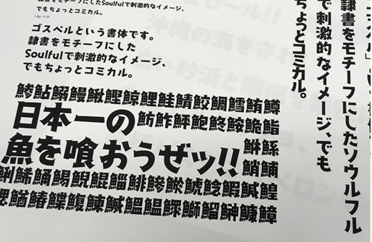
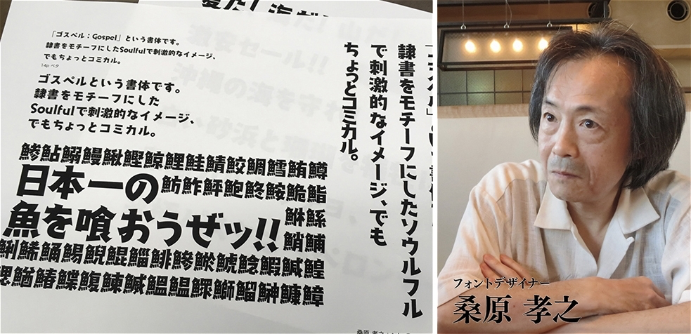
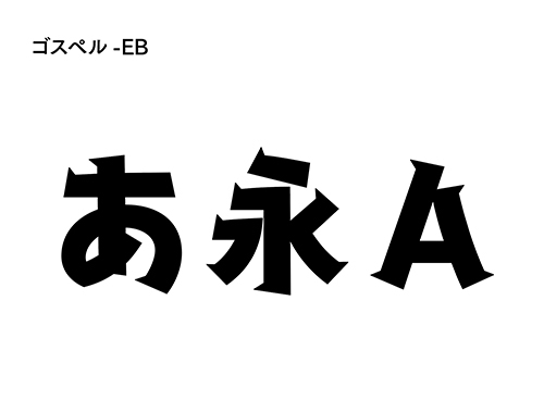
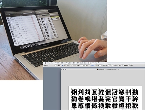
"Gospel-EB" is characterized by its thick weight and the design of elements that rise sharply above the beginning and end of the strokes. It is a font that can make the impression of fonts with a lot of black, which tend to be heavy, look light and comical.
Due to its design, it is often used not only for catchy titles in Advertisement, but also for short lead sentences and subtitles in variety shows. In particular, since it is often used with cute pictures, many people may think that it was created by a font designer who specializes in fonts with strong design. However, it was actually created by designer Takayuki Kuwahara, who also works on fonts for "household electrical appliances," where readability is more important than design.
This is the first font release from Fontworks, but I think many people are already seeing fonts created by Kuwahara in their daily lives.
Please tell us how and why you became a font designer.
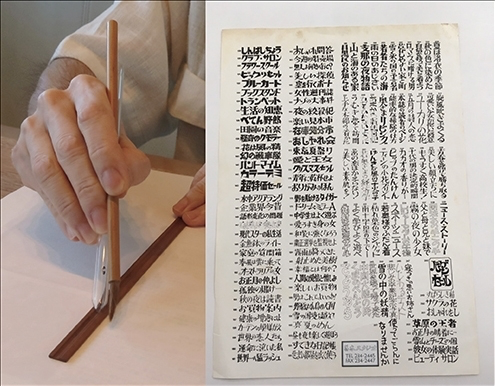
I used a tool to draw ukiyo-e ruled lines, cut a bamboo ruler into a good thickness, and used a brush with a sharp tip to write letters. The writing sample is a collection of Namiki Studio so that the editor can easily specify the typeface. Unlike today's sophisticated magazines, magazines that used a lot of different typefaces were favored, and the number of circulation increased.
It was my first chance to get involved with writing that I started training precision lettering (writing character shop) under Mr. Tatsuji Kato of Namiki Studio (author of Namiki Pop).
What is precision lettering in the first place? Many people may think that. About 40 years ago, there were various typefaces for phototypesetting, but I had no choice but to handwrite thick basic typefaces and design typefaces. Brush ink with ink every day and use a face brush and sashi (grooving).
It was a time when I didn't even have a fax, so for the first three years, I practiced writing in my spare time while I was using it. It was a world in which the characters of the master were simply copied from right to left, and while doing so, the skeleton of the character came to be able to finally write the character.
At the same time, I think it was a good idea that I originally liked machines. When the writing itself declined and I didn't have a word processor yet, I was able to learn what programs and digital data were while playing around with an 8-bit personal computer. I think it was an expensive toy, but since the machine was made by Sony, I was also involved in Sony's dot font production.
What led you to start creating outline fonts, including "Gospel-EB"?
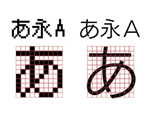
It is interesting to see that if you fill the squares with black, you will write "1", otherwise you will write "0". Dot fonts such as alphanumeric characters are still in demand occasionally.
After that, outline fonts started to become mainstream, but for a while I was only interested in dot fonts, which have mechanical limitations. Actually, before I created my own outline font, I helped other people create them, so I knew how difficult it was to create an outline font...or maybe that's why.
However, I had many friends around me who were creating typefaces, and I was inspired by their hard work and wanted to try it myself. Among them, the "Gospel-EB" typeface I'd like to introduce this time is one I've always been drawn to clerical script, and I started making it hoping to create something out of it. Even though I'm stylizing clerical script, I could have made it a little softer, but I made it a strong design that suits the words GOD SPELL, "the spelling of God." Elements like scales can be annoying if they're made too big, so I tried to give it a comfortable, raised look like a Mincho font, to lighten the impression a little.
The other day, in a TV variety show special on the Olympics, the italicized "Gospel-EB" was used for the caption "Men's Gymnastics Team." Because it was an effected display, it felt like it wasn't a typeface I made, but I thought the speed-letter style of handwriting was well-used and made the most of its appeal.
The "Gospel-EB" that is delivered to "LETS members" is produced in the following order: Mr. Kuwahara designs the font, and FW checks the design and characters and turns them into a font. In fact, this "Gospel-EB" is a typeface that hardly requires any corrections. Please tell us the secret.
By managing the fonts being created, the design will be less likely to blur. When checking the characters, I made them into fonts when the design was completed to some extent, so I could easily check what I typed in the text on the monitor.
While creating a font, it's often tempting to see what you've already created, for example, "This bias should have been created earlier, but what about the element processing?" At that time, if I start searching for the location of the file, I will soon get stuck in the design, but this is not the most troublesome and stressful place for people who make fonts. Or?
In order to solve such a problem, every time a design is created in Illustrator, fonts are converted into data with Fontgrafer, OTEdit, etc. at any time, and information is managed in a card-type database.
For example, if you search for “Nimben”, you can see the design of “Namiben” and “Saku” in a line. We have created an environment where you can check it at any time near the design work so that you can check the consistency of the design such as dot painting, compare the reference typeface and processing you care about, and prevent the creation of duplicate fonts. I will.
However, some of them were designed and modified by Fontworks. The fonts used for "scientific symbols" and "tate-chu-yoko" correspond to this, but for punctuation marks that are not familiar to you, there were some that were designed with the assumption of the scene to be used wrong, so it was helpful It was
What kind of font do you plan to create in the future?
Actually, one of my fellow designers told me that they never thought Kuwahara would write such cute characters. (laughs) Rather than writing characters, it still feels like I'm just filling in the spaces, so I'd like to get rid of that feeling as much as possible in the future.
I think it's because I've been doing calligraphy, but my method of font creation is to fill in the squares so that the letters fit into the squares... In the future, I want to write characters without being bound by that, I want to create characters that I've never done before, Styles fonts that are not pretentious.
Actually, I had imagined Gospel this time being used for something manga-like, but as in the example I mentioned earlier, I'm happy to see that it's being used in a more appropriate way by people who actually use the font.
We would like users to continue to use it freely as they like.
Profile of Takayuki Kuwahara
Digital font designer and engineer
From 1977, he trained as a calligrapher in the Iwanami Mincho at Namiki Studio, run by Tatsuji Kato, for about nine years.
After going independent, he mainly produced dot fonts for Sony's interfaces, and was involved in the design of around 10 typefaces, including Gospel.