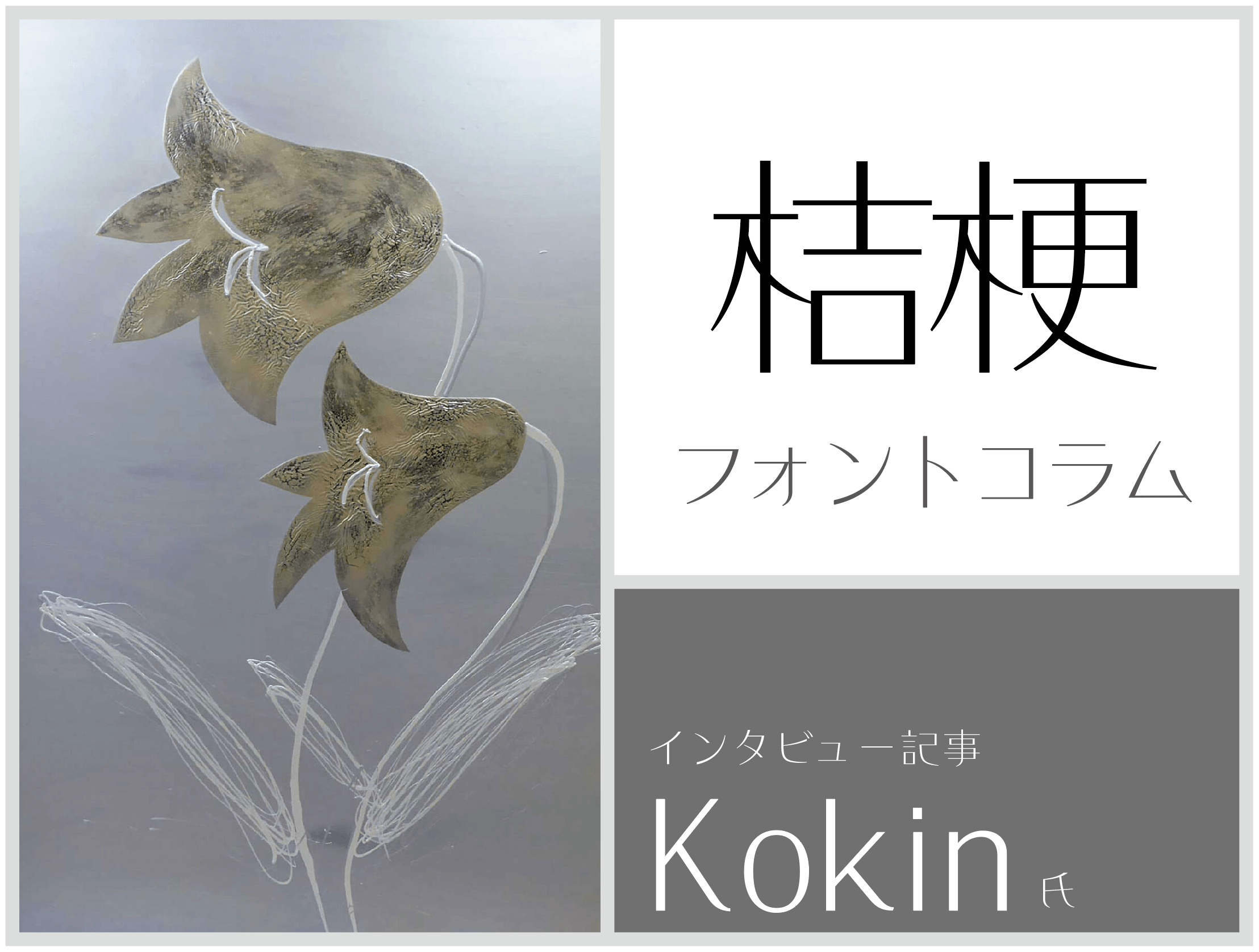
Following on from "KokinEdo", "KokinHige" and "Budo", font designer Kokin's latest font is "Kikyo".
One of its features is the thin weight, which gives the bold design of the elements a familiar and comfortable rhythm in its simplicity. On the day it was released on LETS, people tweeted on social media that it was an "emo typeface!"
This time, we spoke to Kokin, the creator of the font "Kikyo," about the design concept, what inspired it to be created, and the story behind its creation.
What are the features of "Kikyou" design?
"Kikyo" is a typeface created with a delicate and modern theme.
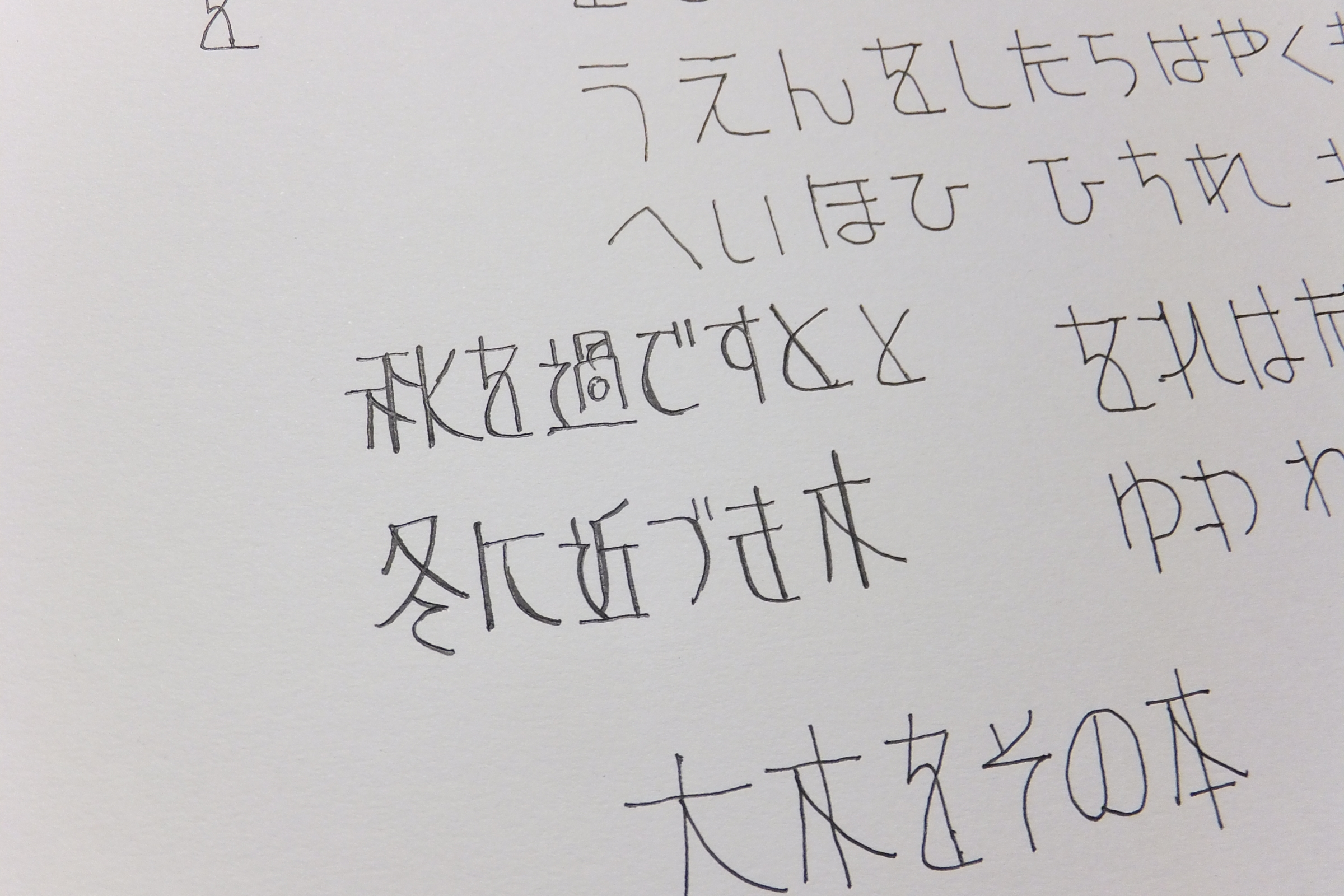
I have a bold design process everywhere in the kanji, so I think that there are eye-catching effects due to the typesetting. It seems that a bold design will appear if you increase the points. Especially kanji is remarkable.
Also, I feel that when the text is small and has a certain length, that part will blend into the expression of the text and give a relaxed impression.
This typeface is inspired by the artistic expression of Korin Ogata, famous for the national treasure "Kakitsuba Tazubyobu" (Ikuso Rokkaku, Nezu Museum Collection). I was impressed with the production when I wanted to express my impression at that time with a typeface.
Ogata Korin is a writer who is more design-oriented, delicate, expresses tension and strength among Rinpa, and I thought that I could express that point with elements and skeletons.
For that reason, I originally created it with the name "Kourin", but as an image of the impression of the typeface, I finally chose it from the name of my favorite flower and named it "Kikyo". I decided to.
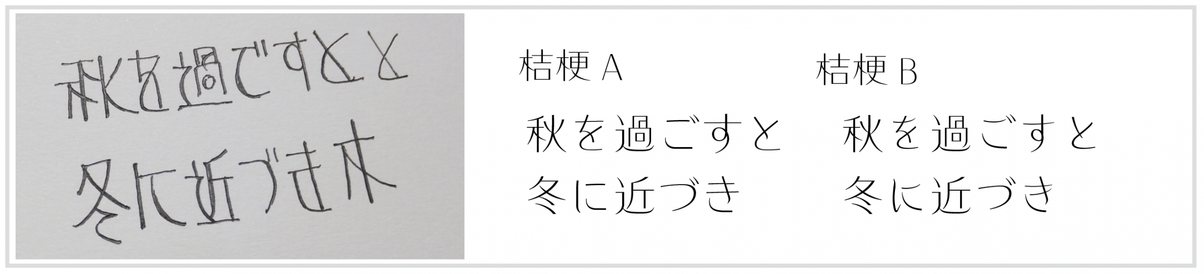
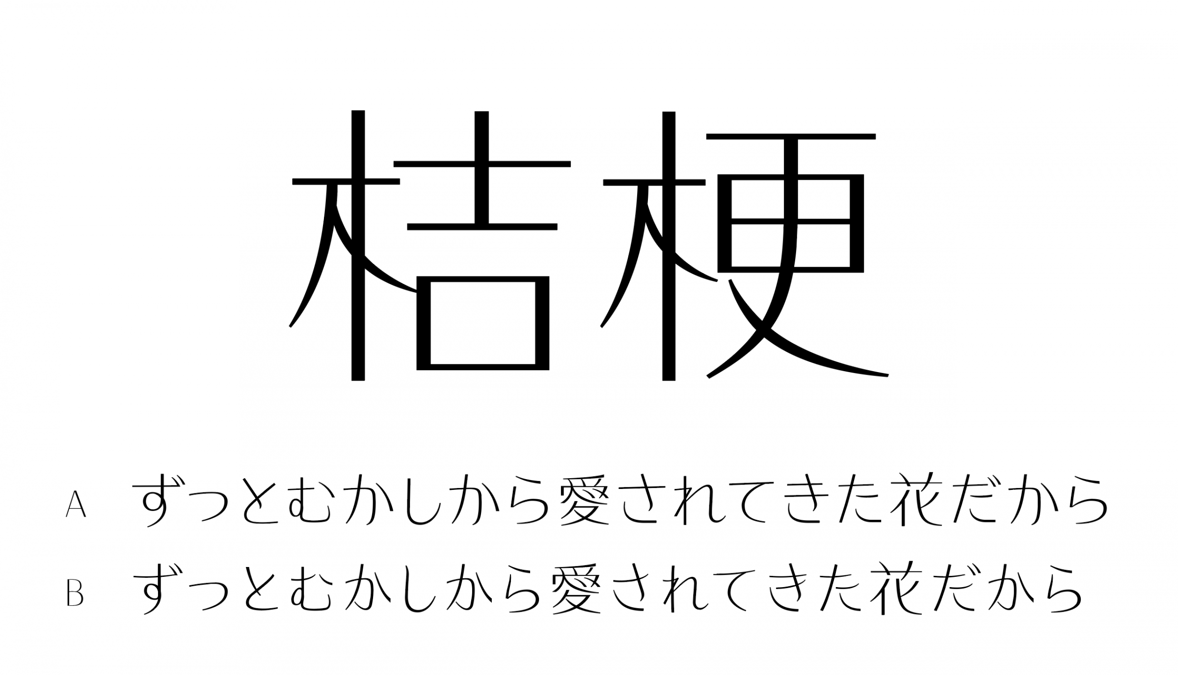
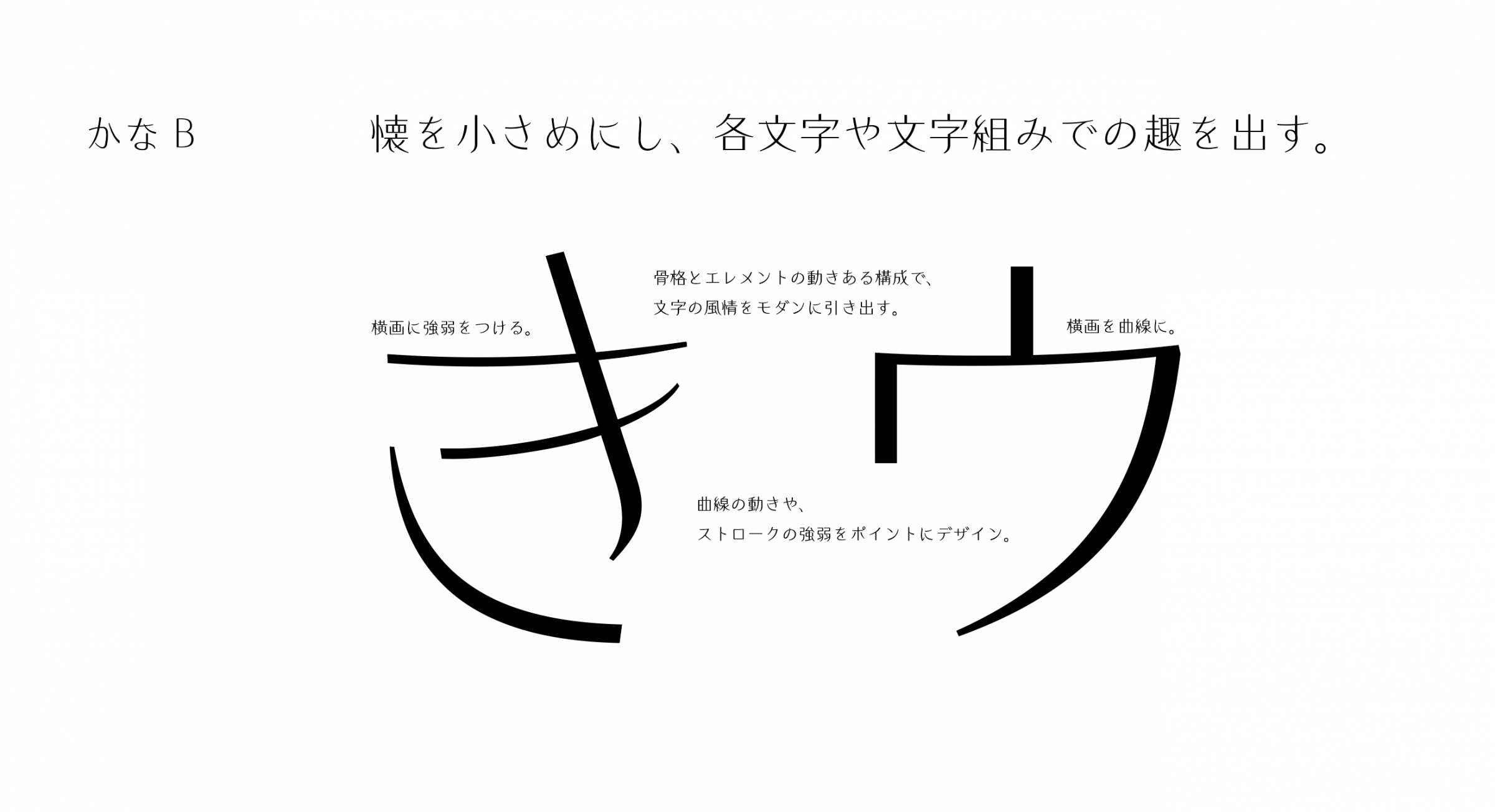
Difference in appearance due to kana design
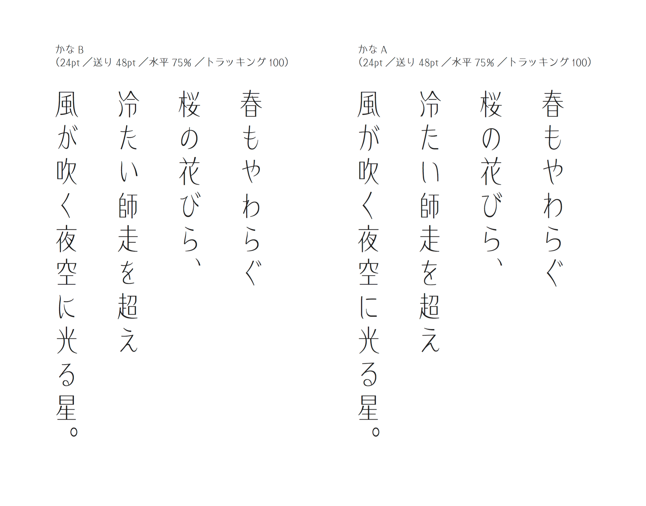
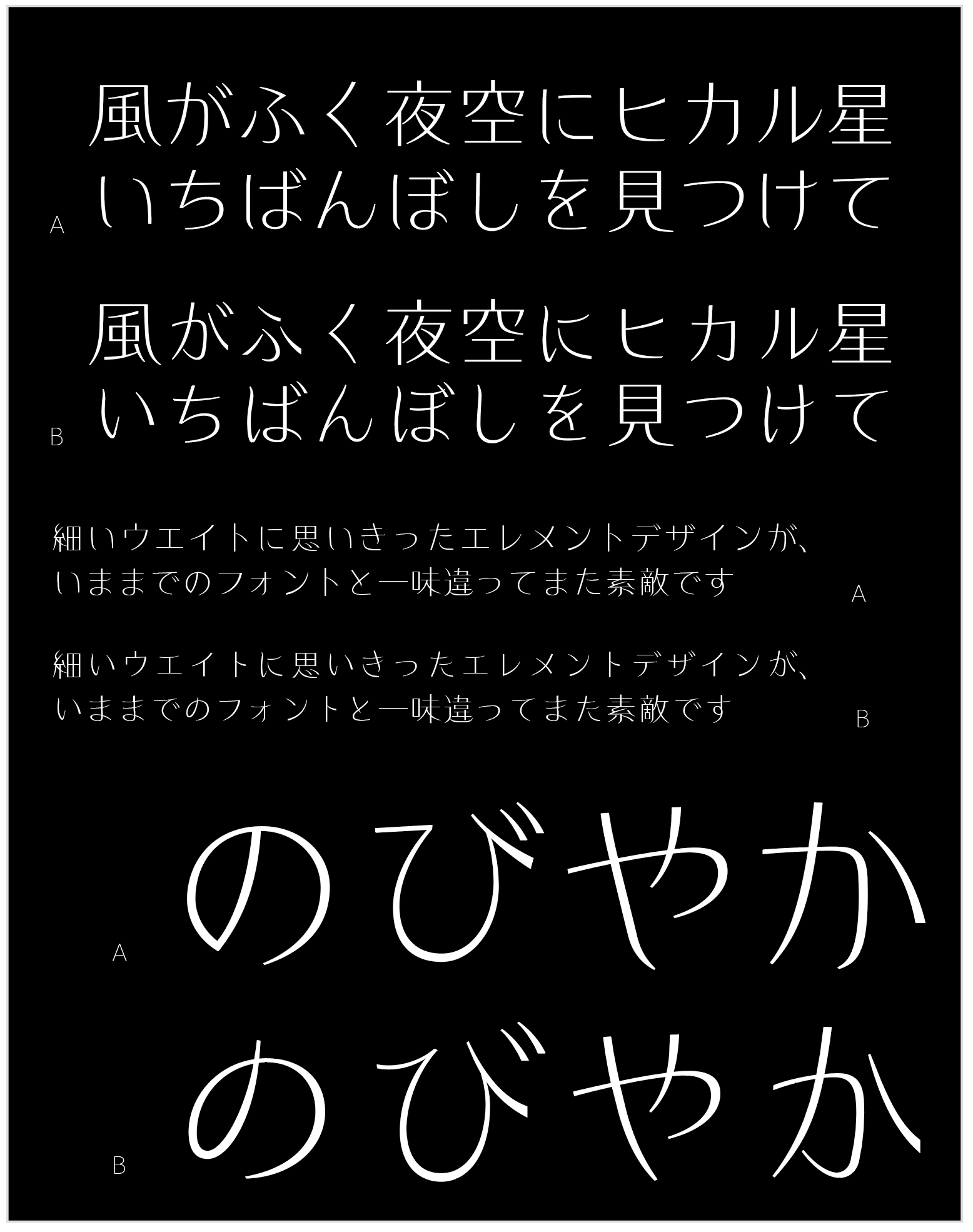
The "Type A" has a simple design and a large kana, giving it clarity, whereas the other type "Type B" has a lyrical look, while it has a design with an epic look. I will.
"Type B" is more lyrical and has a more attractive look. Pseudonym is small minute, a few lines from the lead sentence Text I think we also look how much divided to be.
I think that "Type A" can bring out more design characteristics of Kanji when used in combination with Kanji.
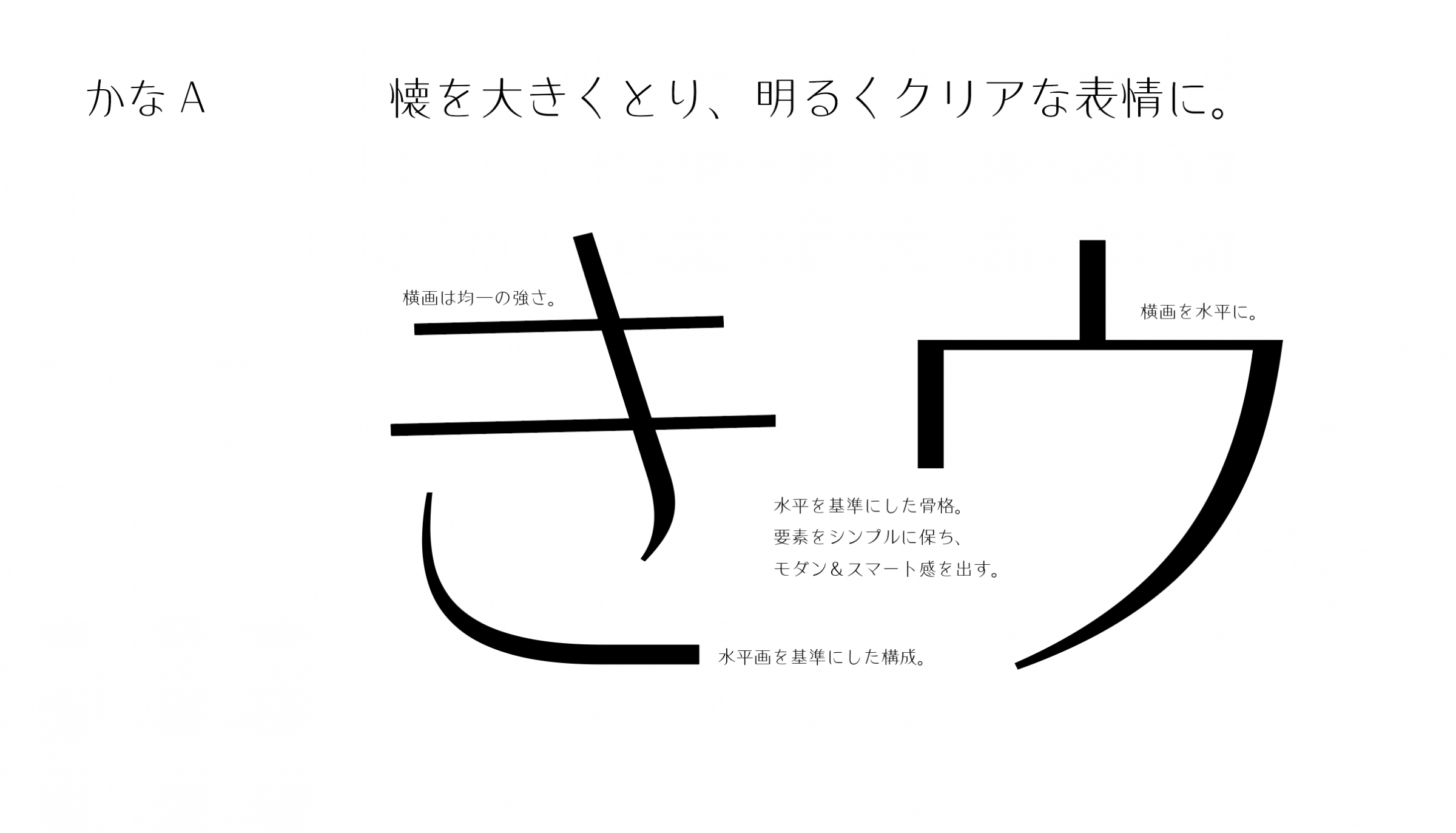
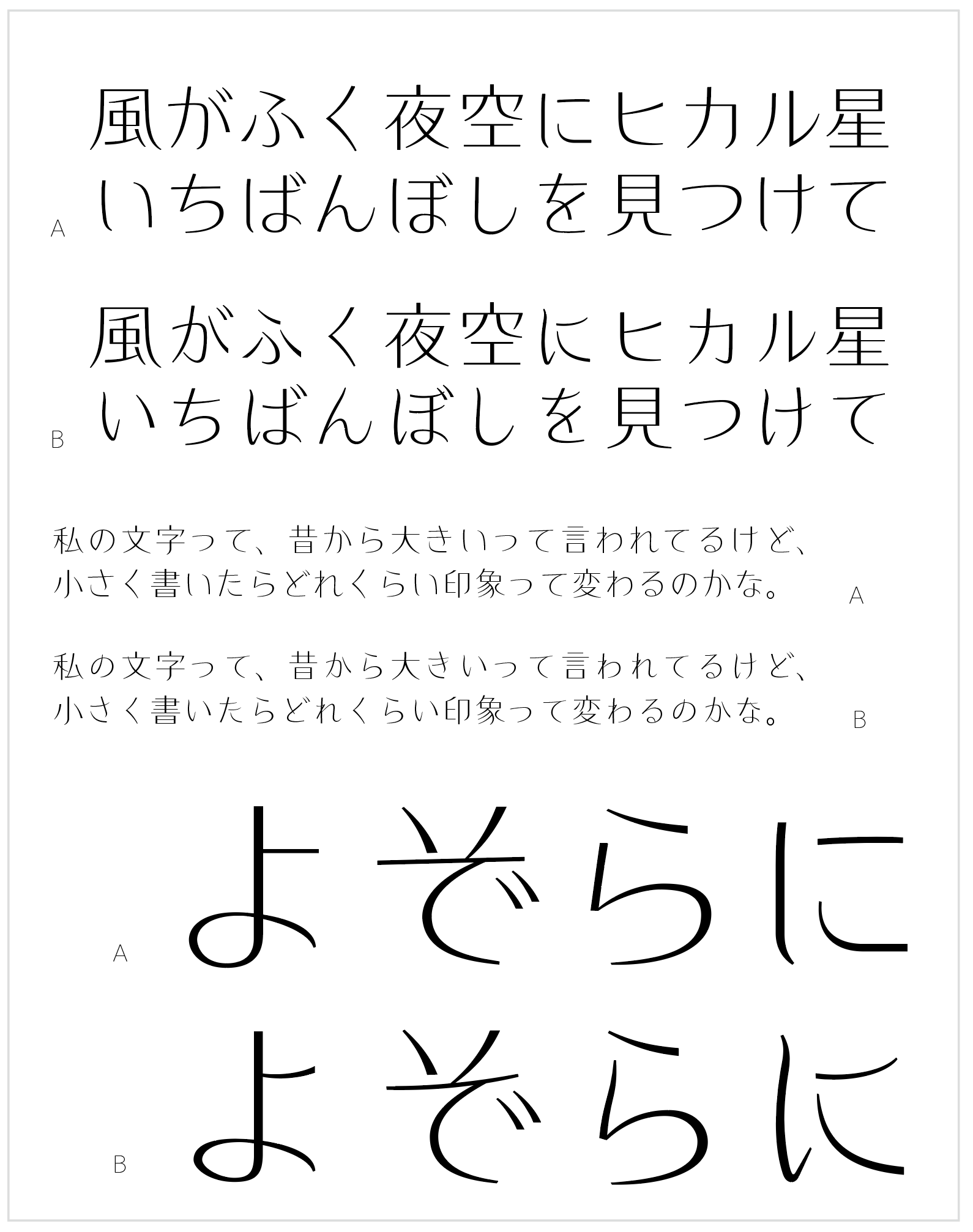
Design takes priority over the original shape
“Dramatic design”
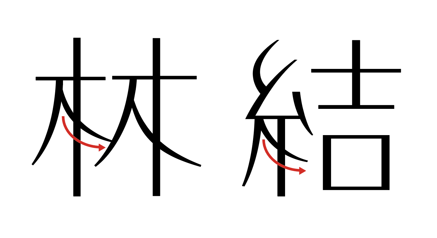
This is also one of the features. It is made so that it appears in various places as much as possible, such as by applying it to the parts that frequently appear in the radical such as “tree” and “thread”.
For example, the right stroke of "tree" and the final stroke of "thread" have different strokes, but by designing with the same element and giving priority to the impression of the typeface design, we have made the font "Kikyo".
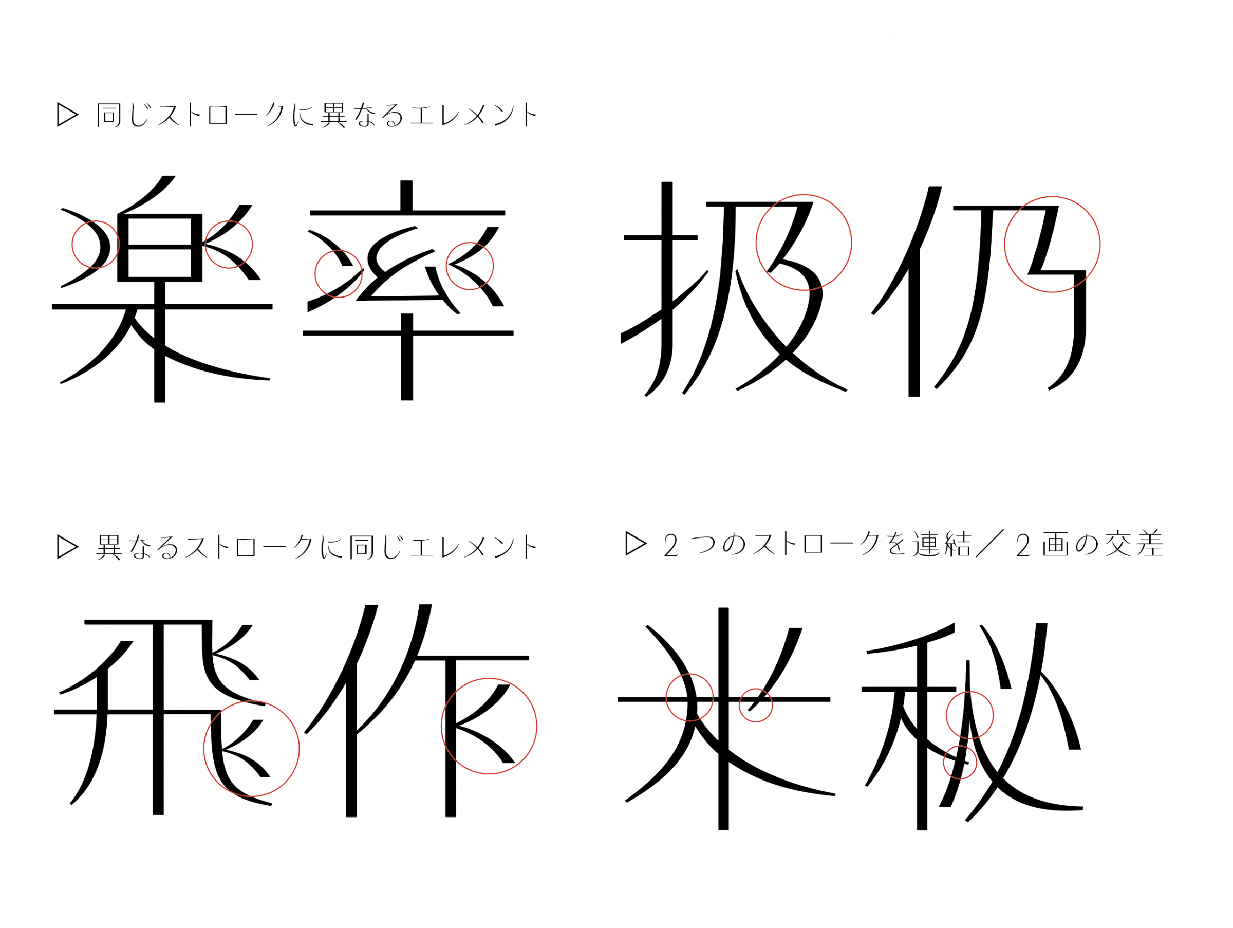
In addition, you can make the same stroke different elements,
On the contrary, there are many parts that have the same element even if the strokes are different.
In addition, by intersecting two strokes that do not intersect originally, we emphasized the flexibility of the payment, and we are processing away from the original shape, but it looks like that character and the expression when assembled The spread (softness due to shaking) is the design point. It was difficult to have a sense of balance (frequency of appearance of radicals and degree of design) when designing with priority given to design, apart from the original Kanji strokes.
Opportunity to become a font designer
My interest in letter design was the hand-printed gully print I saw when my father was making a public relations paper for the government office. When I was still in the lower grades of elementary school, I was surprised to see the beautifully arranged letters, even though they were handwritten, and I still keep that impression.
When I entered university, I still wanted to go to art and design letters, but my father, a public servant, didn't allow me, so I decided to enroll in a reluctant Faculty of Law and start designing. is. Since I didn't go into beauty, I had no connections or information about people, and by the time I designed the letters, I was fumbling while changing several subcontracting companies such as phototypesetting and blockmaking.
At that time, I strongly wanted to see the actual facts of Type Designers, and even though I was suspicious, I visited Yasaburo Kuwayama and Motoaki Okuzumi. It was a sudden request, but he kindly showed me the actual work, and Mr. Kuwayama gave me a special graph paper for the original characters, and Mr. Okuzumi drew me with a groove.
The memories at that time are the energy for the current typeface production.
After that, I decided to study at the site of typeface production, hit the gate of type bank, and studied as an employee during the transition period from analog to digital font. After leaving the company, I rented a desk of a design company and became independent (freelance), and while doing my daily work, I was collecting sketches and original characters of my original typeface. A while later, I had my own portfolio, and at that time emigure (which had an influence on the world in font design) https://www.emigre.com I have also visited.
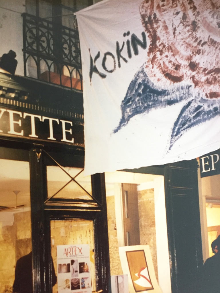
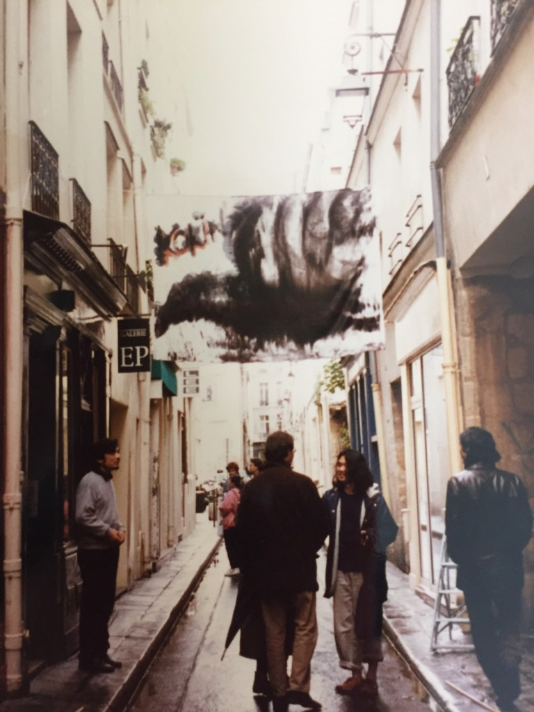
Through logo production and activities as a painter
From the beginning of my independence, when I was working crappy while gathering small, unknown logos, I had the opportunity to design according to a wide variety of clients and design concepts. I think that the accumulation of things that deepen the interpretation and try to create a design (design) based on the reason is more connected than the word (order) that is not made. In that respect, I feel that my insight and expression as a writer are useful.
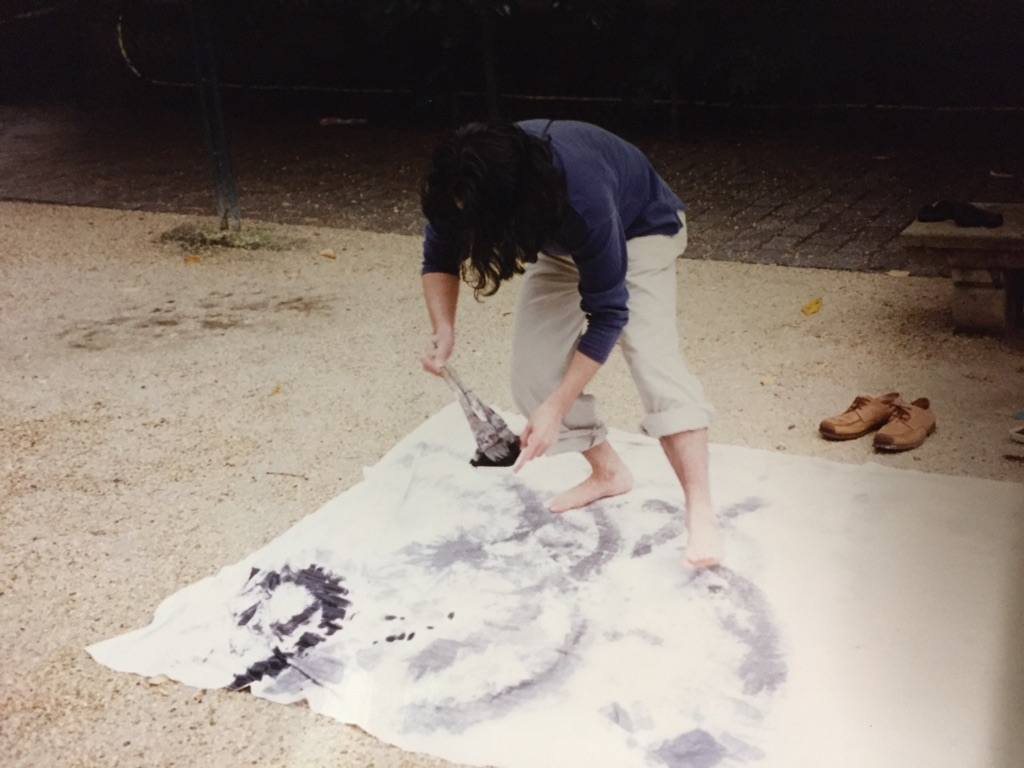
When I started drawing, I had the opportunity to show Mr. Toshimitsu Imai, an artist, an illustration that I had been drawing in parallel with the character design after I became independent. It was better to draw it ", and as a result of continuing to exhibit and announce it little by little, it became the current Styles of both character design and painting.
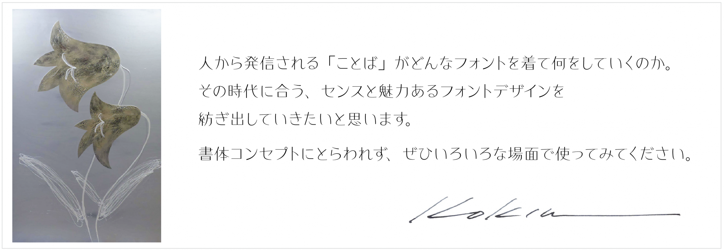
Since typeface production creates all letters over a long period of time, I would like to continue to create something that I can keep with the passion for production with this design.
I'm still new, so I'm still not sure if the stage of "Kikyo" is the sea or the mountains, but I'm sure all of you will find a wonderful field.
I'm looking forward to how the expression of the expressed characters, the text, and other elements are entwined!
From the following, you can test-print the font
Kokin Profile
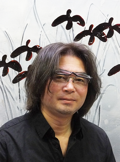
Type Designers
Born in Shimane Prefecture in 1963. Dropped out of Dokkyo University Faculty of Law. Joined Type Bank in 1991. Became independent as a designer in 1993, and began creative activities as an artist. Released KokinEdo-EB in 1995, KokinHige 1997, and Budo-L in 2004 through Fontworks. Member of the International Typography Association (A.Typ.I.) from 2006 to 2014. Gave a presentation on "Chinese, Japanese, and Korean Kanji and Design" at A.Typ.I. Dublin in 2010. During a presentation on "Black and White and Edo Characters" at A.Typ.I. Hong Kong in 2012, he donated a memorial work for the Great Tohoku Earthquake, drawn using all the characters of X-0208, to A.Typ.I.
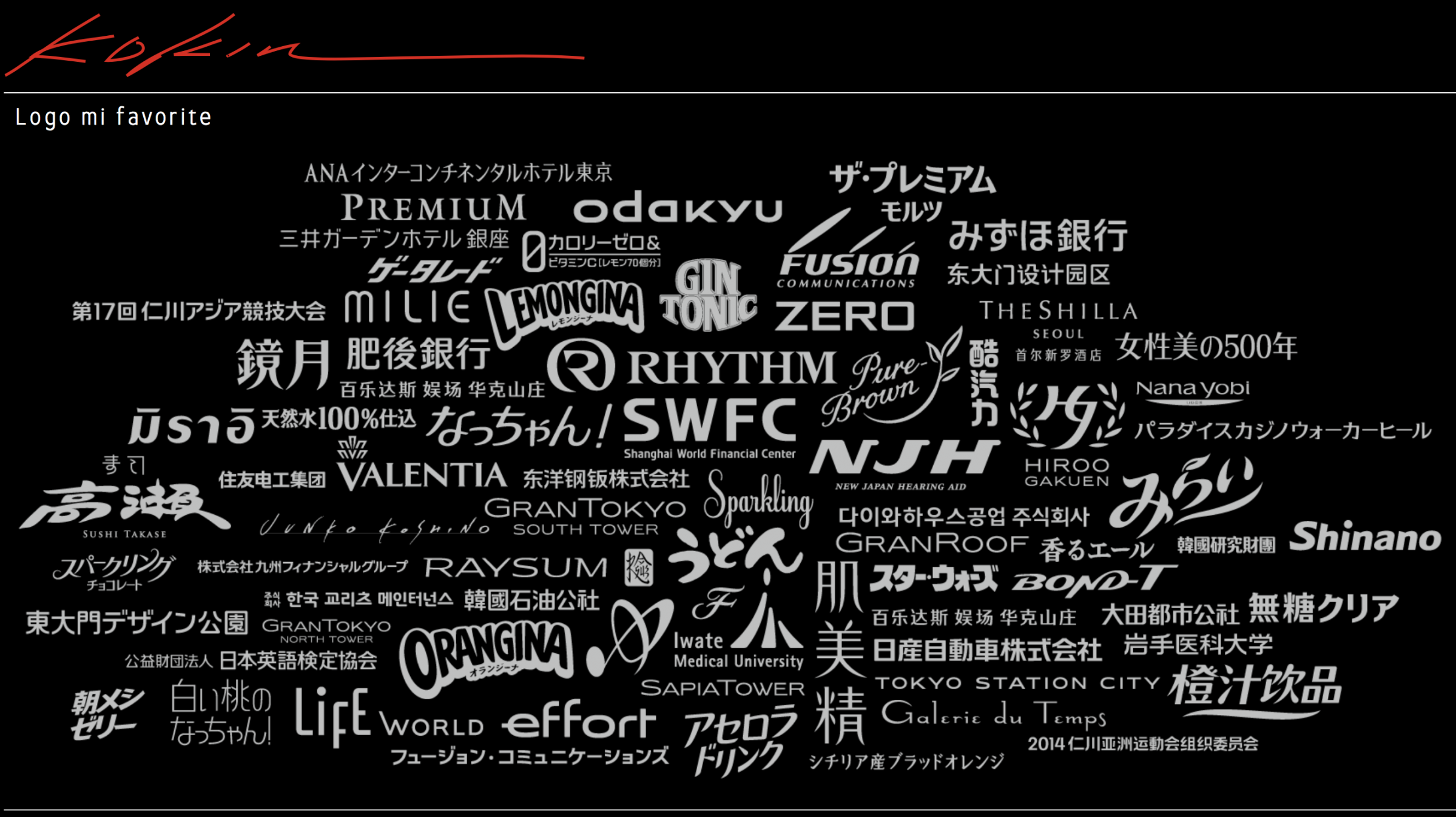
Main logo designs
The Premium Malt's, Acerola Drink, Natchan!, Kyogetsu, Mizuho Bank, Nissan Motor, TOKYO STATION CITY, Odakyu, Rhythm, Orangina, Korea Paradise Group, Dongdaemun Design Park, etc.
Main painting collections
Chateau Restaurants Joel Robuchon, Hyatt Regency, The Ritz-Carlton, Imperial Hotel, etc.