株式会社ぱどは、フリーペーパーとして世界一の発行部数を誇る情報紙「ぱど」を提供している会社です。人・街・元気マガジン「ぱど」は、アメリカでのフリーペーパーとの出会いをきっかけに、現在の代表取締役社長・倉橋泰氏によって1987年10月、横浜で創刊されました。
フランチャイズシステムによる着実な全国展開をはかり、2001年にフリーペーパー発行部数No.1の1,000万部を達成し、ギネスブックの世界記録に認定されました。2005年3月現在の発行部数は、北は仙台から南は広島まで全国214エリア1,200万部を超え、着実にエリア・発行部数を拡大しています。
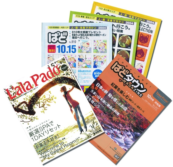
個人や企業が気軽に情報発信できるメディアとして成長し続けている家庭版「ぱど」は、地元のお店や個人広告などの地域に根ざした情報が満載です。その他にOLをターゲットにした「ラーラぱど」、街の様々な情報を紹介する「ぱどタウンマガジン」を発行しています。さらに紙媒体のみならず、2001年にはインターネットのバーチャルタウン「ぱどタウン」を開設し、電子メディアとのメディアミックスも進行しています。「情報を通じて、人と人、人と街をつなぎ、人も街も元気にする=人・街・元気マガジン」として、2000万部発行を目指し、ますます積極的に地域に密着した情報を発信しています。
「これは素晴らしいプログラムだ」と感じましたね
最初のきっかけはフォントワークス(以下、FW)営業担当さんからのご紹介です。以前からパッケージを購入して使用していましたが、LETSがスタートする3ヶ月くらい前の早い時期に、今度「LETS」というプログラムがスタートしますとお話をいただきました。当時、社内にMacが90台くらいあったのですが、OSやDTPアプリケーションがどんどんアップグレードしていく中で、OCFフォントが使えなくなるという状況になってきて…。どうしようかと困っていたところに、ちょうどLETSのお話をいただきました。フォントはかなりコストが掛かりますので、「これは素晴らしいプログラムだ」と感じましたね。(井上氏)
以前からFW書体を使っていました。途中他社書体もいろいろと検討したのですが、ロダンは当社のベース書体としてずっと使っていたこともありましたので、結局戻ったんですよね。やっぱりFWの書体は使いやすいんですよ。(飯泉氏)
もともと我々は写植で版下を作ってきて、'96年からDTPを導入したんですけど、最初何がショックだったかって、どうにもこうにもまともな書体がないなという思いがありまして…。やはり写研やモリサワの書体にずっと慣れていたものですから、DTPを始めたはいいが写植文字が使えないという事態が起きて…。普通に素人さんや読者の方が見ても分からないとは思うんですけど、やっぱり書体へのこだわりというものが我々にはありますので。そういった中で、FW書体のロダンやマティスは割と今まで使っていた写植の書体にかなり近いものがあるなという感想を持ちました。(井上氏)
みんなが個々に自分好みの使いたい書体が自由に使える

導入の決め手は、年会費のみというところのコストパフォーマンスだと思います。これだけの書体が使えるのは非常にお得だと思います。今までFW書体、特にロダン、マティスあたりの一般的にスタッフが使っている書体もそのまま継続して使えますしね。ほとんどのスタッフは自分の好きな書体や頻繁に使う書体をだいたい決めていると思うのですが、それが変わってしまうと表現したいものが表現できなくなったりということもあります。現在制作スタッフが全体で90名くらいはいますが、これらのスタッフみんなが個々に自分好みの使いたい書体が自由に使えて、表現の幅が広がるという部分でLETSを導入して正解だったと感じています。(飯泉氏)
それと管理が楽になりました。当社ではデザイナーは基本的には作業に専念して、セットアップや管理は別部署で行っていますが、台数が多いので管理する側からすると非常に楽になったのではないでしょうか。(井上氏)
LETSの導入で印刷会社や外注先とのやり取りもスムーズに
昨年の10/1発行号から組版ソフトがAdobe InDesignに切り替わりました。一般枠と呼んでいるフリーの広告はMacintoshでCIDフォントを使っており、逆に形が決まっていて自動的に文字を流し込んでシステマチックに制作するフォーマット広告はWindowsでOpenTypeフォントを使って制作しています。2種類のフォーマットを使っていますが、当社がLETSを導入したあと、印刷会社にもLETSを導入してもらいましたので、制作から印刷までトラブルなくスムーズに進行しています。また、印刷会社や社内でできないことは外注のデザイン会社に発注するんですが、当社の環境が変わるときに一番問題になってくるのがやはりフォント絡みなんですね。そこで、実際外注のプロダクション等にLETSを紹介すると、金額的にもそんなに負担が大きくないので気軽に導入してもらっています。以前は、書体を揃えてほしいとお願いしても、1書体が数万円するのでなかなか簡単に買ってもらえるものではありませんでしたし。そういう意味ではLETSは年額でこれだけの数のフォントが使えるという点で、購入動機として非常に大きいのではないかなぁと思います。(井上氏)
DTP開始当初からFW書体を採用
そもそもDTP化の開始時期は、まず'95年に最初に2〜3台をテスト的に導入し、ある程度形になり基盤ができて、本格的にフルDTPになったのは '96年です。ロダン、マティスはDTP開始当初から採用していますね。採用した理由は、やはり写植の文字に今まで慣れていたので、それに一番近いかなぁと。特にゴシックがそうなんですけど「はね」とか「はらい」とかの微妙なラインが、他社の書体ではどうも納得できなかったんですよ。本当に細かい話なんですけど、そういった部分でFWさんは気をつかってちゃんと設計されてるんだな、というのが感じられました。(井上氏)
タイポグラフィ、文字組みにこだわりを持って
文字間の「詰め」が甘いと美しく見えないんですが、詰めの作業をしなくても普通に文字を流せば自動的に文字詰めができる機能とか、あるいは句読点や濁点がバッチリ美しく流せる機能とか、FW書体専用のプラグインやカーニングソフトのような機能があるといいですね。アプリケーション上の機能を使わなくても美しい文字組みができるようになることを期待しています。(井上氏)
アナログ経験者ってビジュアルもちろんですが、文字間等の文字を扱う事に対してのこだわりが強いと思います。最近入ってくる新しいスタッフは、デジタルからの技術や知識がほとんどなのでどうしても文字打ちっぱなしの状態で終わらせてしまう傾向があります。その辺の感覚はもう全然変わってきていますので、逆にオートでそのような調整機能があれば個人の感覚は向上できませんが、見せ方としてのクオリティは上がるかもしれませんね。(飯泉氏)
一応プロのデザイナーとしてやってるかぎり、常日頃そういったこだわりを持ってやってほしいなと思っています。それらの一番基本の部分って文字詰めなのかな、というのが僕の中ではあって、文字詰めに関してはかなり口を酸っぱくして言ってますね。(井上氏)
当社のスタッフを見ているとあまりタイポグラフィ自体に重点を置かない傾向が見られます。逆にその辺をもう少し意識付けたいというところは常に考えます。(飯泉氏)
これまでにない完璧な美しい明朝系、ゴシック系の開発に期待
いろんなデザインの書体があちこちからリリースされるんですけど、本当に使いたいと思う書体ってあまりないんですよね。基礎となるゴシックと明朝に関して、シンプルかつ見やすいデザイン、そしてこれまでにない完璧で美しいと感じられる書体を突き詰めて開発してほしいですね。(井上氏)
昨年末に筑紫明朝-R,RB,Mなどがリリースされましたが、やはり筑紫ゴシックを早く出してほしいですね。書体の種類が多いと、それだけ「自分の書体」を選ぶ幅が広がりますよね。それと、書体の使いやすさも重要ですね。CIDのかな書体はかな文字のみの収録なので、混植して置き換えをしなければなりません。そういった手間が省けるだけで、作業時のスピードアップや作業時のストレスがかなり違ってきます。LETSのOpenTypeのかな書体はCID と違って、漢字も含めたフルセットになっているのでとても使いやすいです。(飯泉氏)
LETSがなかったら…考えたら怖いですね
以前はプリンタフォントの載せ換え等、何かあったらFWのサポートに何十枚もFAXを送ってメンテナンスをお願いしてましたからね。そういう手間がなくなって今は楽ですね。いまだに他社書体の載せ換えは厳しいなというのがありますので。またコストを掛けてOS X対応版の書体を購入するのもね…。そういう意味で、LETSがなかったらどうだったんだろう、って考えたら怖いですね。当社の制作環境は現在もまだOS 9で、次のステップOS XになるときはまたLETSのパワーが十二分に使えるし、そういった意味で将来性も十分高いっていうのは大きいですね。(井上氏)
<編集後記>
フリーペーパーとして世界一の発行部数を誇る「ぱど」。その紙面に数多くのフォントワークス書体が使用されていることはとても光栄です。タイトなスケジュールの中でも、LETSを導入することで印刷会社や取引先との連携をはかり、スムーズ&セーフティな制作環境を実現されています。「ぱど」の紙面をより一層美しく、にぎやかに、そして効果的に飾れるよう、弊社は今後もますます魅力的な書体を開発してまいります。
企業情報
| 社名 | 株式会社ぱど |
|---|---|
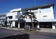
| 本社所在地 | 神奈川県横浜市中区桜木町3-8 横浜塩業ビル |
| TEL | 045-212-8150(大代表) |
| URL | http://www.pado.co.jp/ http://www.padotown.net/(ぱどタウン) |
| 設立 | 1987(昭和62)年8月 |
| 創刊 | 1987年10月1日 |
| 従業員数 | 194名(2004年3月末現在) |
| 事業内容 | 1.「情報紙ぱど」の発行、配布 2.フランチャイズシステムによる「情報紙ぱど」の発行、配布 3.ダイレクトメール・チラシなどの配布事業 4.各種の地域情報の提供 5.インターネット・モバイル関連事業 6.宣伝・広告物・催事の企画、制作、運営および代理店業務 |
「LETS」プログラムへのご入会や製品のご購入については、お取引のある販売店様へお問い合わせ・ご注文くださいますようお願いいたします。