このコーナーでは、同年にリリースの「LETS」新書体にスポットを当て、書体が作成された経緯や誕生秘話などを、フォントデザイナーからの視点でお伝えします。
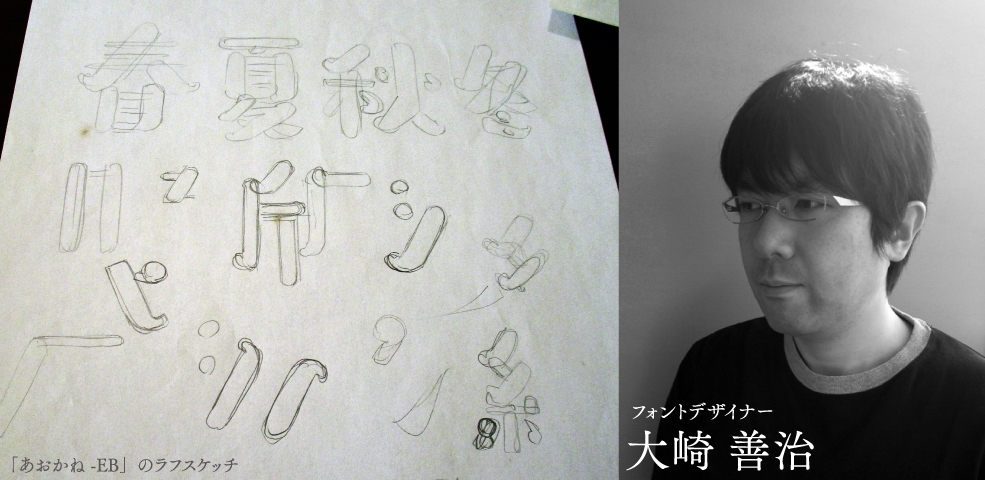
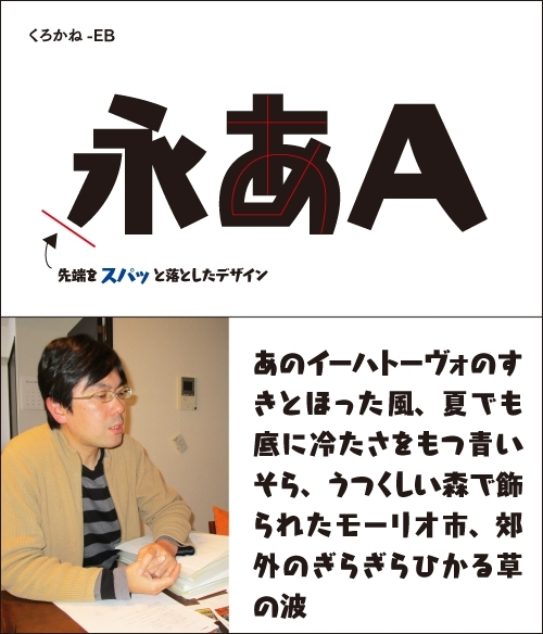
今回は、2015年2月にリリースの「LETS」新書体より、フォントワークスコレクション(デザインクラブ※)の「あおかね-EB」について、フォントデザイナーの大崎 善治氏にインタビューを行ないました。大崎氏は、「あおかね-EB」のほか、書籍のタイトル、広告の見出しなどといった紙媒体はもちろん、バラエティ番組などのテレビテロップや、スマートフォン向けのアプリケーションなどでも広く使用されている人気の書体「くろかね-EB」のデザインも手掛けられています。 「あおかね-EB」、そして「くろかね-EB」の誕生について、制作時の思い出や、完成後の気持ちについて伺いました。
※デザインクラブは、これまでにないジャンルを切り開く、新進の書体デザイナーがデザインし、フォントワークスがプロデュースした個性あふれる書体を集めたシリーズのカテゴリです。
新書体「あおかね-EB」について成り立ちとコンセプト
早速ですが、今回の新書体「あおかね」について教えてください。「あおかね」は「くろかね」のリリースに続いて、第二弾の作品ですが、この書体はどういった思いで制作されたのですか?
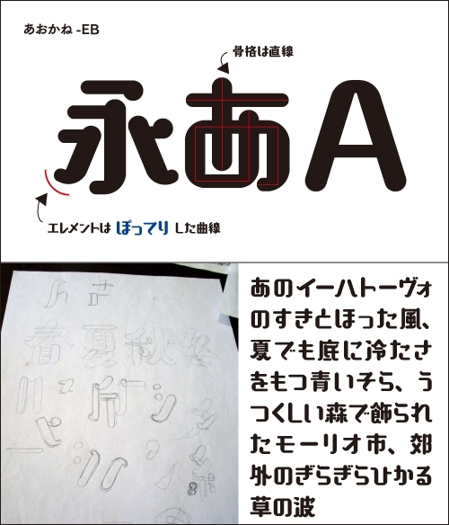
もともとウエイトの太い書体が好きなので、次に書体を作るときにも太いものでいこうと思っていました。「くろかね」が“カクカク”感のあるデザインだったので、その反動というか、今度は曲線を活かしたものを作りたいなと思って取りかかったのが「あおかね」です。
見ためはぽってりとした姿なんですけど、文字の中心線である骨格は直線的という「硬いんだけど柔らかい」っていうあたりをコンセプトにしています。文字の形で、見ため的にわかりやすいところになるエレメントのデザインについてですが、最初は太さの変化を、個々の文字で自由にしようかなと思っていました。全体としての黒みがあっていれば、それでいいかなあと。
なのでサンプルの段階では、同じ処理の部分でもはばをもたせていたんですけど、画数の多い文字のことや、エレメントのデザイン処理の統一などを思うと、「面白いけどダメか~」と、名残惜しさを感じながらも、当初のコンセプトを保ちながら整理して今のデザインに落ち着きました。
そういった想いで完成された「あおかね」。どんなところで使うのに適していると思われますか?
丸くやわらかい印象になるように制作してきたので、言葉をやさしく包み込んでくれるような印象を、見る人が持てるようなフォントになっているのではないかなあと思っています。使用状況としては、やはり「くろかね」同様にタイトルやコピーなど、少し大きめのサイズで表示できるところに似合うのではないでしょうか。
ですが、フォントというのは世に出てみると、作り手が思ってもみなかったような嬉しい使い方をされていることも多いように感じますので、これから「あおかね」がどんな風に使ってもらえるのか、楽しみです。
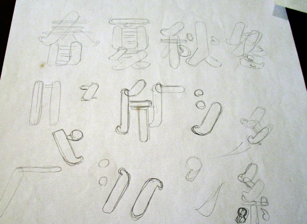
いちばん最初に制作したサンプル(写真)。 同じ縦線でも“偏にくるのか旁にくるのか”“画数が多いのか少ないのか”などによってかなりの変化がある。 ひらがなも当初は全体的にもっとボリュームがあったが、いずれも最終的には統一させる感じで落ち着いた。
デザインしたフォントが使われているのを見つけたときの気持ち
“作り手が思ってもみなかった嬉しい使われ方”というと、どういった使われ方でしょうか、ご紹介いただけますか?
大崎氏は主にAdobe Illustratorを使用してフォントを制作。 グラフィックデザインで慣れたIllustratorのペジェ曲線の感じが一番良いとのこと。 コード表の区ごとにAIファイルで管理し、書体の黒みを比較•確認。 最終的にはFontgrapherに貼り込んで調整している。
一番は、スマートフォン向けのアプリケーションに「くろかね」をご使用いただいていることです。これはCMでもよく見かけるので、ご存知の方は多いかもしれませんね。
タイトルのような短い文章によく似合うかもと思って作った「くろかね」ですが、それだけに留まらず、表示されるテキスト全般に使ってもらっているということにびっくりしましたし、本当に嬉しかったです。ネット上でフォント名が検索されるようになったのも、このアプリで使われている影響が大きいのかなと思っています。
あの人気のパズルゲームですね! 「くろかね-EB」ってどういうフォント?って聞かれたときに使用例として挙げるとすぐに分かってもらえるくらい有名ですよね。 その他にも、エピソードなどあればお聞かせください。
そうですね、「LETS」のユーザーさんは紙媒体から映像まで幅広くいらっしゃるので、チラシやテレビなど、自然と普段の生活で目にする機会は多くなってきているように思っています。見つけたときは「おっ!使われてる」って嬉しくなりますね。
例えば、たまたま通りかかった東京・上野駅のJRと地下鉄の改札を結ぶ連絡通路にバーンと貼り出されていた動物園(?)だったかの広告に「くろかね」が使われているのに遭遇したことがあります。大きく「パンダ」と表示されていたのですが、「まさにくろかねのデザインを表したようなコピーだよなぁ〜」と。
そこはエスカレーターでしたが、そんな「くろかね」発見!のときは立ち止まって眺めたりしています(笑)。
「くろかね-EB」のデザインができるまで
その「くろかね」の誕生について、リリースまでに紆余曲折あったと伺っています。もともとグラフィックデザインをされていて、後にフォントデザイナーとして活動をされるようになったからだということですが、どのような経緯でグラフィックデザイナーになられたのですか?
実を言いますと...もともと「グラフィックデザイナーになりたい!」と強い意志を持ってなったわけではなく、興味の赴くままに進んでいって今に至るという感じです。 昔、書店で働いていた時期があって、そこで様々なジャンルの本を見ながら、こういうのを作っている人もいるんだよなあと意識するようになっていったんです。
さらにその書店には、美術系の専門学校に通っている学生さんがアルバイトでいまして、その方から、その世界のことや本のデザインを勉強する学校があるんだということを聞いてるうちに、作るほうに興味が湧いてきたんです。勉強してみるのも楽しそうだなあって。
それで書店をやめるんですけど、結局いろんな事情で学校には行かず、いきなり働ける先を探し、運がいいことにとある写植屋さんに入れまして、デリバリーとか文字入力とかやりながら、写植オペレータとして働きだしました。書体見本帳やデザイナーさんの指定紙とか、初体験で楽しかったです。
ほどなく仕事の大半がほぼMacでという流れになってきまして、両方使うようになりました。仕事内容もMacのほうでは人手不足からか、「デザインもやって!」ということになってきました。その後、勤めていた会社がなくなってしまうのですが、当時担当していたシリーズ本の仕事を投げ出す訳にもいかず、そのまま独立。
なので気がついたらデザイナー?みたいな。なんか不思議な感覚でした。だから最初は、この肩書きを名乗ってもいいのかな…と恥ずかしかったのを覚えています。
その後、フォントデザイナーとしてフォントワークスから「くろかね」をリリースするまでに、どのような経緯がありましたか?
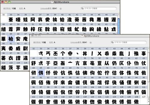
「くろかね」のFOGファイル。 「くろかね」は、JIS第1水準にあるアジアの「亜」から順々に作成。 制作を進めていき、JIS第2水準の「イ=人偏」に見られるように、 同じ「偏」が続くようになって改めてデザイン調整をしたいと思われたとのこと。
写植に出会った当初、見本帳をみて「こんなにもたくさんの書体があるのか!」って驚きました。同じメッセージでもどんな書体を使うのかによって印象がかわるじゃないですか。書体の役割ってすごいなあ、文字ってすごいなあって。そんな中、“1,000文字程度の文字を作ってそれをフォントにして販売する”という活動の存在を知り、軽い気持ちで「私でもできるかも?」と思って参加します。なのでこれが書体を作るもともとのきっかけです。
それで、いざ始めてみる訳ですが、作り方なんて知りませんからね(笑)。 “偏と旁があるから、組み合わせて作っていけばいいんだよね”といったくらいのことしか分からず、とりあえず渡された文字コードの先頭から文字を描き始めていったんですけど、いくら1000文字とはいえ、まずはその数に圧倒されましてね。また、文字のエレメント処理の整合性がとれてなかったり、他の仕事で制作しない日が続くと前に作った文字のバランスを変えたいと思い、また先頭まで戻ったりしてと、もうエンドレスです。ついには開き直って逆に不慣れな感じを活かしたデザインをコンセプトにしたものにしよう!とかって(笑)。
でも、この活動があったおかげで「書体制作を生業にできたらな」と思いまして、それで、藤田さん(FWのフォントデザイナー)を紹介してもらい、プレゼン・制作を開始したのが「くろかね」になります。
最初の作り方がよくなかったですから、「くろかね」はちゃんやろう!ということで、複数の太さの基準や文字の分類などをやりながら制作をはじめたんですけど、大分制作が進んでいた中、ある方から、作り方のコツみたいなのをひとつ教えてもらいましてね。で、急きょその方法にトライするんですけど、そこで壮大なループにはまってしまい、いやあ、大変な思いをしました(苦笑)。
その壮大なループとは、いったいどんなことだったんでしょうか?
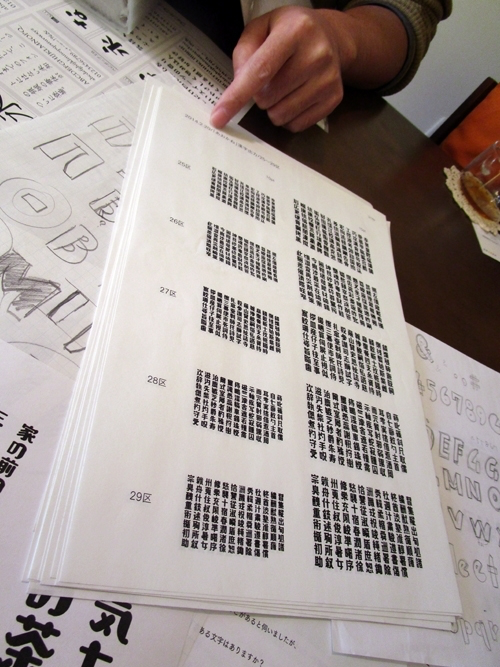
「くろかね」は、私が[Adobe-Japan1-3]規格の9,354文字までを作成した初めての書体なんですが、いろいろな設定や文字の分類などをやりながらも、基本はそれまでのやり方であるコード表の最初の文字から描き始めるという順序で取り組みはじめました。
そのため、[JIS第1水準]が終わった段階で[JIS第2水準]へという流れをとっている訳ですけど、第2水準は偏ごとに並んでいるので、その偏を使った文字の制作が続いていくんですね。すると、第1水準以上に偏と旁のバランスの取り方に対して意識が強くなり、最初には見えていなかったものが見えてきたんですね。それで結局は、いくつかの偏のデザインやバランスに修正を加えることとして、終わっていたはずの第1水準にも再び手を入れはじめ…。これが壮大なループです(苦笑)。
最後は苦行といっても過言ではないくらいの思いで、5年かかって完成まで辿り着きました(笑)。それ以来、あんまり使わない第2水準を先にやって感覚をしっかり叩き込んでから、頻出する第1水準を制作するというやり方にしています。
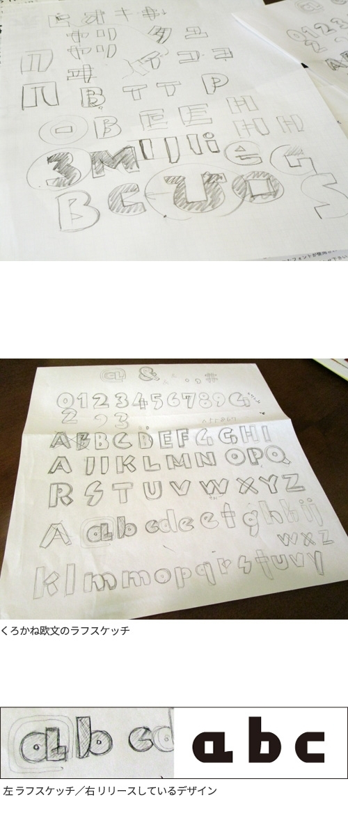
9,354文字をお一人で全て作成すると思うだけでも気が遠くなりそうな作業ですね。それをデザインの構成も考えながらとなると...。 当時のラフスケッチなど残されていましたらお見せいただけますか?
和文のスケッチはなぜか見当たらなくて、「くろかね」の欧文のラフスケッチをお見せします。欧文はけっこう自由にやったのですが、私にとっては日本語のように会話などで普通に使っている言語の文字ではないので、上手くまとまらないところもけっこうあり、多くの方にアドバイスをいただいてなんとか形にできました。
このほかギリシャ文字やキリル文字も作りましたが、日本の書体制作はほんと多くの字種を作らないといけないのだなあ...というのを制作を通して改めて感じました。
「くろかね」は、文字の持ってるパワーも強く、キャッチーな書体が欲しいと願って制作いただいたフォントだったので、広く使っていただいているのを見ると、フォントをリリースしている弊社としても大成功だと感じています!!
それでは最後の質問ですが、今後はどういったフォントの作成を考えられていますか?
「くろかね」は、最近生活していると自然に目に入ってくるくらいにまで使って頂いて、ほんとに嬉しい限りです。まさかこんなになるとは思っていなかったので、ほんと、自分でもびっくりです。
今後は、そうですね、最初にもいいましたが太いウエイトのものが好みなので、作るとしたらその方向だと思っています。「あおかね」がわりと揃った感じのデザインだったので、次はより自由でくだけたラフな感じがいいかなと思っています。すべての字種を全部1人で作るという作業は、誰もが経験できるわけではない“特別な機会”だと思っているので、これからもがんばって制作していきたいと思いますが、今、5年で1書体のペースなので、もうちょっと制作スピードを早くしたほうがいいですか、ね(笑)。
大崎善治氏 プロフィール
グラフィックデザイナー、書体デザイナー。
1973年埼玉県生まれ。活版印刷を用いたタイポグラフィ作品からオリジナルの和文書体まで、文字にまつわるデザインを幅広くおこなう。
著書に『タイポグラフィの基本ルール』『レイアウトの基本ルール』がある。
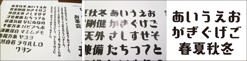
LETS会員様からの「くろかね-EB」の使用箇所と使用感のご紹介
パン屋さんの広告やチラシを作るときに使用。太くて丸みのあるデザインに、配色を工夫してもっと柔らかい印象を演出。
子ども向けのワークショップをアピールする広告で使用。紙を切り貼りしたようなデザインは、手づくり感があってピッタリ。
メカのイベント告知のポスターで使用。家族連れに親しんでもらえるようなデザインを目指し、フォントに飾りをつけてブリキ感を演出。
食品パッケージに使用。明朝体ともゴシック体とも違った新鮮なデザインで、消費者様からも高評価。
テーマパークのお土産パッケージに使用。カチッとした中にも柔らかさや遊びごころがあり、イメージキャラクターとの相性も良い。
無料通話やメールのアプリで使うスタンプに使用。デザインをそのまま使っても、短いフレーズでインパクトのあるスタンプが完成。