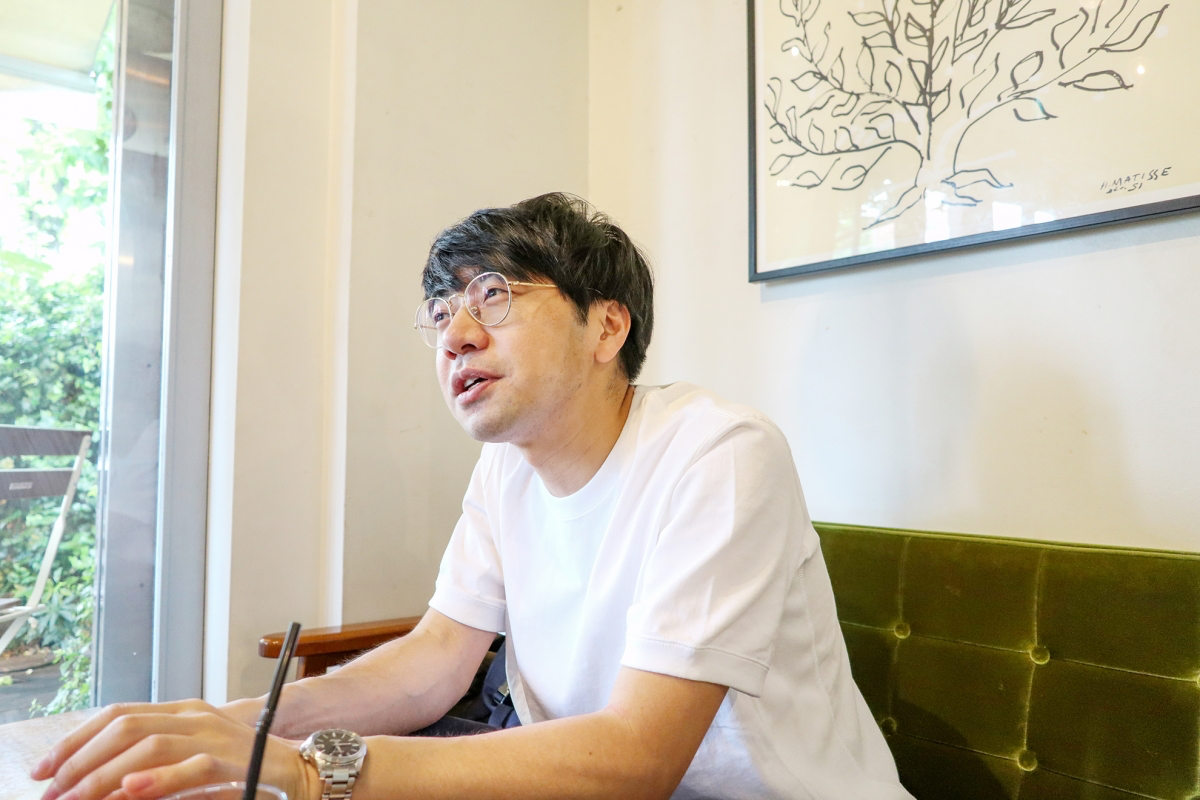
Hello, this is sales department Ando.
Last article After coming out (?) From Font Fetish in, I decided to start a new series "Adventures around Fonts" to meet the people I want to meet. For the first time, we visited the “sakana bacca” store in Nakameguro to talk to Yosuke Watanabe, a designer at Hoodison Co., Ltd., who proposes a new way of utilizing fisheries for IT.
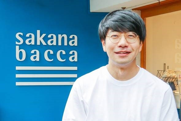
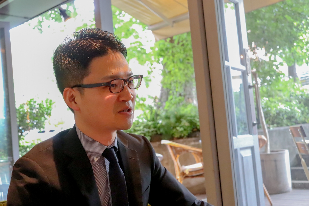
Yousuke Watanabe
Born in Tokyo in 1977. Shares that operate a fish wholesale system "Uo-Pochi" for 10,000 restaurants in the Tokyo metropolitan area, a fresh fish retail store "sakana bacca" located at four locations in Tokyo, and a staffing service "Food Human Resources Bank" for mass sales and restaurants Participated in October 2014 as an initial member of the company Hoodison. Contributing to business promotion in a wide range of sales promotion activities and promotion such as CI, stores, brand concept, UI / UX, Web, video. Since October 2018, he has been operating the business as the business manager of “sakana bacca”, and has begun not only designing but also essential branding.
As a "connecting producer and consumer"
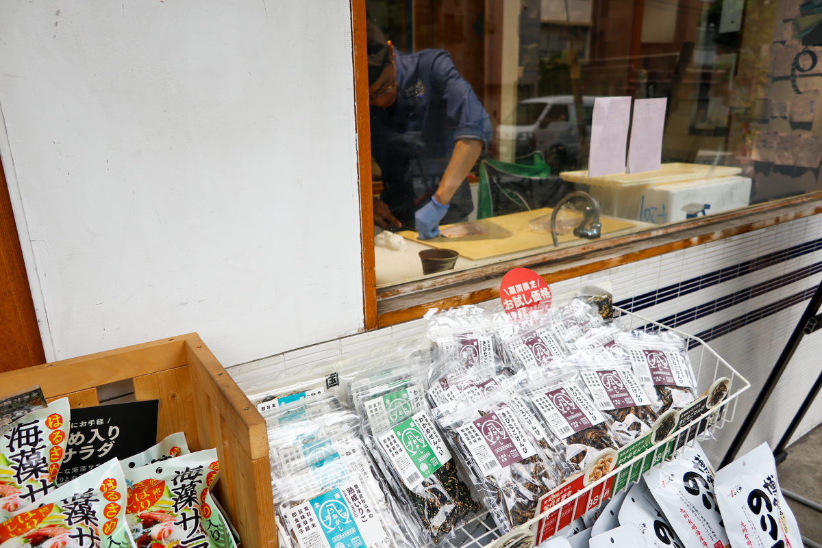
-- It's been four years since I met you, but today was my first time visiting the "sakana bacca" store. The interior of the store is TsukuGo (laughs).
Watanabe: That's right (laughs).
-- Once again, please tell us briefly about your company.
Watanabe: Foodison is a venture company founded in April 2013. With the mission of "making food more fun around the world," we are expanding our business with the aim of rebuilding the seafood distribution platform and revitalizing the entire seafood industry.
-- In focusing on the fisheries sector, I think one of your company's unique features is that, despite being an IT company, you actually operate a fish shop in the city. What was the reason you insisted on opening a fish shop?
Watanabe: In 1982, there were nearly 54,000 fish shops in Japan, but now there are fewer than 20,000*. There are very few street-side fish shops. Globally, especially in Asia, fish consumption has increased considerably, but in Japan, fish consumption finally fell short of meat consumption a few years ago. No matter how hard fishermen try to catch, the fish do not reach the consumers. Within our company, Yamamoto (CEO) had a strong desire to open a fish shop, so we decided to open one ourselves first.
*From the Ministry of Economy, Trade and Industry's Commercial Statistics
-- But isn't it difficult to actually run a store?
Watanabe: We believe that it is best to connect producers with consumers, and we were looking for a place where we could have contact with consumers. There is information that can only be obtained from consumers, and we feel that opening a store is meaningful. However, it is still difficult. First of all, it is very difficult to get the understanding of fishmongers to open a store.
- What do you mean?
Watanabe: Fish shops have an image of being smelly and dirty. In December 2014, we opened our first "sakana bacca" store in Musashi-Koyama (now closed), where a fish shop had been located, so the opening went fairly smoothly. However, in the case of our second store in Nakameguro, a kushikatsu restaurant had previously been located there, and even though it was a similar business, we had a hard time getting the owner to understand. When persuading the owner, the concept we appealed to was "bright, clean, and easy for young people to enter," which was a departure from the conventional image of a fish shop.
-- Opening a fish shop in a quiet residential area of Nakameguro must have been quite a challenge, right?
Watanabe: Yes. It's not particularly close to the nearest station, and there's no road to the store. But I turned a blind eye to that (laughs). When I first opened the Nakameguro store, I wanted to create a luxury fish shop. I thought that even if the prices were a little higher, customers would buy from me if I offered high-quality products.
――How was your reaction?
Watanabe: To be honest, the results did not come out for 1-2 years after opening the store. However, cars go well on Komazawa Street. It seems that it was easy to get the impression of “what shop?” Because of the blue appearance, and due to the sales efforts of the store manager, the recognition gradually spread and more people use it on a daily basis ( Lol). Recently, more and more people are coming in after work.
--Specifically, do you have a target group that you envision at the Nakameguro store?
Watanabe: It's not limited to Nakameguro, but a woman in her late 20s to 40s. From now on, we will give top priority to how to provide safe and delicious fish to those who will raise children and pass on the fish food culture to the next generation.
――While the target layer has been clearly set, what are the points in appealing to that layer?
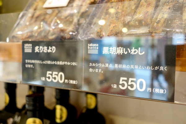
Watanabe: We of course provided delicious fish, but we also thought about differentiating factors such as being able to see where they were judged and selling face-to-face. Also, I personally think that the most important element in branding is the "typeface." I think that even for customers who visit stores, the typeface is information that they potentially recognize even if they are not aware of it. It's obvious whether you're looking at a store that has a unified typeface, or a disjointed typeface that doesn't have a unified typeface, and which one your customers prefer in the end.
――So it's finally time for us.
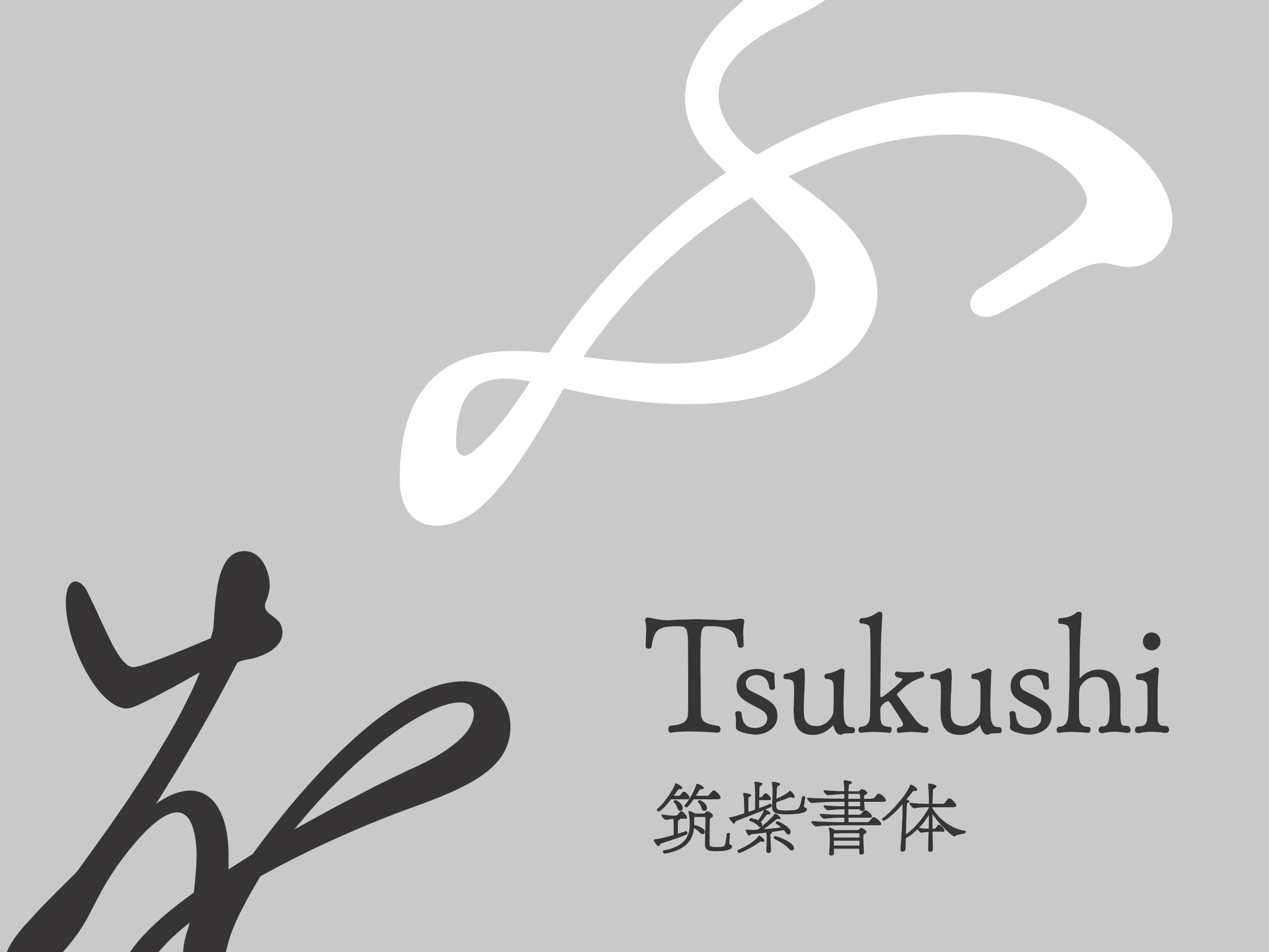
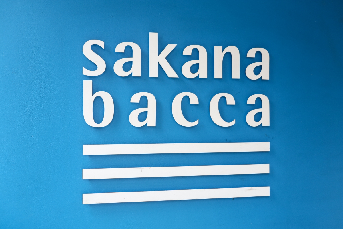
"sakana bacca" is the only choice for TsukuGo!
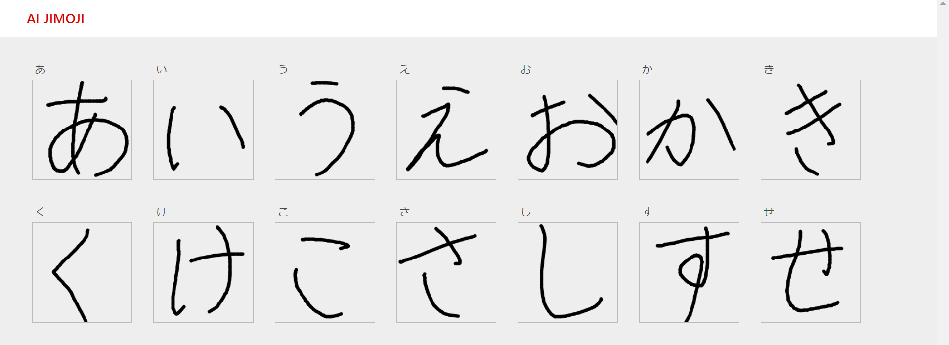
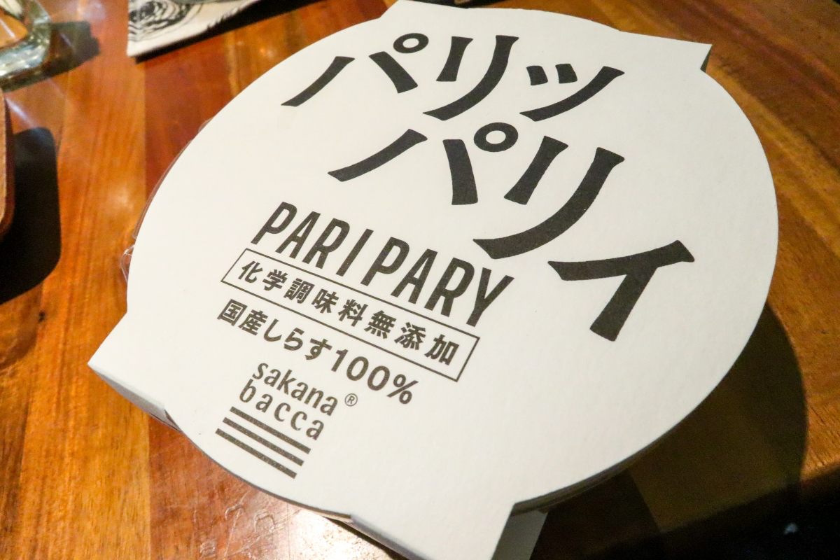
-- I heard that you have been using Tsukushi typefaces as your main font since you signed a new contract with LETS in October 2014. What is your current situation?
Watanabe: When we decided on the brand concept for "sakana bacca" in November 2014, we established a regulation that we would not use any Japanese fonts other than TsukuGo. This rule continues to this day.
-- That's very much appreciated! What do you think is the appeal of the Tsukushi typeface?
Watanabe: I guess it's "emotion." Compared to other fonts, it's a font with an overwhelming atmosphere. In my previous job, I was an art director at a printing company, and I remember being shocked when I used Tsukushi fonts for editorial design.
-- Is there any reason why you use the Tsukushi typefaces so frequently, and TsukuGo in particular?
Watanabe: Personally, I like TsukuGo because it makes food look the most delicious.
--Shigenobu Fujita, the designer who created TsukuGo, mainly produced Ming typefaces at his previous company, so the Gothic fonts he creates somehow have the feminine, soft atmosphere of Ming typefaces. It also happens to match the target demographic of your company.
Watanabe: I see. It's already come together beautifully (laughs). To begin with, fish shops tend to use calligraphy and Ming style, but we decided to go with Gothic. From the store design onwards, we wanted to overturn the traditional image of a fish shop.
-- We may be the first to say this, but don't you get bored of using TsukuGo? (laughs)
Watanabe: I think it's important to continue doing the same thing in branding, so I think we'll continue using TsukuGo.
-- Have you tried other Japanese fonts?
Watanabe: Yes (laughs).
Aiming to eliminate "information asymmetry"
--Since last October, you have become the general manager of "sakana bacca" as well as your conventional design work, and I think that the areas you should pay attention to have expanded further. What are you most worried about at work now?
Watanabe: Is it part of the responsibility for store sales figures (laughs)? The rest is to formulate and promote a new store opening plan. Since opening a new store in Ecute Shinagawa, which has high customer liquidity in March of this year, we have received many calls from many people.
--There are area characteristics, so opening a store is not easy, right?
Watanabe: That's why I originally imagined an overseas market (market) selling aquapatsa, paella, etc., but when I actually opened the store, I heard that I like simmering and want to eat sashimi (lol) ). From now on, I would like to continue to grasp the needs of customers, and also to value the "freshness" of the store, and aim to develop attractive stores.
―― Above all, I agree with the difficulty of chasing numbers (laughs).
Watanabe: However, I feel that I am able to take responsibility for numbers such as store sales and make statements that really enhance the brand value. For example, we are in the process of reassessing all of the in-store pop, etc., but the fact that the backing of the remarks has become clearer makes me feel that we can provide accurate advice.
――As your company and Mr. Watanabe have changed their positions, how do you want to contribute to the fisheries distribution industry in the future?
Watanabe: As a major theme, I would like to create a platform for fisheries distribution as a whole. We would like to eliminate the "information asymmetry" between the production area and the consumption area. In particular, we would like to create a situation where consumers can purchase fish at an appropriate price and easily eat fish by improving logistics. By doing so, farmers will also be able to make money, and as a result, a good cycle of fish will be created.
――It's wonderful spirit. Thank you for your valuable story today!
After Recording After the interview ...
Watanabe-san has been talking freely about his secret love for Chikushi since we first met in April 2015. We were fortunate to have the opportunity to have him express those feelings even more directly in the form of a long interview.
His devotion to the Tsukushi font remains the same, and as a salesperson, I was able to hear many happy words that made me want to jump for TsukuGo, such as "From a branding perspective, we have decided that the Japanese font for 'sakana bacca' will be Tsukushi Gothic." I was also happy to be able to dig deeper into more personal aspects of Watanabe, such as his personal upbringing and musical tastes. However, personally, I was very interested in his strong sense of crisis about the current state of seafood distribution and his strong will to overcome it through trial and error.
Watanabe-san has stepped forward from his role as a designer and has been involved in the management of the fish shop as the manager of the "sakana bacca" business since the latter half of last year. When asked what he finds the most difficult right now, he lamented, "Maybe it's the responsibility for the numbers (store sales)," but his face was somehow full of confidence and seemed to be enjoying it.
I hope that Chikushi Typeface will continue to be a strong ally for Foodison, which is bringing a breath of fresh air to the world of seafood distribution, and above all for Watanabe. This interview reinforced this feeling.
Interview cooperation = "sakana bacca"
Photo = Mamezo