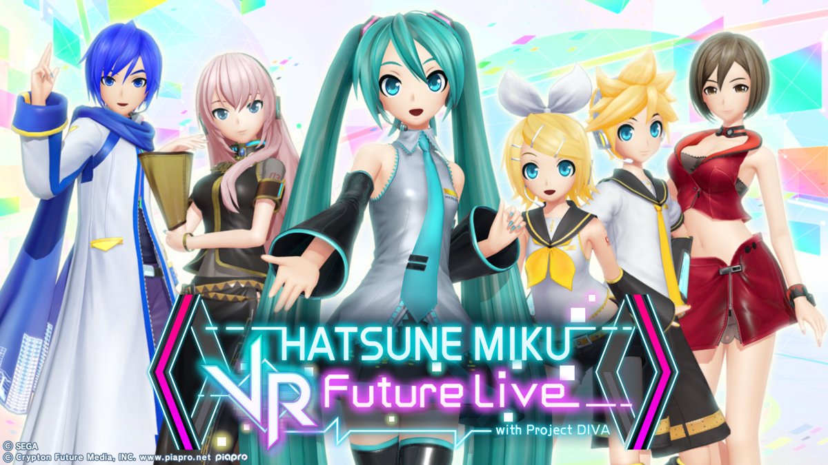
バーチャル・シンガー『初音ミク』は、音声合成システムから生まれたキャラクター。発売当時から人気のコンテンツとなり、ゲームソフトや、キャラクターフィギュアなど関連商品も多数リリースされています。
今回は、『初音ミク』として初のVRライブコンサートとなる、PS VR『初音ミク VRフューチャーライブ』に採用されたフォントについて、その経緯などを伺いました。
© SEGA
© Crypton Future Media, INC. www.piapro.net
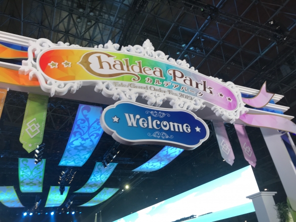
VRゲームの先駆けとなった『初音ミク VRフューチャーライブ』
制作経緯からフォント選定
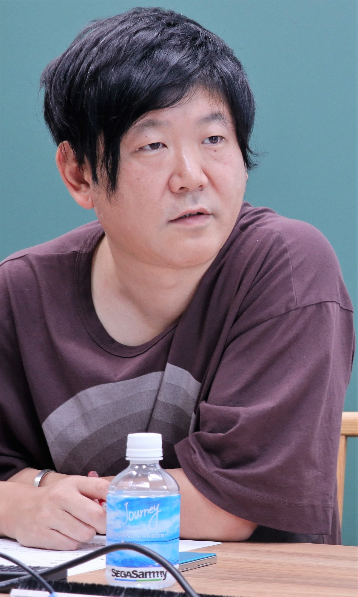
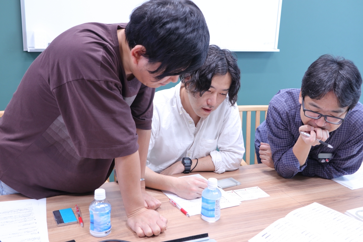
第1事業部 第1開発2部
第1デザインセクション リードデザイナー
安部 道郎 氏
――『初音ミク VRフューチャーライブ』(2016年10月配信開始)の制作経緯から、改めてお伺いできますでしょうか?
安部:当時は「PlayStation VR」という新しいハードが発売される(※1)ということで、弊社としてもVRに対してソフト開発していこうという機運が高まったタイミングでした。どのゲームがVRと親和性が高いかと考えたときに、デジタルフィギュア的な扱いのあった「初音ミク」でまずは開発してみようと。当初は研究・検証的なニュアンスが強かったですが、デモ版をE3(Electronic Entertainment Expo)で発表して、そこでの評判が良かったということも有って、製品版(VRフューチャーライブ)をリリースしたという流れです。弊社としてVRの商業的な製品として世に出したのは、このタイトルが初めてでしたね。
※1 「PlayStation VR」は2016年10月に発売された。
第2事業部 第2開発2部
第1デザインセクション デザイナー
甲斐 彰 氏
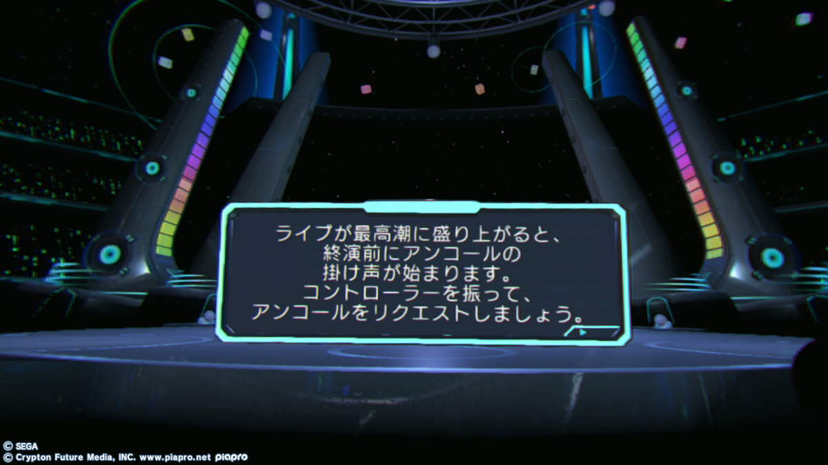
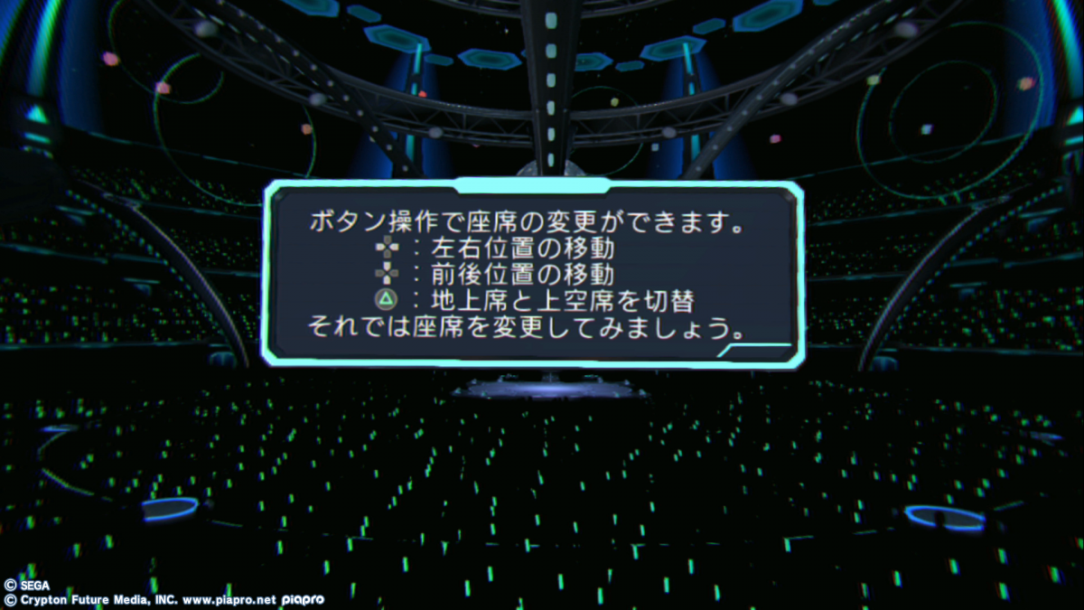
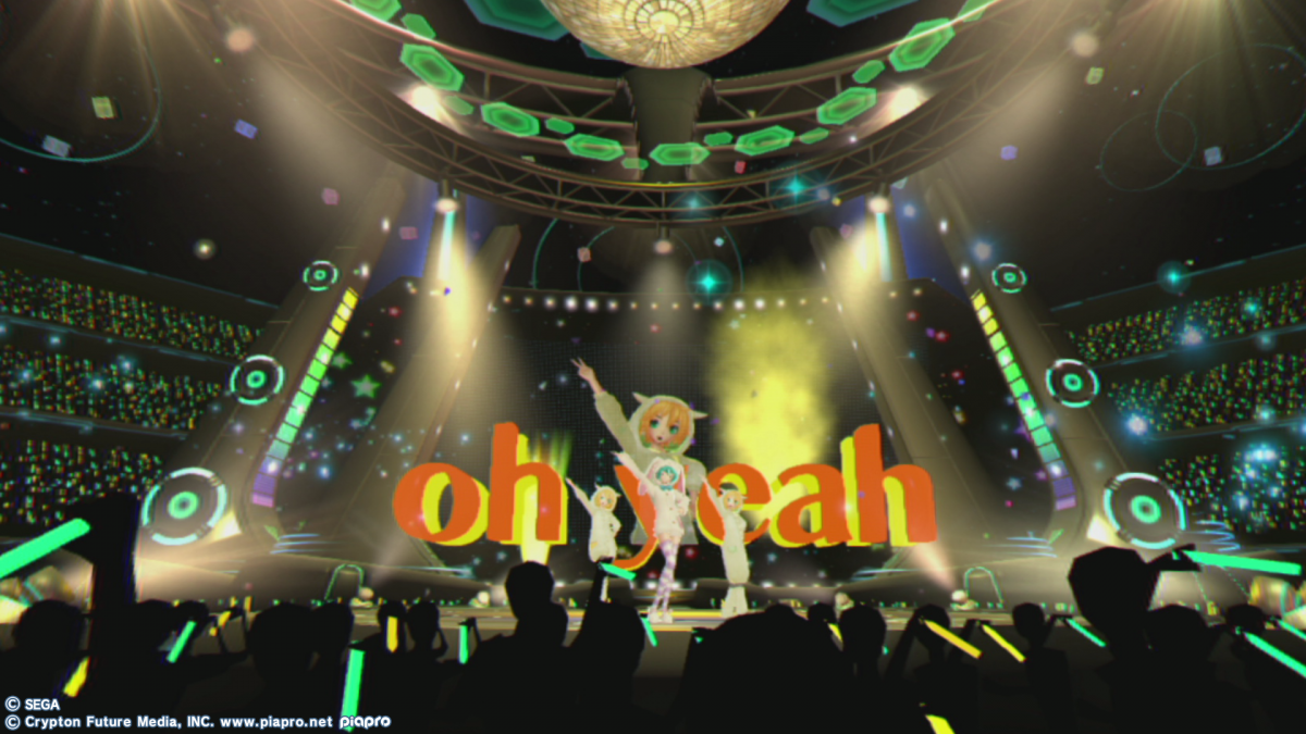
―― 『初音ミク VRフューチャーライブ』の中では、チュートリアルで「ニューロダン」をご使用頂いてます。システムフォントとして「ニューロダン」を選定頂いた経緯を教えてください。
甲斐:「ニューロダン」を選定した理由は3点有ります。
1点目は『初音ミク VRフューチャーライブ』の世界観に合致していたことです。初音ミク自体が現代のバーチャルアイコンで、現代の印象に近いサンセリフ(ゴシック)体で選定を進めました。
2点目はフォント自体の汎用性が高いこと。初音ミクの冠が付くタイトルは沢山有り、楽曲の数だけ作者がいます。作者の世界観は楽曲毎に異なりますが、汎用的に至る所で使用されるシステムフォントとして、全体の世界観を統一する意味で(良い意味で)個性が主張していない「ニューロダン」が適正と考えました。
3つ目の理由は、VR空間での視認性が高いと判断したことです。VRはヘッドセットを用いて空間を覗き見る形です。そのようなガジェットを通してだと、目にモニターの光が直接来て光の抜け場が有りません。ゲームユーザーが瞬時に識別出来て、分かりやすいものが求められると判断して採用に至りました。
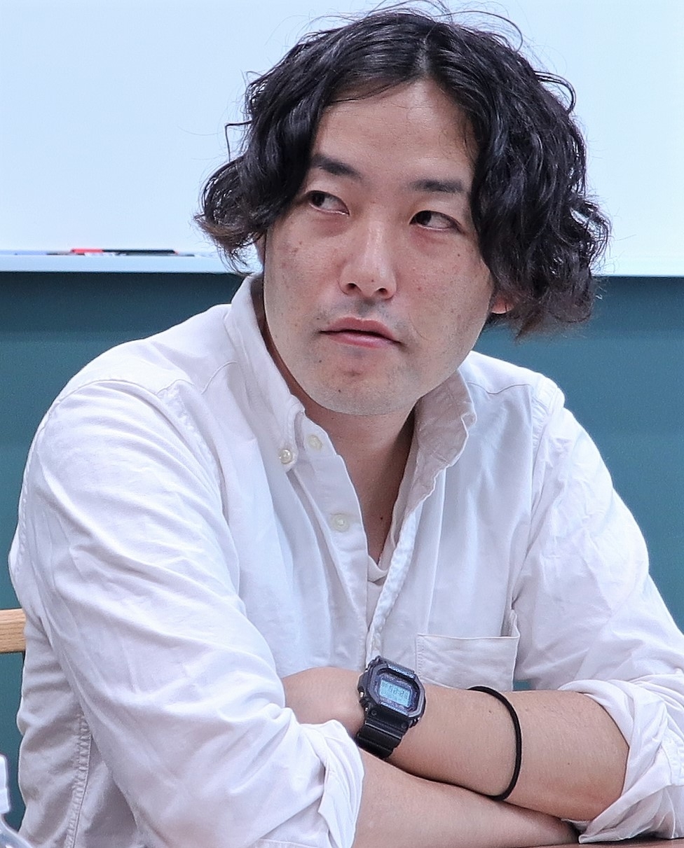
第2事業部 第2開発1部
第1デザインセクション リードデザイナー
深澤 準 氏
―― そもそも、VRという特殊空間ですと、通常のフォント選定とは違った難しさが有りますよね。
深澤:ヘッドセットの解像度の問題も有って、画数の多い複雑な漢字はボールド系だと潰れてしまったり、ヘッドセットを付けて頭や首を動かしながら文字を追いかけると気持ち悪くなってしまったりという難しさが有りました。
ただ、そういった難しさのなかでも、様々な角度から視認性の検証を弊社で行ったところ、パッと見た時に文字が理解できる性質が「ニューロダン」には有りました。情報量が多すぎることなく、ゲームユーザーのストレスを最も軽減できるフラットなフォントと判断して採用した次第です。アルファベットと数字も「ニューロダン」で統一しましたが、ユーザの正確な操作感を保証する意味でも正解だったと思いますね。
「字面の大きな書体なのでそもそもの視認性も優れていますが、英数字の見やすさ、また漢字が潰れないといった点も選定のポイントになりました」(甲斐さん)。
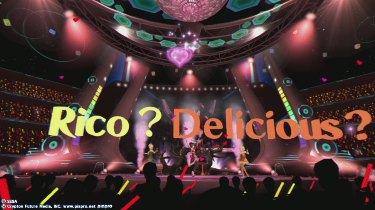
―― 一方で“39”や”Amazing Dolce”といった楽曲では「キアロ」を選定頂きました。こちらの選定理由は?
安部:特に演出が絡む部分は、システムフォントではなく色気や抑揚の有る文字が望ましいと考えました。楽曲に「色」を近づけたような、装飾性が強くデザイン性の高いフォントをと考えて「キアロ」を選択しましたね。
―― 音楽ゲームということで、歌詞表示はどうされたのでしょうか?
安部:歌詞は敢えて出さなかったですね。VRコンテンツは空間への没入感が特性だと思いますし、「ゲームユーザーの没入感を阻害する」という理由で歌詞表示は見送りました。
―― なるほど。その他、文字表現でどんなことに苦労されましたか?
深澤:文字のサイズや行の長さですかね。例えば、横に長すぎると見づらくなるので、インフォメーションボードの横に入れる量をコントロールしました。
安部:今回、2D的なフォントをベースに3Dモデルにトレースして立体のモデルにした使い方をしています。平面だとあっさりして立体感がないので、厚みを付けてあげて「物質感」、迫力を出そうと。VR空間の特性を生かした文字表現として最も訴求できると考えてこの演出に落ち着きましたが、平面のものをVR空間内に実装するということで、調整に相当苦労しましたね(笑)。
チュートリアルでは「ニューロダン」を使用頂いた一方で、「キアロ」などのデザイン系書体も使用頂いた。「システムフォントとは差別化するために、楽曲の中では逆に装飾性が強いものを使用しました」(甲斐さん)。
―― 『初音ミク VRフューチャーライブ』のリリースから3年が経過し、世の中のVRを取り巻く環境も大きく変わりました。VRコンテンツのリリースに関して先陣を切った御社として、今改めて『初音ミク VRフューチャーライブ』の表現に関して思うことは有りますか?
甲斐:我々が思い描く「未来感」に多少のばらつきは有るけれど、現代より一歩進んだ未来感を出したい、新しい体感を提供したいという強い想いを持ってタイトルをリリースしたと記憶しています。VRコンテンツというもの自体、人が今まで体験したことのないものですから。UI的にも未来感を出すことを意識しました。フォント選定に関しても、後悔は何一つないですね。
―― 今後、御社でVRコンテンツを新たにリリースするとなった場合に、チャレンジしたい書体は有りますか?
甲斐:最近、他社のUD角ゴシックを使用して格好良いなと思いましたね(笑)。
―― 弊社でもUD角ゴシックの用意有ります(笑)。まさに「ニューロダン」をベースに、特に英数字の表現にこだわってまして、海外のフォントにも引けを取らないデザインになってます!
深澤:確かに「ニューロダン」と比較して、英数字が非常にすっきりしてて視認性が高いですね。欧米版のコンテンツとも親和性が高そう。「UD角ゴ_ラージ」「UD角ゴ_スモール」、次回のコンテンツから使用させて頂きます(笑)。
「mojimo-VR」について
今回ご紹介したPS VR『初音ミク VRフューチャーライブ』に採用されたフォントなどが収録された、セレクトフォントサービス「mojimo-VR」は、VR空間において、どうしても発生してしまう、レンズのゆがみやライティング、エフェクトの影響による文字の視認性の低下といった課題をクリアしたフォントをご用意しています。
「どの角度から見ても視認性が良い書体」のUD角ゴ_ラージを含めた10書体を提供します。フォントファイルを組込んで使用するUnityなどのゲームエンジンでの開発も、追加費用なしで利用でき、またYouTubeなどの動画共有サイトでのご使用もOK!また、人気アニメやゲームなどで使用実績が豊富なフォントを収録しています。
こちらもぜひお試しください!