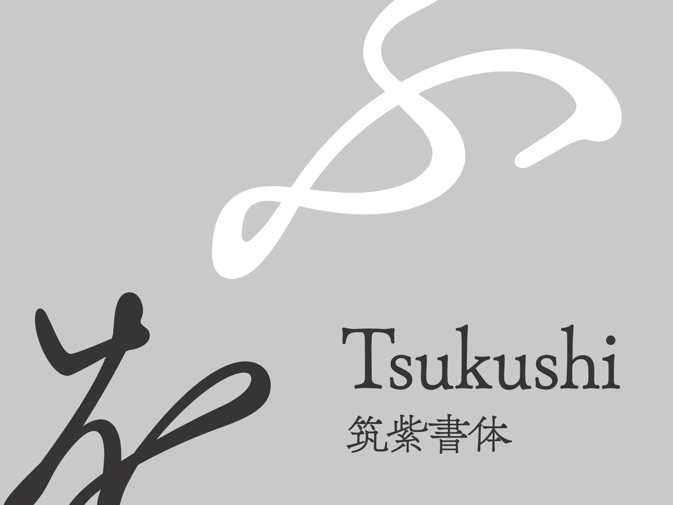
Tsukushi Antique L Mincho L
ちょうどいい文字を、最適な価格で届ける
About fonts
Correspondence service
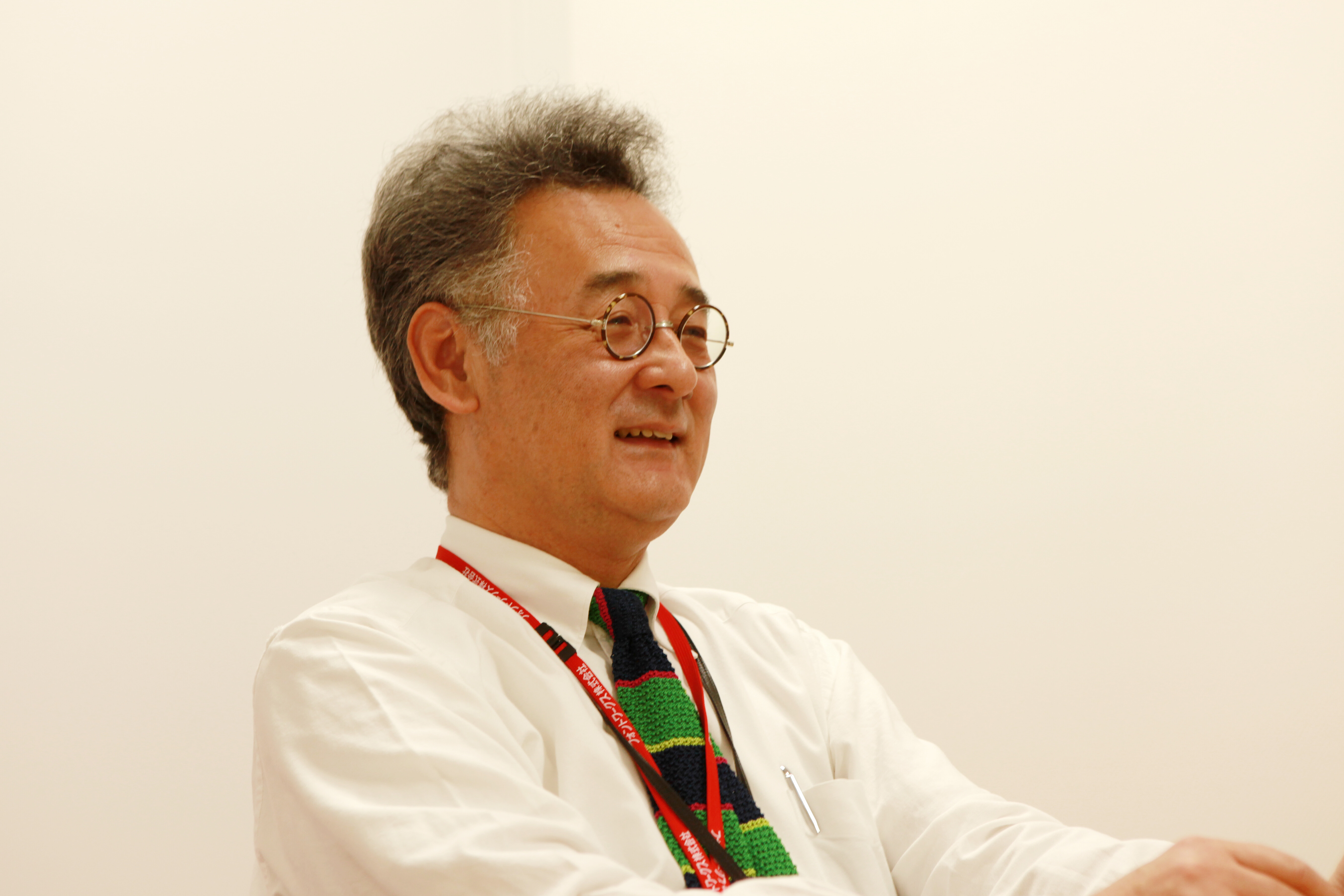
designer

Shigenobu Fujita
Fontworks
Details
- How to read
- Tsukushi Anticuru Mincho
- Font maker
- Fontworks
- Foundry
- Fontworks
- Language:
- Japanese
- category
- Mincho
- Character Sets
- Click here for details
- file size
- 5MB
- OpenType function
- Character width Half-width metric (halt)
- Kerning
- Proportional metrics (palt)
- Vertical type width half-width metrics (vhal)
- Vertical pair kerning (vkrn)
- Vertical Proportional Metrics (vpal)
- Any ligature (dlig)
- Single-width double-byte character (fwid)
- Mono-width half-width character (hwid)
- JIS78 character shape (jp78)
- General ligatures / standard ligatures (liga)
- Proportional glyphs (pwid)
- Old font (trad)
- Vertical type (vert)
Glyph
{{ currentShapeTextTitle }}
- {{ text }}
Font family1 Styles
{{ currentSampleTextTitle }}
- Tsukushi Antique L Mincho L
- {{ currentSampleText }}
detail of function
{{ functionType === 'spec' ? '文字セット' : 'OpenType機能' }}
| OTF | TTF | ||||||||
|---|---|---|---|---|---|---|---|---|---|
| AJ 1-6 | AJ 1-5 | AJ 1-4 | AJ 1-3 | ||||||
| Pr6 | Pr6N | Pr5 | Pr5N | Pro | ProN | Std | StdN | ||
| L | ● | ● | |||||||
Ligature
- General ligatures / standard ligatures (liga)
- Glyph depending on context (calt)
- Any ligature (dlig)
letter
- Small Caps (smcp)
- Uppercase small caps (c2sc)
- Swash-shaped (swsh)
- Design variations (salt)
Number
- Lining number (lnum)
- Old Styles numbers (onum)
- Proportional number (pnum)
- Monospaced numbers (tnum)
- Fraction (frac)
- Superscript ordinal notation (ordn)
Set of designs
- Design set 01-20 (ss ##)
Glyphs with different widths
- Proportional glyphs (pwid)
- Proportional metrics (palt)
- Proportional kana (pkna)
- Single-width double-byte character (fwid)
- Mono-width half-width character (hwid)
- Character width Half-width metric (halt)
- Monospaced triplet (twid)
- Monospaced quartet (qwid)
Culturally different glyphs
- JIS78 character shape (jp78)
- JIS83 character shape (jp83)
- JIS90 character shape (jp90)
- JIS2004 character shape (jp04)
- Old font (trad)
- Glyph for ruby
- Kana for horizontal writing (hkna)
- Standard print font (nlck)
- Modified glyph (nalt)
- Italic
Vertical writing function
- Vertical pair kerning (vkrn)
- Vertical type (vert)
- Vertical Proportional Metrics (vpal)
- Vertical type width half-width metrics (vhal)
- Kana for vertical assembly (vkna)
Other
- Kerning
- Typesetting / decomposition (ccmp)
- Localized glyphs (locl)
- Superscript (sups)
- Subscript
Correspondence service
-

Fontworks LETS
An annual flat-rate font service that allows you to use all of the high-quality, variety of fonts from multiple manufacturers. With a wide variety of lineups, we offer various fonts such as Japanese, Hangul, Simplified Chinese, Traditional Chinese, Thai, and Hebrew.
-
mojimo-manga
Fontworks fonts are never seen in anime and comics. Select the best typeface for designers, illustrators, hobbyists and doujinshi creators.
Usage
-
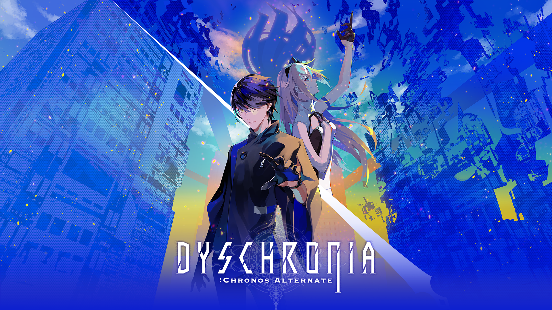
DYSCHRONIA: Chronos Alternate
UD Kakugo_Small M, Tsukushi Gothic M, Tsukushi Antique L Mincho
©Project DYSCHRONIA.
-
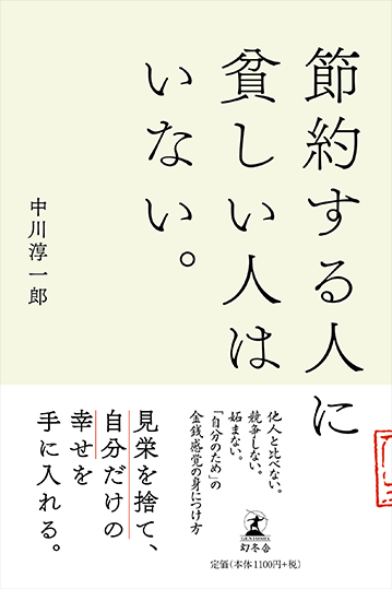
No one saves money.
Tsukushi Antique L Mincho
-
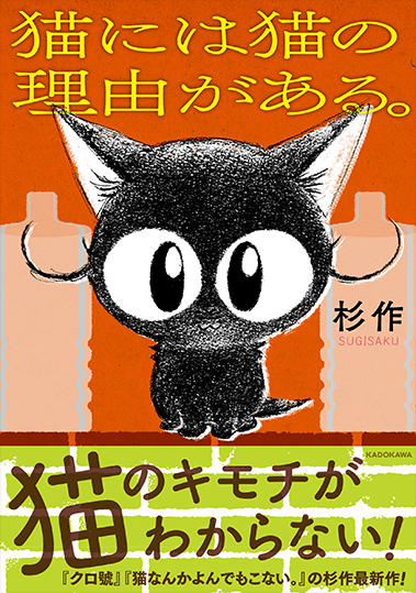
Cats have a cat reason.
Tsukushi Antique L Mincho / Tsukushi A MaruGothic
-
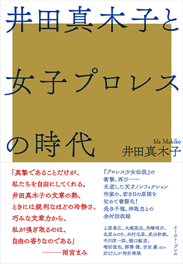
Age of Makiko Ida and female professional wrestling
Tsukushi Antique L Mincho
-
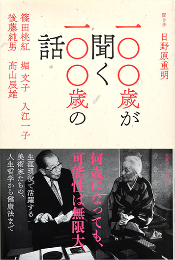
100 years old talk about 100 years old
Tsukushi Antique L Mincho / Tsukushi C Old Mincho
-
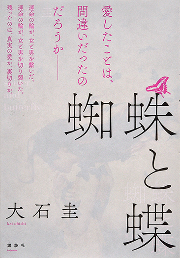
Spider and butterfly
Tsukushi Antique L Mincho / Tsukushi C Old Mincho
-
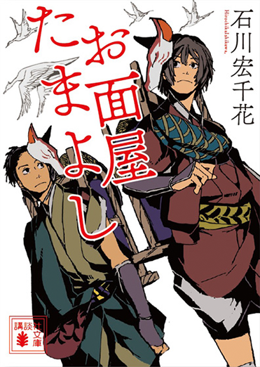
Mask shop Tamayoshi
Tsukushi Antique L Mincho
-
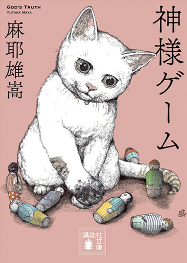
God game
Tsukushi Antique L Mincho
-
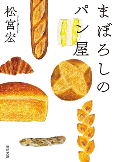
Phantom bakery
Tsukushi Antique L Mincho
Related article

© 2024 Fontworks Inc., a Monotype company.