Hello, I'm Mamezo, who used to read "bonbon" and "corocoro" at the manga club when I was in elementary school.
When I was a kid, I used to read manga, and I imitated myself and drew illustrations in my notebook. It was such a boy Mamezo, but since he was a male brother, he never had a chance to come into contact with shojo manga.
But I know, "Ribon". When I talked to the women in Fontworks, I found that most of them were "Ribbon-ko".
I was involved in the 65th anniversary project of Ribon, so it's exciting! yes.
This time, I would like to introduce the reason why I got involved in this project and the story of the production of "Ribon Photo" (by Type Designers Morita-kun).
The beginning is... "Moji Fes."
Looking back, it started with a single phone call in mid-December 2019.
"Noramoji Discovery Project" A call from Mr. Shimohama. I heard from Mr. Shimohama about this "Ribon Font" and participated in "No, I really want to do this!".
Held in November with Shimohama "Moji Fes." Was in October before that Pre-exhibition at "NEW TOWN 2019" It was a pleasure to meet you when I did it, but I'm glad to have another wonderful and enjoyable work together.
We interviewed all the members as a “Noramoji Discovery Project”.
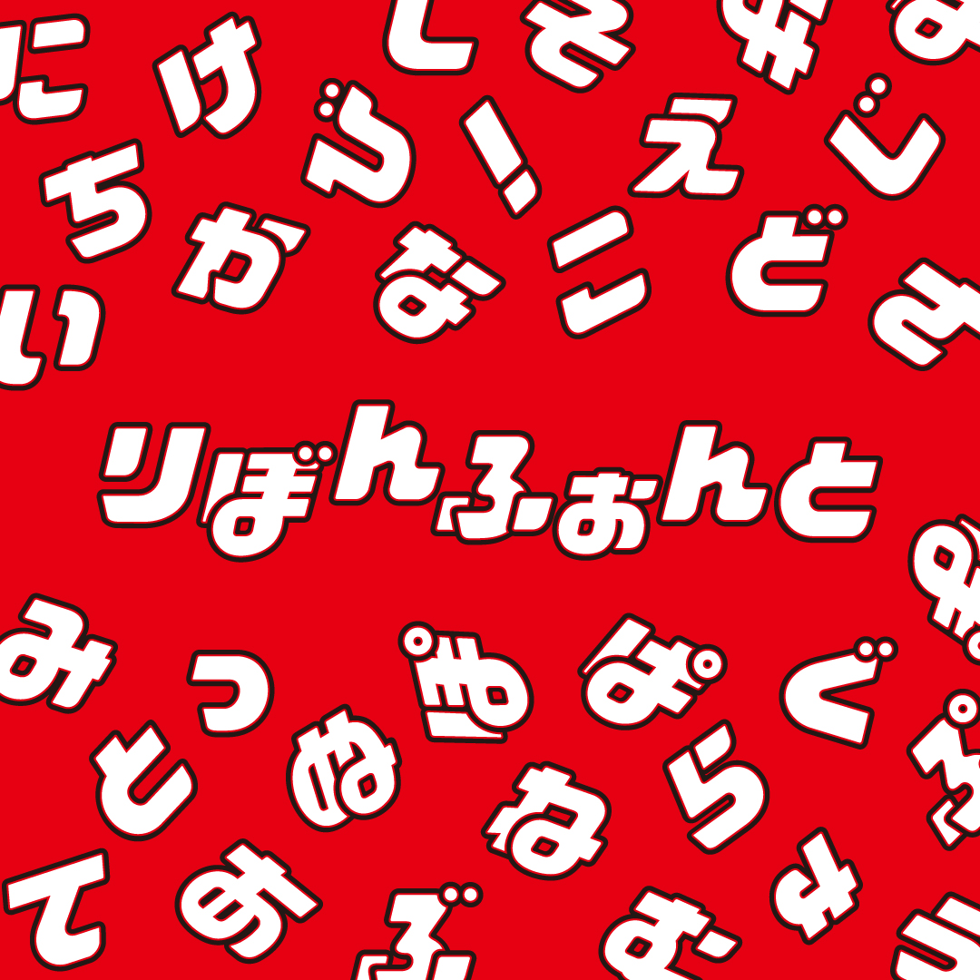
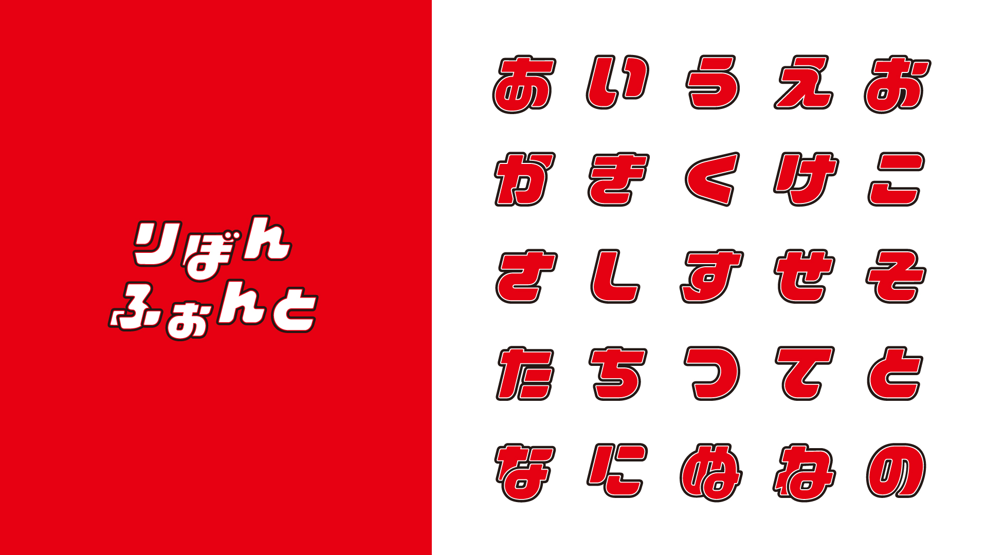
"Ribon Font" was born in this way
Although I didn't have much time to make it, Fontworks Type Designers Morita-kun worked hard!
I asked him about stories such as "How was it going to be made?" and "How did you make it?"
――How did you feel about making Ribon Font?
Morita-kun: The reference sample was only three letters, "ri", "bo", and "n", and there were many parts that I had to supplement with other letters by imagination, so it was a difficult place, but there is room to imagine It was also interesting because that was also left.
--Oh! I'm enjoying the difficult problems in reverse! What kind of points are you particular about?
Morita-kun: It was more difficult than I imagined to develop a logo in a font. I made the rules, but even if I make them according to the logic of the "Ribon" logo, it does not give the same impression as when I saw the three characters of "Ribon".
In order to match the taste of the logo and other characters as a font, I didn't pay much attention to the rules, and prioritized the process of making it more "ribbon"-like.
――I see, it looks like "Ribon". How did you make the letters?
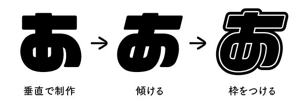
Morita-kun: When developing the font into the Japanese syllabary, it is difficult to produce with a frame and with a tilt, so I first removed the frame from the Ribon logo to eliminate the tilt.
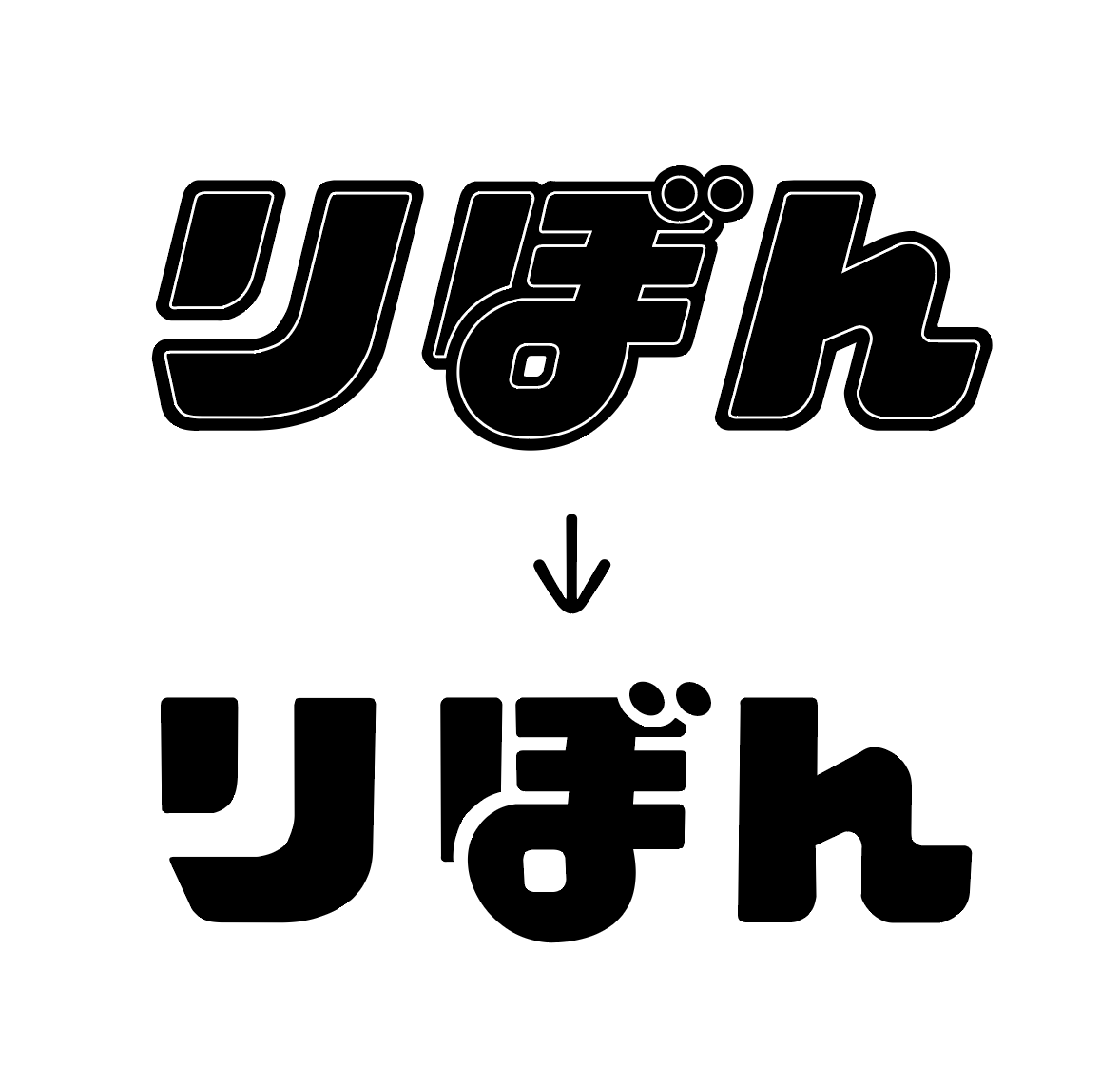
I made other letters based on this shape, then later performed a process to incline them all at once, and then added a frame to make adjustments.
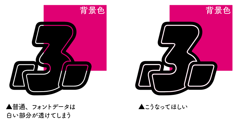
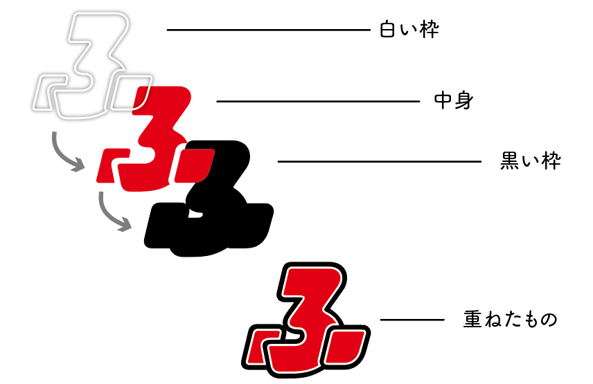
The "Ribon" logo has a double frame consisting of a white frame and a black frame. If you create it as font data, the background will be transparent in the white part, but it was assumed that the designer using this "Ribon Photo" would change the color of the character.
So, I made 3 sets of data, "data of the contents", "data of a black frame" and "data of a white frame", and separated the layers to reproduce the frame of the "Ribon" logo.
By doing this, the data is "white frame is not transparent" and "colors are easy to change in a batch because it is divided into layers".
――It's not only cute, it's also easy to use. Did you have any difficult characters to make?
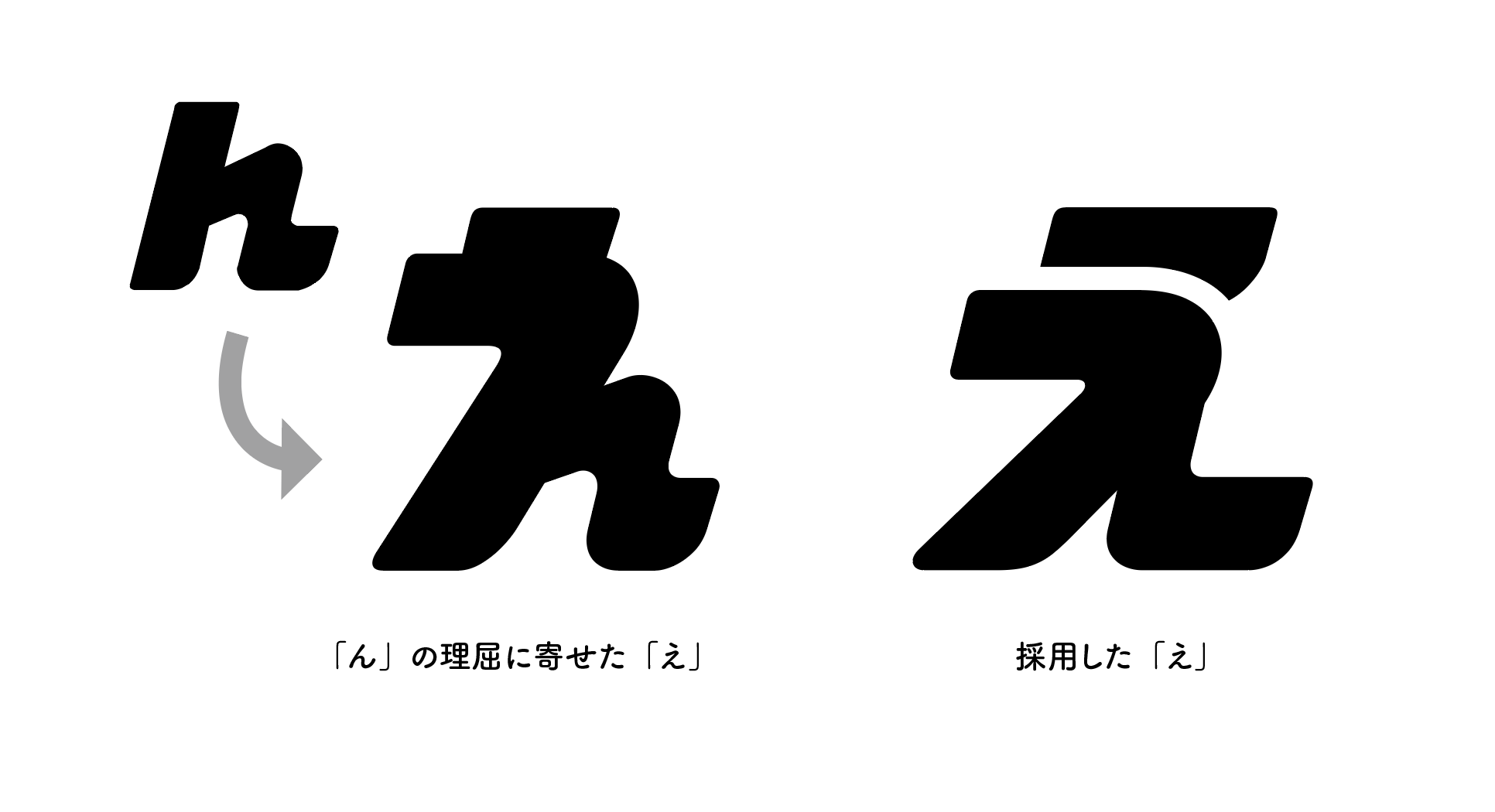
Morita-kun: Characters that have parts that are not included in the original "ri", "bo", and "n", and "e" and "o" that have a complicated skeleton take a long time to harden the design. It was
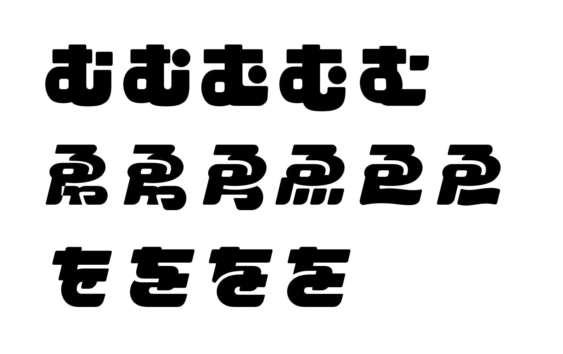
How can I make it look like "ribbon" while maintaining the impression of the original letters? While receiving advice from the members around me, I proceeded with the design, such that these people are more like "Ribon" and that this character can be made more cute. During the production, a senior who was a "Ribonkko" seemed to be jealous.
--For cuteness, you can't compromise, lol
Morita-kun: People who see this "Ribon Photo" should have the "Ribon" logo imprinted on their heads, so if you don't carefully match it with the image, enjoy this font. I had a feeling that you would not receive it.
I am very happy to have an interesting attempt to raise the 65th anniversary of Ribon from the side of letters.
I went to the pop-up store "Ribon no Mise" in Harajuku!
I was able to watch the production process of "Ribon Photo" and finish it, but when I made the Announcement, I was very pleased with the huge response.
Shueisha's “Ribon” 65th anniversary project [Ribon no Ribon] I participated in @ribon65th and created “Ribon Photo” 🎀 A very cute original typeface created based on the “Ribon” logo ❣️ https://t.co/269nDbo3Cs # Ribon pic.twitter.com/oH6Zz0X9mq
— Fontworks / Fontworks (@Fontworks_Inc) February 27, 2020
I also visited Ribon no Mise, which is open in Harajuku for a limited time from March 6th to March 20th, 2020.
Besides, on the first day of opening!
It was a weekday, but it was very busy.
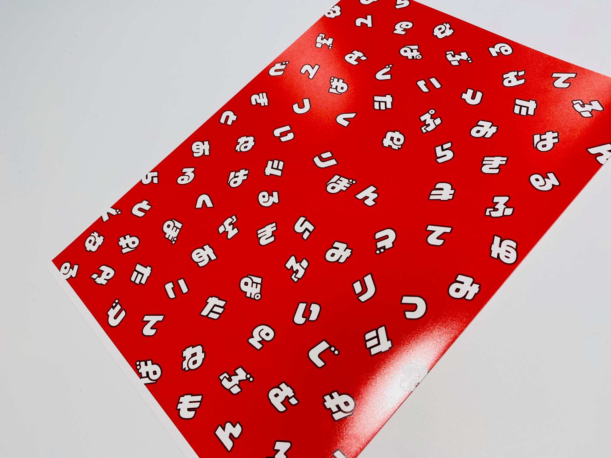
As a souvenir, I got a clear file infused with "Ribon Font".
LINE Emoji is finally released!
Announcement, LINE pictographs will be available for sale from March 13, 2020 (Friday).
🎀 LINE pictographs with Ribon Fon are released 🎊 It is divided into three, ① ② ③, so please get all and enjoy it 🥰
— Fontworks / Fontworks (@Fontworks_Inc) March 13, 2020
① Ah~ https://t.co/7bjqbZ84qg
② Ran, dull sound, semi-done sound https://t.co/tUf7AZ7oZT
③ Small letters and symbols https://t.co/PNo Universal Design oRRl8@ribon65th pic.twitter.com/GLGlktNvqi
I also bought it immediately and Downloads it.
This is also cute!
I hope more and more "Ribonkko" will enjoy this "Ribon Photo" and be loved.
Tokun...this feeling...……………………!
See you!